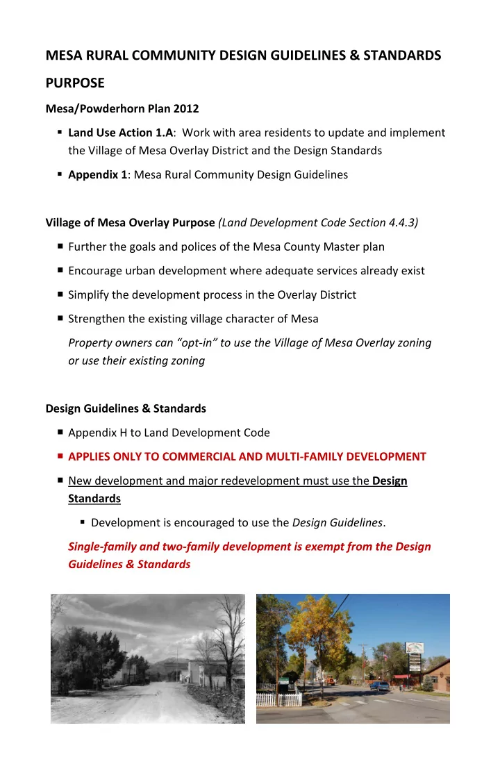

MESA RURAL COMMUNITY DESIGN GUIDELINES & STANDARDS PURPOSE Mesa/Powderhorn Plan 2012 Land Use Action 1.A : Work with area residents to update and implement the Village of Mesa Overlay District and the Design Standards Appendix 1 : Mesa Rural Community Design Guidelines Village of Mesa Overlay Purpose (Land Development Code Section 4.4.3) Further the goals and polices of the Mesa County Master plan Encourage urban development where adequate services already exist Simplify the development process in the Overlay District Strengthen the existing village character of Mesa Property owners can “opt-in” to use the Village of Mesa Overlay zoning or use their existing zoning Design Guidelines & Standards Appendix H to Land Development Code APPLIES ONLY TO COMMERCIAL AND MULTI-FAMILY DEVELOPMENT New development and major redevelopment must use the Design Standards Development is encouraged to use the Design Guidelines . Single-family and two-family development is exempt from the Design Guidelines & Standards
DESIGN GUIDELINES & STANDARDS OUTLINE The intent is to ensure a continuance of design styles and patterns already found in Mesa “A front porch community” “Keep Mesa as it is” Introduction Intent & Purposes Mesa Character Design Theme & Style: Western Map Applicability Review Process Design Guidelines & Standards Circulation Site Design Building Design Signs Appendix Process & Public Participation Glossary References
DESIGN GUIDELINE AND STANDARDS SUMMARY CIRCULATION Standards: Coordinate the development and layout of projects with CDOT and Mesa County Guidelines: A network of pedestrian and bike paths should be developed Sidewalks along Highway 65 and KE Road in Tier 1 Alternative surfaces may be used in place of sidewalks SITE DESIGN Standards: Pedestrian connections to street network, building entrances, parking Primary building entrances facing the street or main drive Shared driveway access Parking behind or to the side of buildings Parking lots screened from residential uses and from street Landscaping along street edges and parking lot perimeters Locate service areas to the rear of the site Place mechanical equipment to the rear or on the roof Provide fenced or walled enclosures for trash and recycling Breaks in fences and walls to allow pedestrian connections to the street Fences no taller than 4 feet in front setbacks Streetlights are not required in subdivisions or on local roads Follow “Dark Sky” lighting principles; use shielded bulbs Guidelines: Break larger parking lots into smaller sections; shade parking lots Water-wise landscaping Landscape portions of site not covered by buildings, driveways, etc. Use landscaping to define and enhance development Retain mature trees and vegetation Use high quality fence materials Provide lighting at entrances, parking areas and walkways Provide places for people to site, relax and interact; include shade Public art is encouraged.
DESIGN GUIDELINE AND STANDARDS SUMMARY BUILDING DESIGN Standards: Use offsets in walls and roof if more than 50’ long on street Building style and design shall be predominantly “Western” Front porches shall be provided on the primary street frontage Exterior materials shall include wood, rock, brick, stucco, non-reflective unpainted metal Alternative materials, i.e. Hardie board, cultured stone, are O.K. Front facades of steel buildings shall be architecturally finished Metal roofs shall be non-reflective Ground floor windows shall have two-way visibility Guidelines: Buildings should be rectangular, simple in form Buildings should be proportional to others in the area Buildings should have a base, middle and top Conceal flat roofs using parapets or false fronts Use dormers, cross gables or changes in roof heights to break up roofs Provide eave overhangs Provide cornices on false fronts and parapets Use architectural elements to provide visual interest and pedestrian scale Architectural elements should be proportional in scale to the building Provide trim around windows, doors and at corners Doors should be well-defined Windows should be appropriate to the use, style and scale of the building SIGNS Standards: External illumination shall shine directly onto the sign Signs shall be placed so views at intersections and driveways are unobstructed Guidelines: Internally illuminated signs should have dark backgrounds and light letters Signs integrated into building design and landscaping Maximize visibility to both motorists and pedestrian
WESTERN STYLE Simple & straightforward Provides a connection to agricultural roots Rectangular in form, 1 or 2 stories tall Gabled or hipped roof; false fronts Wood and stone Porches are essential, creating an inviting appearance Bay windows and similar features Decorative elements are limited, not ornate, and highlight features like windows, doors and cornices; folk Victorian is acceptable
Recommend
More recommend