
���������� ������� ������� ������������� ���������� ��������� � � � � � � �
death by powerpoint right now , someone out there is actually dying from a boring presentation hopefully it’s not yours
your presentation should move & inspire people don’t bore your audience, gore them!
toda y all the tools are a v ailable to create a beautifully designed presentation and most are free!
so please, lets stop designing presentations like its 1999
Standard templates (like the ones found in Powerpoint) are fugly and don’t communicate, they KILL! You can do better!
tHERE’S AN ART TO PUTTING TOGETHER A SOLID PRESENTATION
The “art” is setting yourself apart. This means many things, but what i’m talking about is design. This presentation isn’t about public speaking skills, it’s about designing great looking slides that will knock the socks o ff your audience and most importantly move and inspire people to action. Follow me and i’ll show you how to design like a superstar.
1. ha ve a killer opening slide
Don’t be afraid to have a bold title that will grab people's attention. At most conferences you can almost tell which presentations are going to suck even before they start. Remember that 65% of your audience will be in carb coma after lunch, bored or thinking about sex. It’s your job to snap them awake by making your first slide a killer one.* *OK, I made that up, but i’m sure it’s partly true.
Here’s some opening slides that don’t suck
If you’re uploading your presentation online a visually stunning opening slide is everything. Just like a book people will judge your presentation by its cover, so make sure its an awesome one that will get clicks.
2. use a color scheme
In this presentation I wanted to use the same font and colors from EasyJet. So, I Google’d: Easyjet font & color (I know, crazy huh?) The result was a low cost airline feel throughout the entire presentation.
An easy way to find a great looking color combination is to pick a popular palette on COLORlovers.com 2,383 people ‘love’ this one
Or use colors found in popular websites or magazines. For this presentation I wanted to give a gossip magazine feel.
3. use stunning visuals
Your audience reads your slides faster than you talk. Never, ever, ever put word-for-word what you are saying, instead use strong visuals to help add to your story and not give it away before it comes out of your mouth. If I was giving this presentation to you face-to-face I would eliminate 90% of the text
When someone puts all their text in their presentation i’m like: “Dude?! What’s the point of being here?! Just email me your slides and I’ll read it on my own time without you.” Oh ya, and bullet points are so old-school. (more on this later)
ditch the notes you don’t need them
Instead use images to remind you of each point. “Let me tell you about how my 3-year old child is using an iPhone...” “As part of our sta ff we “The idea for the Gutenberg actually have 1 ex-clown...” press came about by... ” *It takes a little bit of practice but this alone will make your presentation 100% better (that’s a fact).
There are 4 types of images you can use: roy alty Your free own (paid) See, this is much more sexier than using bullet points creative commons screenshots (free!)
ok, where to find them: what it looks like: Time consuming, but Your gives your slides a nice touch. I like full screen own width photos. iStockphoto.com . For a few $$ get professional photos or illustrations roy alty that you can use without -free having to pay royalties. (paid) Perfect for a cohesive professional look. Flickr.com . Best place to look for Creative creative Commons images. commons All you need to do is add (free!) a proper credit to your presentation.
Use screenshots to highlight bits of something on your computer Skitch.com it’s a free tool for taking screenshots and add little things like screen- arrows to it. shots Its dead simple to use. I use it 30+ times a day (no joke). or Command-Shift-4 on Mac to copy a selected area.
e ’ r u y o o n i i t d o n c t a h w r e n d u y f c i e p s o s g o l u e s o s y e l l h a T e m t i e h t f o s t o M k . o r w e t h e s u o t d e r . w o o a t a l l e c r s t o i t t d i e c r l e p m s i a d d a i s o d o t d e e n
there are 2 wa ys to add credits: bottom of image last slide
a quick word on picking photos
this is cheezy! Seriously dude, nobody’s office looks like that. (unless you work in an office of cheezy models)
this is cool! unexpected, visually interesting photos are fun & gives energy to your story .
EXAMPLES: “I want to talk to you about early childhood medical care...” “Here’s what’s happening with sales of luxury french goods...” “In freshman year i studied...” (kidding)
GRAPHS ARE OK, BUT REMEMBER: IT’S NOT ABOUT THE NUMBERS, IT’S ABOUT WHAT THE NUMBERS MEAN
4. Get your text right
keep it simple (less is more)
are you giving a document or a presentation? 75+ words/slide = document @nancyduarte
few things about fonts: never use more than 2 - 3 styles. (it’s not cute)
keep it in the your best bet is to family
blinking, blinking g sparkling or n twirling i l twirling twirling text is r i w just not cool t
but adding a slight rotation to text or images makes your slides a little more interesting but go easy tiger, don’t overdo it.
5. use CRAP
Contrast Repetition the most important acronym Alignment in design Proximity
WHAT IT mEANS: Contrast *First coined by Text and images that are all the same size Robin Williams and style is extremely boring and not (no not that one) communicative. Add some contrast to make it interesting. Repetition Repeat colors, fonts and images throughout your presentation for a cohesive feel (remember color mix?). Each new topic slide should have related styles so that your audience knows you are moving onto a new point. Alignment Text and images on each slide should be visually connected. Nothing should be out of place. Proximity Related elements should be grouped together
what it looks like:
Contrast examples Good contrast can make your slides look crisp and organized
Repetition examples Repetition of design elements gives a cohesive look
ALIGNMENT examples Line it up, add some padding and make sure elements are symmetrical
You can take some matching photos yourself... Or purchase collections on iStockphoto. This one is called ‘Gorilla Guy’. This looks awesome.
proximity examples group similar or related elements together
! p a r c h o Always double-check your design work with these principles: Contrast, Repetition, Alignment, and Proximity.
6. 6. USE USE VIDEO VIDEO
videos are cool But keep it short, simple & relevant. 2-3 min is good, 30 seconds is best.
and sa ve yourself from the awkward silence and alwa ys preload your videos.
To avoid waiting for videos to load I like to record a YouTube clip and edit it down to only the bits I want to show and then I embed in my slides. Works 100% of the time with no waiting! I use screenflow for this
Here I recorded a YouTube video and removed the sound and had it play automatically when I advanced slides. This allowed me to talk over the video and give a narrative which included a Facebook page + Youtube clip (In the presentation world this is like George Lucas type stu ff )
7. SHARE YOUR WORK
Sa ve a tree Upload your presentation to SlideShare.net. This allows your audience to download a PDF version and also share via Twitter and Facebook. If you get selected as the top presentation of the day you get instant fame and glory. Use bit.ly so you can track where and how your presentation is being shared.
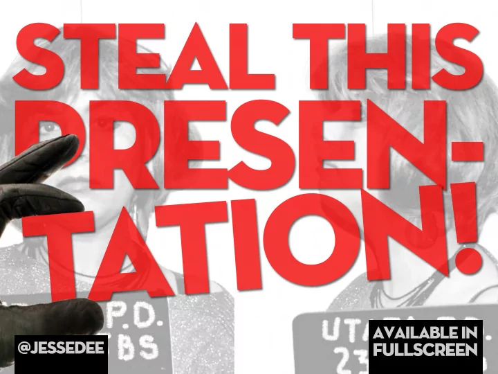
Afraid of someone ‘stealing’ your presentation?
Unless you’re dealing with top secret stu ff don’t be. If you use the methods you just learned the only person able to give your presentation should be you. Using things like images instead of text refreshes the memory of someone who was at your talk but means nothing to someone who wasn’t.
set your ideas free (you’ll get more in return)
Recommend
More recommend