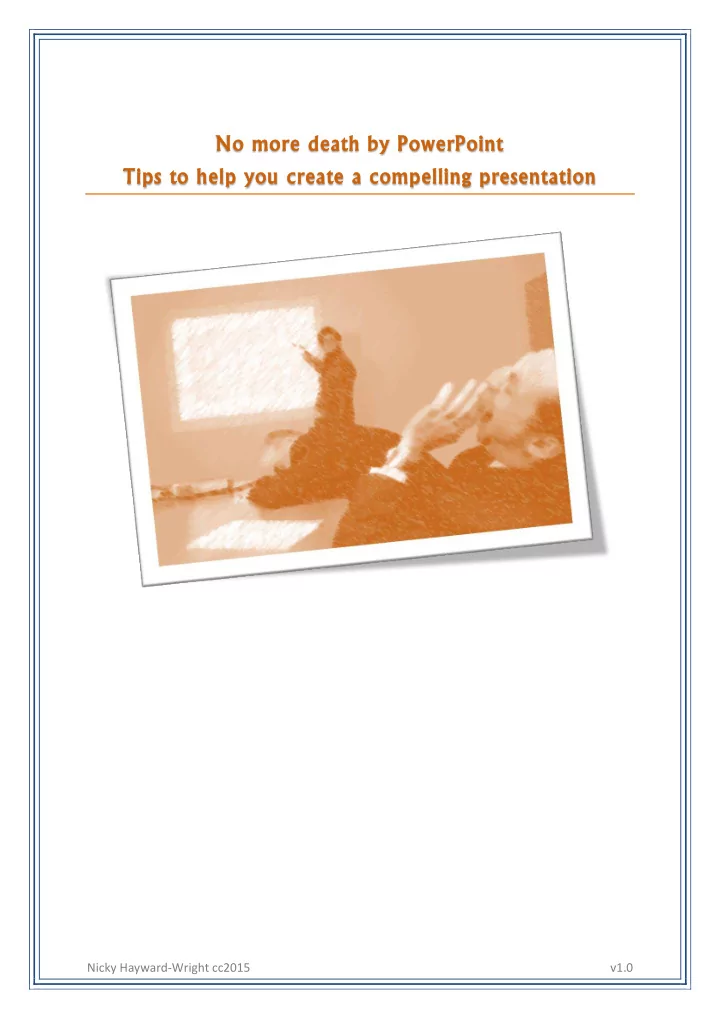

No more death by PowerPoint Tips to help you create a compelling presentation Nicky Hayward-Wright cc2015 v1.0
Craft a compelling story that engages Establish the context (why) then address the what and how Identify and tell your audience why they should care/listen Identify what’s in it for them Keep it simple If it’s complex make it simple > Listen to: Talk nerdy to me - TedTalk (4:37mins) by Melissa Marshall Have a plan 1. Brainstorm ideas 2. Outline main points 3. Create structure a. Start – have a bold and unique cover slide b. Middle – sell the benefits, solve the problem… c. End – recap and call to action 4. Fill in detail 5. Storyboard slides 6. Design slide deck 7. Rehearse Create slides that are memorable Let your slides breath so the audience listens to you Don’t use your slide as a manuscript Create slides that reinforce or compliment what you are saying Less is more Cut the fluff - get to the core of your message fast One key message per slide If in doubt, split it out or ditch it Visuals should convey a message in 3 seconds Use headlines, not paragraphs Use images, shapes, colours and fonts to grab attention Images on the web Use images to inspire emotion and action Flickr Images make content 55% more memorable than words Compfight Make the image the hero and support with key words (picture FreeImages superiority effect) Unsplash Use images where the background of the image blends into the Creative Commons background of the page. Tip: in Google images advanced search filter on image transparency colour Use high quality images (photos) and make sure you credit image source, either at bottom or slide or on credit slide, where appropriate Nicky Hayward-Wright cc2015 v1.0
Use icons and graphs to help visualise text Infographics Transform facts into messages easel.ly > Listen to: How to Present Complex Information PikToChart Simply through Stories (GoTo on demand Infogram webinar – registration required) Venngage Don’t use standard charts or forms - use circles, blocks, Dipty (timeline creator) shapes Infographics are even better to represent graphical information Use icons and symbols Typography is important Typography #1 - font Icons Change from a stock font to create interest PICOL Find Icons Use one font family to create consistency Iconmonstr Use no more than 3 fonts - one for title, one for body copy, The Noun Project one for accents Match the font to the tone of your presentation Typography #2 – size Large fonts are easier to read – use 30 point font Fonts Use larger font to highlight key words Urbanfonts Typography 3 - contrast DaFont Use two different font thickness (bold and thin) Font Squirrel Font Fabric Use 2 two different colours Google web fonts Use 2 different fonts Use semitransparent background behind text for when contrast is required Typography 3 – spacing Adjust spacing between words to change look of your text Colour Adjust spacing between lines to create better typography Pictaulous Design Seeds Use colours wisely Adobe Kuler Use a colour scheme that matches the tone of your Colour lovers presentation Color Scheme Designer Use complimentary colours – 5 colours that work well Color hunter (pulls out together main colours of picture) Create slide samples/masters Use the same layouts for slides that have the same purpose – transition slides, content slides, impact quote, image Reuse what’s available Presentation software Haiku Deck PowToon Nicky Hayward-Wright cc2015 v1.0
References 3 steps to prevent presentation pollution 5 big tips to become a presentation Jedi 5 Tips for better typography in your slides 8 tips to create epic visual presentations How to create presentation slides that are out of this world Presentation design techniques The presenters manifesto Tips to create an epic visual presentation Some Resources for Online Presentations 7 Online presentations mistakes to avoid GoTo on demand webinar | registration required Speaker: Gihan Perera, Author, Webinar Smarts Topics covered: o How technology can add value to your webinar o Why you can’t treat online and in -person presentations the same o The importance of creating and keeping with the agenda Epic Webinars series Part 1 : Making online presentations memorable GoTo on demand webinar | registration required Speaker: Matt Abrahams, Educator and Coach, Stanford Graduate School of Business and Author Topics covered: o Make your presentation memorable o Grab attention with practical public speaking techniques o Practice and prepare for your presentation Epic Webinars series Part 2 : Preparing and presenting compelling webinars GoTo on demand webinar | registration required Topics covered: o Assess your audience and context o Prepare and test technology o Implement an effective structure o Interact with participants to make webinars more engaging o Use variety in visuals and delivery to keep focus From Start to Finish - Prepare & Present Compelling Webinars Epic Webinars series accompanying ebook Nicky Hayward-Wright cc2015 v1.0
Recommend
More recommend