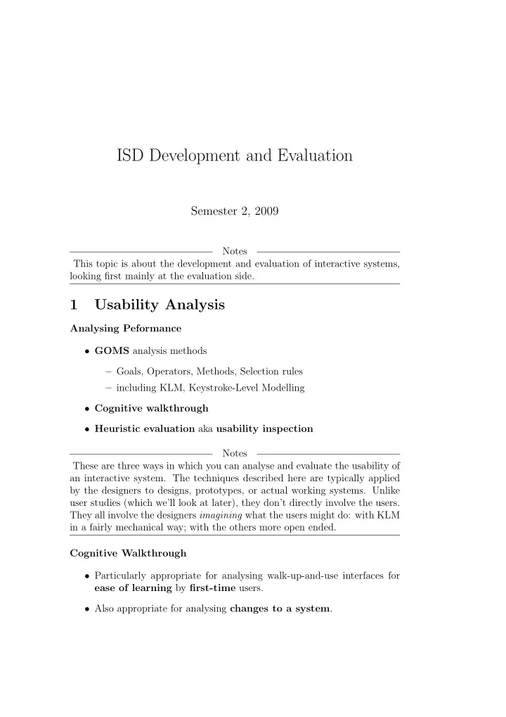
ISD Development and Evaluation Semester 2, 2009 Notes This topic - PDF document
ISD Development and Evaluation Semester 2, 2009 Notes This topic is about the development and evaluation of interactive systems, looking first mainly at the evaluation side. 1 Usability Analysis Analysing Peformance GOMS analysis methods
ISD Development and Evaluation Semester 2, 2009 Notes This topic is about the development and evaluation of interactive systems, looking first mainly at the evaluation side. 1 Usability Analysis Analysing Peformance • GOMS analysis methods – Goals, Operators, Methods, Selection rules – including KLM, Keystroke-Level Modelling • Cognitive walkthrough • Heuristic evaluation aka usability inspection Notes These are three ways in which you can analyse and evaluate the usability of an interactive system. The techniques described here are typically applied by the designers to designs, prototypes, or actual working systems. Unlike user studies (which we’ll look at later), they don’t directly involve the users. They all involve the designers imagining what the users might do: with KLM in a fairly mechanical way; with the others more open ended. Cognitive Walkthrough • Particularly appropriate for analysing walk-up-and-use interfaces for ease of learning by first-time users. • Also appropriate for analysing changes to a system .
• Similar in spirit to code walkthrough . • Evaluators step through the sequence of interface actions required to complete some task. • At each step , determine why it is or isn’t appropriate for a new user. Cognitive Walkthrough • Based on a user model of exploratory learning : 1. The user starts with a rough plan of what is to be achieved—a task to be performed. 2. The user explores the system, via the user interface, looking for actions that might contribute to performing the task. 3. The user selects the action whose description or appearance most closely matches the goal. 4. The user interprets the system’s response and assesses whether progress has been made towards completing the task. • Exposes design flaws that may interfere with exploratory learning. Notes Clearly, there are parallels between Exploratory Learning and Norman’s Model of Human Task Perform. You might almost say they were the same idea, just expressed in different words. There are several differences in em- phasis, however. For one, Exploratory Learning emphasizes how users learn , while Norman’s model emphasizes how users do . Cognitive Walkthrough Requirements To do a cognitive walkthrough, as an evaluator you need • sufficiently detailed description of the prototype, • description of the task the user is to perform, • list of actions needed to perform the task with the prototype, • indication of the user’s experience and knowledge, 2
Cognitive Walkthrough Questions As you step through, ask: 1. Will the correct action be made sufficiently evident to the users? 2. Will the users connect the correct action’s description with what they are trying to do? 3. Will the users interpret the system’s response to the chosen action correctly? That is, will the users know if they have made a right or a wrong choice? 4. Will the user’s mental model be affected? Will new concepts be added, or existing concepts lost? Notes So the process (ritual?) of a cognitive walkthrough is for you to go step by step through the steps your user has to go through, and at each step ask these four “magic” questions, and try to answer them, given what you know about your users. The first three questions are the crucial ones. If the answer to any of them is no, then that’s a sign that that part of your interface needs fixing. The fourth question is a reminder to be aware how interaction with your interface will affect your user’s mental model, for good or bad. Keep in mind that the user’s mental model also lurks behind the the first three questions, in that how the user interacts with the system will depend not only on what the user can see, but also on what the user thinks about how the system works. There will always be something of a subjective element in this process, since you the designer are making judgements about what you think your users will see and do and think. Heuristic Evaluation • also called usability inspection • more appropriate for designs where method of operation is less pre- dictable • typically done by small team of evaluators 3
Heuristic Evaluation • apply usability heuristics (general-purpose guidelines) – simple and natural dialogue – speak the user’s language – minimize memory load – be consistent – provide feedback – provide clearly marked exits – provide shortcuts – provide good error messages – prevent errors – . . . • informal walkthroughs as needed Notes The guidelines given here are just examples, of guidelines that might be used. We’ll look at guidelines in more detail later in the semester. Heuristic Evaluation, Comments • rather loose and flexible • low cost, compared with other methods • little or no advance planning required • can be used early in development process • problem oriented • design inertia • more varied outcome, less repeatable 4
Notes Heuristic evaluation is a less formal, more open-ended kind of analysis than cognitive walkthrough. You need to have ahead of time a list of guidelines or usability heuristics that you think your interface should conform to. You then look at the interface and evaluate whether indeed it does follow those guidelines. Because one team member may see what other team members don’t see, heuristic evaluation works better with a small team of evaluators than with a solo evaluator. Heuristic evaluation has a number of sources of variability: what guide- lines are chosen, how the evaluators perceive the interface and interpret the guidelines. So the results may be variable, but still useful. Heuristic evaluation can be done at any stage of the development pro- cess, but can be done in quite early stages of design, even before there are prototypes. One problem that afflicts heuristic evaluation (and also prototyping) is design inertia : Designers can get stuck in evaluating the interface in terms of the current design. 2 User Studies User Studies Can be with respect to: • existing system • prototypes of new system • completed new system User Studies Can be for: • understanding users, their work and environment • identifying problems • eliciting, clarifying, and validating requirements • system evaluation: “acceptance testing” 5
User Studies • May need to conduct initial studies to define problems then follow-up studies to address particular issues • Tension between thoroughness and availability of resources Some Methods of Data Collection • Interviews • Questionnaires • Observation • Other methods, e.g. focus groups, server logs for websites (see later) Notes These are ways in which you can gather information about your users. As with all user studies, they can be to find out about how users work with an existing system (which you’re planning to replace or improve); with a new system under development (say through prototypes); or with a newly completed system to confirm that it does indeed do the job. Interviews • Who to interview? – users: workers, supervisors? – number of people and range depends on allocated resources • How long should interview be? – half an hour to an hour • Logistics of scheduling interviews • Need to be structured, but should also allow for open-ended exploration 6
Interviews Some issues to address: • explaining purpose of interview • enumerating user’s activities/responsibilities • work methods: how is the job done? • tracing interconnections with other people • performance (may be sensitive, seeming to reflect on user’s competence) • following up on exceptions: non-routine aspects of work • knowledge of the domain (interviewer’s homework) Interviews • May be set questions to ask, but need also allow for interviewee to volunteer information • Approach needs to be conducive to finding out, i.e., non-threatening to users • Lack of anonymity, users may feel intimidated • Record may be interviewer’s notes, or audio recording (with permis- sion) • Labor-intensive and time-consuming, so relatively costly and only few can be interviewed Questionnaires Questionnaires need to be devised carefully—a whole area of study in itself • only one chance—can’t seek clarification or elaboration as in an inter- view • questions need to be unambiguous • users have only limited time to answer – make things easy for the subject 7
• avoid leading questions • beware of ordering effects, biases • . . . Questionnaires Kinds of questions, e.g.: • multiple choice • tick boxes • rating on a scale: numeric, or converted to numbers • short text or numeric answers • open-ended free-text comments Questionnaires Can be anonymous • may get more honest answers, but less “responsible” answers • still may need “demographic” data Questionnaires • More advance planning needed than for interviews • Less costly per person • Can potentially obtain data from a large number of people – more representative, particularly for statistical analysis • May need to offer incentives to get people to take time to answer • Can be paper, postal, email, or web form. . . —different characteristics • Usually advisable to test questionnaire on small group beforehand 8
Recommend
More recommend
Explore More Topics
Stay informed with curated content and fresh updates.










![Towards Self-Explainable Cyber-Physical Systems [1] Mathias Blumreiter, Joel Greenyer, Francisco](https://c.sambuz.com/1049181/towards-self-explainable-cyber-physical-systems-s.webp)


