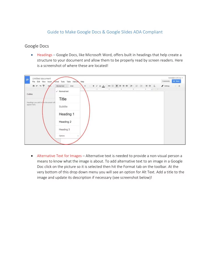

Guide to Make Google Docs & Google Slides ADA Compliant Google Docs • Headings – Google Docs, like Microsoft Word, offers built in headings that help create a structure to your document and allow them to be properly read by screen readers. Here is a screenshot of where these are located! • Alternative Text for Images – Alternative text is needed to provide a non-visual person a means to know what the image is about. To add alternative text to an image in a Google Doc click on the picture so it is selected then hit the Format tab on the toolbar. At the very bottom of this drop down menu you will see an option for Alt Text. Add a title to the image and update its description if necessary (see screenshot below)!
o Another way to show Alternative text is to put a caption of the photo next to it. This means that you write a small description or sentence about the photo instead. Alternative text and captions should be no more than 140 characters! o Photos acting as decorations to the document and aren’t essential to the informative part only need to have Alternative Text that says alt=”” (alt + an equals sign + two quotation marks works best for screen readers to know this is a decorative image.) If you have trouble remembering this, then it is best to leave the Alternative Text field blank so as most screen readers should pass over the image entirely. • Lists – Sometimes you may need to create lists or columns and may just tab over to indent the content. While this provides a good visual structure for you, it doesn’t provide the document structure needed for assistive technology users. o In order to properly use a list or column use the bullet point or numbers provided by Google Docs. This will help a screen reader understand the content and read it in the correct order. See image below to know where the bullet point and numbers options are located.
• Links - When using links in a Google Doc always use a hyperlink and not the url itself. For example, a screen reader may have trouble recognizing http://www.google.com is a great search engine, where as it would recognize, Google is a great search engine. The Google hyperlink is the exact same web address, but the screen reader will now recognize it as text that needs to be clicked! o To hyperlink text simply highlight the text, right click it and select the link option. Then paste the desired url in the box that pops up. o To hyperlink a photo, click on the photo then hit the “Insert Link” button on the toolbar. Then paste the desired url in the box that pops up!
• Data Tables – Make sure your tables serve their purpose, to provide data in a grid or matrix style with no images or un-needed characters. • Landmarks (Headers, Footers…etc) – Landmarks such as headers, footers, page numbers and page counts - all in the insert menu, help your readers orient themselves in your document and maximize accessibility! • Comments and suggestions – use the commenting and suggesting features instead of writing notes within the document text. Screen reader users can navigate to comments using keyboard shortcuts rather than hunting through the document. Google Slides • Slide Layouts – Google Slides contains a series of highly-accessible slide layouts and users are encouraged to use these layouts to ensure their presentation has the correct structure for ADA Compliance. o To use these built in layouts, open an existing or blank presentation. Where your slides are listed on the left, look for a plus sign with a drop down menu. Click this dropdown menu to access Google Slides built in slide layouts (see screenshot below).
• Alternative Text for Images – Alternative text in a Google Slide is done the exact same way as you would add it in a Google Doc. To add alternative text to an image in a Google Slide click on the picture so it is selected then hit the Format tab on the toolbar. At the very bottom of this drop down menu you will see an option for Alt Text. Add a title to the image and update its description if necessary (see screenshot below)! o Another way to show Alternative text is to put a caption of the photo next to it. This means that you write a small description or sentence about the photo instead. Alternative text and captions should be no more than 140 characters! o Photos acting as decorations to the document and aren’t essential to the informative part only need to have Alternative Text that says alt=”” (alt + and equals sign + two quotation marks works best for screen readers to know this is a decorative image.) If you have trouble remembering this, then it is best to leave the Alternative Text field blank so as most screen readers should pass over the image entirely. • Links - When using links in a presentation always use a hyperlink and not the url itself. For example, a screen reader may have trouble recognizing http://www.google.com is a great search engine, where as it would recognize, Google is a great search engine. The Google hyperlink is the exact same web address, but the screen reader will now recognize it as text that needs to be clicked! o To hyperlink text simply highlight the text, right click it and select the link option. Then paste the desired url in the box that pops up.
o To hyperlink a photo, click on the photo then hit the “Insert Link” button on the toolbar. Then paste the desired url in the box that pops up! • Lists – Sometimes you may need to create lists or columns and may just tab over to indent the content. While this provides a good visual structure for you, it doesn’t provide the document structure needed for assistive technology users. o In order to properly use a list or column use the bullet point or numbers provided by Google Slides. This will help a screen reader understand the content and read it in the correct order. These options may be hidden on your toolbar, so you may have to hit the More button to bring them up. See image below to know where the bullet point and numbers options are located.
• Data Tables – Make sure your tables serve their purpose, to provide data in a grid or matrix style with no images or un-needed characters. • Text Boxes – please be conscious of the order in which you create your text boxes as almost all screen readers read text boxes in the order they were created and not based on the position they are on the screen!
Recommend
More recommend