CSS Transforms, Transitions, and Animation Basics WordCamp - PowerPoint PPT Presentation
CSS Transforms, Transitions, and Animation Basics WordCamp Northeast Ohio 2016 Beth Soderberg @bethsoderberg | What is a transform? "to change in form, appearance, or structure; metamorphose" - Dictionary.com The CSS transform
CSS Transforms, Transitions, and Animation Basics WordCamp Northeast Ohio 2016 Beth Soderberg @bethsoderberg |
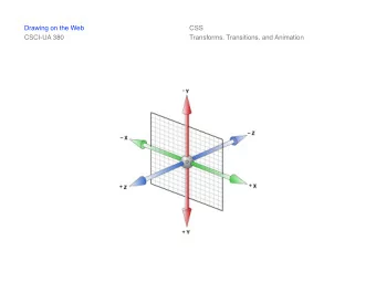
What is a transform? "to change in form, appearance, or structure; metamorphose" - Dictionary.com “The CSS transform property lets you modify the coordinate space of the CSS visual formatting model. Using it, elements can be translated, rotated, scaled, and skewed according to the values set.” - Mozilla Developer Network
Transforms: Syntax No Transforms transform: none; One Transform transform: transform-function; Multiple Transforms transform: transform-function transform-function transform-function;
Transform Functions Rotate Scale Skew Translate ... and Matrix
Rotate Rotates an element clockwise from its current position. Counter clockwise rotations can be achieved by using negative values.
Rotate: Syntax transform: rotate(angle); * angles are expressed as (5deg) or (-5deg), for example.
Examples Box <div class="box"></div> .box { width: 3em; height: 3em; background: #bced91; } Box with Smiley <div class="box"><i class="fa fa-smile-o"></i></div> .box .fa { font-size: 2em; line-height: 1.45em; text-align: center; color: #000000; }
Rotate: Examples Rotate 25 Degrees to the Right .box { transform: rotate(25deg); } Rotate 25 Degrees to the Left .box { transform: rotate(-25deg); }
Scale Scales an element relative to its original size. The values specified within scale transforms are unitless and should be thought of as a multiplier.
Scale: Syntax X and Y axis Scale transform: scale(valueX, valueY); * if only valueX is specified, valueY is assumed to be equal to valueX Just X axis Scale transform: scaleX(valueX); Just Y axis Scale transform: scaleY(valueY);
Scale: Examples Shrink to half size .box { transform: scale(0.5); } Double Y Axis .box { transform: scale(1, 2); }
Skew Skews an element along the X and/or Y axis by an angle value.
Skew: Syntax X and Y axis Skew transform: skew(angleX, angleY); * do not use Just X axis Skew transform: skewX(angleX); Just Y axis Skew transform: skewY(angleY);
Skew: Examples Skew left .box { transform: skewX(25deg); } Skew left and up .box { transform: skewX(25deg) skewY(25deg); }
Translate Moves an element vertically and/or horizontally relative to its current position. Positive values will move the element right on the X axis or down on the Y axis. Conversely, negative values will move the element left on the X axis or up on the Y axis. Any regular length value can be used (px, em, etc.).
Translate: Syntax X and Y axis translation transform: translate(valueX, valueY); Just X axis translation transform: translateX(valueX); Just Y axis translation transform: translateY(valueY);
Translate: Example Starting Point .box-wrap { width: 6em; height: 6em; border: 5px solid #282828; } Move Box to Bottom Right .box { transform: translate(3em, 3em); }
Why would you use translate when you can use more established CSS standards for layout and formatting? Think of translate as a more efficient way to move placement in a transition or animation.
Transform Origin A CSS property that defines the point from which a CSS transform is applied to an element. By default, transform-origin is set to the center of an element (50% 50%).
Transform Origin Syntax transform-origin: x-offset y-offset; x-offset: a length or percentage from the left edge of the element's box. y-offset: a length or percentage from the top edge of the element's box. Accepted keywords left (0%) center (50%) right (100%) top (0%) bottom (100%)
Transform Origin: Examples Rotate 25 Degrees to the Left & Transform Origin at Top Right .box { transform: rotate(-25deg); transform-origin: 100% 0%; } Rotate 25 Degrees to the Left & Transform Origin at Bottom Right .box { transform: rotate(-25deg); transform-origin: right bottom; }
Transforms: Browser Support 9+ NOTE: 3d transforms are coming and can be used in a lot of browsers now, but they are only partially supported in IE11. Pre�x Requirements -ms- -webkit-
What is a transition? "movement, passage, or change from one position, state, stage, subject, concept, etc., to another; change" - Dictionary.com “The transition property is a shorthand property used to represent up to four transition-related longhand properties [that] allow elements to change values over a specified duration, animating the property changes, rather than having them occur immediately.” - CSS Tricks
Transition Properties transition-property transition-duration transition-timing-function transition-delay
Transitions: Syntax Shorthand transition: property duration timing-function delay; Longhand transition-property: property; transition-duration: duration; transition-timing-function: timing-function; transition-delay: delay;
Transition Property Specifies which property or properties will be impacted by the transition. Syntax transition-property: value; Accepted Values all (default) none single property name multiple property names, separated by commas
Transitions: Example Stage 1 Transition Property Only Starting State .box { transition-property: color, background-color, width; color: #000000; background-color: #bced91; width: 3em; } Active State .box:hover { color: #FFFFFF; background-color: #4f94e2; width: 3.6em; }
Transition Duration Property Specifies the amount of time the transition will take. Syntax transition-duration: value; Accepted Values time in seconds (s) or milliseconds (ms) multiple time values, separated by commas initial inherit
Transitions: Example Stage 2 Transition Property + Duration Starting State .box { transition-property: color, background-color, width; transition-duration: 2s; color: #000000; background-color: #bced91; width: 3em; } Active State .box:hover { color: #FFFFFF; background-color: #4f94e2; width: 3.6em; }
Transition Timing Property Specifies the pace at which the transition will run. Syntax transition-timing-function: value; Accepted Values ease step-start linear step-end ease-in custom cubic Bézier curve value ease-out custom stepping function value ease-in-out For an in-depth explanation of the transition timing property, check out this article: http://www.the-art-of-web.com/css/timing-function/
Transitions: Example Stage 3 Transition Property + Duration + Timing Starting State .box { transition-property: color, background-color, width; transition-duration: 2s; transition-timing-function: ease-in; color: #000000; background-color: #bced91; width: 3em; } Active State .box:hover { color: #ffffff; background-color: #4f94e2; width: 3.6em; }
Transition Delay Property Specifies when the transition will start relative to the instant the property value changes. Syntax transition-delay: value; Accepted Values time in seconds (s) or milliseconds (ms) multiple time values, separated by commas initial inherit
Transitions: Example Stage 4 Transition Property + Duration + Timing + Delay Starting State .box { transition-property: color, background-color, width; transition-duration: 2s; transition-timing-function: ease-in; transition-delay: 3s; color: #000000; background-color: #bced91; width: 3em; } Active State .box:hover { color: #FFFFFF; background-color: #4f94e2; width: 3.6em; }
Transitions: Browser Support 10+ Pre�x Requirements -webkit-
What is an animation? "the state or condition of being animated" "containing representations of animals or mechanical objects that appear to move as real ones do" - Dictionary.com “A way for authors to animate the values of CSS properties over time, using keyframes. The behavior of these keyframe animations can be controlled by specifying their duration, number of repeats, and repeating behavior.” - W3C Draft Specification
Animation: Keyframes Keyframes establish the behavior of an animation over time. Required Properties animation-duration animation-name Optional Properties animation-timing-function animation-delay animation-iteration-count animation-direction animation-fill-mode animation-play-state
Animation: Animation Duration Property Specifies the length of time one cycle of the animation will take. Syntax animation-duration: value; Accepted Values Time in seconds (s) or milliseconds (ms)
Animations: Animation Name Property Specifies the animation/s that should be applied to the CSS element. Syntax animation-name: [custom-value]; Accepted values Custom string with no spaces
Animations: Animation Interation Count Property Specifies the number of times the animation cycle should run. Syntax animation-iteration-count: value; Accepted values a number infinite initial inherit
Animation: Syntax to Call Animation .element { animation-duration: value; animation-name: custom-value; } *Optional animation properties would be included in the same code block as animation-duration and animation-name.
Recommend
More recommend
Explore More Topics
Stay informed with curated content and fresh updates.
