Transitions and Transforms Introduction to CSS Animations PRESENTED - PowerPoint PPT Presentation
Transitions and Transforms Introduction to CSS Animations PRESENTED BY Homer Christensen ABOUT HOMER MadCap Flare user since Version 4 Consultant - MadSkills Tech Writing / Info Architect for 30 years Clients include Nestle
Transitions and Transforms Introduction to CSS Animations PRESENTED BY Homer Christensen
ABOUT HOMER • MadCap Flare user since Version 4 • Consultant - MadSkills • Tech Writing / Info Architect for 30 years • Clients include – Nestle – Ellie Mae – State of California
WHAT WE’LL COVER • Why are animations important and effective? • Best practices • CSS properties – Transition – Transforms – Animation & @keyframes • Examples • Resources
WHY USE ANIMATIONS? • Help viewers focus • Provide feedback • Delight the viewers
BEST PRACTICES • Not too many • Animations should follow physical laws • Some CSS properties are more efficient for animations • Animation speed is important
TRANSITIONS • Transitions allow you to change the state of an element over time. • The browser calculates the “tween” states for you
TRANSITION PROPERTIES • transition-property (required) – What is being animated • transition-duration (required) – How long the animation takes to complete • transition-timing-function – How the transition unfolds • transition-delay – Delay before the transition begins
TRANSITION SHORTHAND • List each property separately in css statement • OR • Use this shorthand: – Transition: [property] [duration] [timing-function] [delay];
TRANSITION STATEMENT SAMPLES • Animating a single property – transition: border-color 0.2s ease-in; • Animating multiple properties – transition-property: background-color, color; – transition-duration: 0.3s, 0.5s; – transition-timing-function: ease-out ;
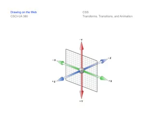
TRANSFORMS • The CSS Transform property lets you scale, rotate, or move elements in two- or three-dimensional space – Not an animation property – But often used in animations to reposition or reshape
TRANSFORM PROPERTY • transform: none | <transform function & amount>; • Examples: transform: translate(20px, 40px); transform: scale(1.2); transform: rotate(90deg); transform: skewY(80deg);
IDEAS TO ANIMATE A TRANSFORM • Bring elements from off a page or element • Buttons that increase in size (scale) on hover • Interface elements that rotate • Cards that flip • Photos on a table
ANIMATIONS AND KEYFRAMES • The CSS Animation property uses keyframes to let you create simple or complex animations. • Animation statements specify the keyframe to use as well as the settings like – how many times it runs – how long it runs – whether there is a delay before it begins • Keyframes are the script that tells the object which parts change, how much, and when.
BENEFITS OF CSS ANIMATIONS • Benefits include: – You can create animations without javascript – The animations run natively within the css – The browser optimizes performance and efficiency – You can specify multiple keyframe animations on an element
ANIMATION PROPERTIES • animation-name animation-iteration-count The name of the @keyframes used. The number of times the animation repeats. • animation-duration animation-direction The length of time that an animation Determines whether the animation takes to complete one cycle. should alternate directions or reset to the start point and repeat itself. • animation-timing-function The timing of the animation--the easing animation-fill-mode functions and acceleration curves. Determines the values applied by the animation before and after it runs. • animation-delay animation-play-state The delay between the time the element Lets you pause and resume the loads and when it begins. animation sequence.
ANIMATION SHORTHAND • animation: name duration timing-function delay iteration- count direction fill-mode play-state; • Example: • animation: bubble 25s linear infinite;
KEYFRAMES • The @keyframes rule is the script that an animation will follow as it runs. – It requires a starting and ending point for the element's state (0% and 100%). – Can include multiple interim points. – Can be used in other animation statements.
EXAMPLE .circles li { @keyframes animate { position: absolute; 0% { display: block; transform: translateY(0) rotate(0deg); opacity: 1; list-style: none; border-radius: 0;} width: 20px; height: 20px; 100% { background: rgba(255, 255, 255, 0.2); transform: translateY(-1200px) rotate(720deg); animation: animate 25s linear infinite; opacity: 0; border-radius: 60%;} animation-delay: 0s; } bottom: -10px; z-index: 0; }
EXAMPLE DEMOS
RESOURCES • Reference Sites – Mozilla Developer Network – W3 Schools – CoDrops CSS reference site • Inspiration and Skill-building – Code Pen • Articles or blog posts – The ultimate guide to proper use of animation in UX – Creating Usability with Motion: The UX in Motion Manifesto
THANKS FOR YOUR TIME! Questions? Feel free to contact me: homer@homerchristensen.com
Recommend
More recommend
Explore More Topics
Stay informed with curated content and fresh updates.
