Animation Presented By Timothy Chan Outline 1. Principles of - PowerPoint PPT Presentation
Animation Presented By Timothy Chan Outline 1. Principles of Traditional Animation Applied to Computer Animation (Lasseter, 1987) 2. Animation: Can it facilitate? (Tversky and Morrison, 2002) 3. On Creating Animated Presentations (Zongker
Animation Presented By Timothy Chan
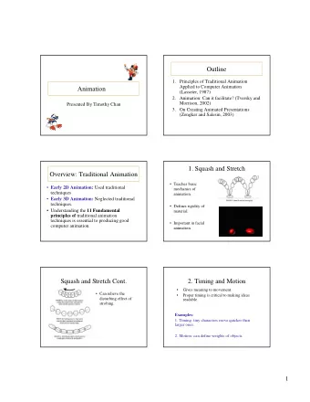
Outline 1. Principles of Traditional Animation Applied to Computer Animation (Lasseter, 1987) 2. Animation: Can it facilitate? (Tversky and Morrison, 2002) 3. On Creating Animated Presentations (Zongker and Salesin, 2003)
Overview: Traditional Animation • Early 2D Animation: Used traditional techniques • Early 3D Animation: Neglected traditional techniques. • Understanding the 11 Fundamental principles of traditional animation techniques is essential to producing good computer animation.
1. Squash and Stretch • Teaches basic mechanics of animation. • Defines rigidity of material. • Important in facial animation.
Squash and Stretch Cont. • Can relieve the disturbing effect of strobing.
2. Timing and Motion • Gives meaning to movement. • Proper timing is critical to making ideas readable. Examples: 1. Timing: tiny characters move quicker than larger ones. 2. Motion: can define weights of objects.
Heavy vs. Light Objects QuickTime™ and a QuickTime™ and a Video decompressor Video decompressor are needed to see this picture. are needed to see this picture.
3. Anticipation Preparation for an action Example: Goofy prepares to hit a baseball.
4. Staging A clear presentation of an idea. Some Techniques: 1. Use motion in a still scene or use of static movement in a busy scene. 2. Use of silhouettes (to the side)
5. Follow Through and Overlapping Action 1. Follow Through Termination part of an action. Example: after throwing a ball 2. Overlapping Action Starting a second action before the first has completed. Example: Luxo Jr.’s hop with overlapping action on chord.
6. Straight Ahead Action and Pose-to-Pose Action 1. Straight Ahead Animator start from first drawing in the scene and draw all subsequent frames until the end of scene. 2. Pose-to-Pose Animator plans actions, draws a sequence of poses, in between frames etc.
7. Slow in and Out 1. 3d keyframe comp. Systems Spacing of inbetween uses spline interpolation to frames to achieve control the path of an object. subtlety of timing and 2. Has tendency to overshoot at movement. extremes (small # of frames).
8. Arcs • Visual path of action for natural movement. • Makes animation much smoother and less stiff than a straight line.
9. Exaggeration • Accentuating the essence of an idea via the design and the action. • Needs to be used carefully. Example : Luxo Jr. made smaller to give idea of a child.
10. Secondary Action • Action that results directly from another action. • Used to increase the complexity and interest of a scene. Example: Body movement is the primary action, facial expression is the secondary action
11. Appeal • Refers to what an audience would like to see. • Character cannot be too simple (boring) or too complex. Examples: Avoid mirror symmetry, assymmetry is interesting.
What techniques used for Wally B.?
What do you think Wally B’s going to do?
The Action: Zooooooooooommmm!
Termination: Poof! He’s gone!
Role of Personality • Animator’s first goal is to entertain. • Success of animation lies in the personality of the characters. Conclusion Hardware/Software are simply not enough, these principles are just as important tools too.
Critique CONs PROs 1. Need more examples on 1. Clear and concepts “bad animation” explained well with 2. What really makes good pictures and vs bad animation? Need examples. to make a better one on one comparison. 3. Personality section: is it necessary?
Outline 1. Principles of Traditional Animation Applied to Computer Animation. 2. Animation: Can it facilitate? 3. On Creating Animated Presentations
Overview • Graphics have many advantages. • What makes graphics effective ? 1. Congruence Principle 2. Apprehension Principle • Can Animation facilitate?
Advantage Graphics 1. Help in communication. 2. May save words by showing things that would otherwise need many. 3. Externalize internal knowledge I. Reduces the burden on memory and processing by off- loading. II. Makes underlying structures and processes transparent. 4. Used carefully can facilitate comprehension, learning, memory, communication and inference Graphics are not always effective. (text vs graphics)
Criteria 1: Congruence Principle The structure and content of the external representation should correspond to the desired structure and content of the internal representation.
Animation • By Congruence Principle: should be natural way for conveying concepts of change, just as space in graphics is a natural for conveying actual space. • Appear to be effective for expressing processes ie. Weather patterns, circuit diagrams, or circulatory systems etc. • Compelling and attractive
Evaluating Animation • Needs to be compared to graphics that do not change with time, as it is change with time that animation adds. • How well does animation teach complex systems: mechanical, biological, physical, and operational.
Selective Review of Research on Animation
Incomparable Content in Static and Animated Graphics Examples: 1. Circulatory system (Large et al., 1996) - animated had blood pathways 2. Electronic Circuit (Park and Gittelman 1992) - animated showed fine structure. 3. Pythagorean theorem (Thompson and Riding, 1990) - paper graphic equivalent to discrete animation, but not equivalent to continuous animation.
Incomparable Procedures In Static and Animated Graphics. 1. Interactivity versus Animation 2. Prediction versus Animation Why the confusion? • Success of animation due to advantages of extra information conveyed, rather than animation of the information. • Animation is attractive and exciting.
Criteria 2: Apprehension Principle The structure and content of the external representation should be readily and accurately perceived and comprehended.
Why Do Animations Fail? 1. Animations may be hard to perceive. 2. Animations may be comprehended discretely. 3. Not universally preferred and often require expertise for understanding.
Conclusions and Implications 1. Many apparent successes turn out not to be successes. 2. Congruence and Apprehension Principles. 3. Interactivity may be key to overcome animations’ drawbacks. 4. Animation must be used with care.
Crtitique PROs CONs 1. Good overview of 1. No figures! where animation 2. Too many examples research is. were vaguely 2. Clearly written. explained. 3. Well supported claims.
Outline 1. Principles of Traditional Animation Applied to Computer Animation. 2. Animation: Can it facilitate? 3. On Creating Animated Presentations
Overview 1. Microsoft estimates ~30 million ppt presentations are made everyday 2. Animation could improve them. 3. PPT is essentially static in nature. 4. Examine how meaningful animations can be created to improve live presentations.
Authoring Principles for Animations for Presentations 1. Use parameterization at all levels of the system. 2. Treat animations as models - animations are treated as parameterized models that have a single parameter: time. 3. Build slides hierarchically
Example of Parameterization
1. Implemented as a set of libraries in Python. 2. Users have access to complete, general-purpose programming language. 3. A collection of drawing objects.
Three Major Drawing Objects 1. Parameterized diagrams - functions that draw objects and are redrawn each time it is executed. 2. Animation Objects - One scalar parameter and provides mapping to a set of other drawing objects to be invoked. 3. Interactive Objects - same as animated objects except can be edited while being played.
Example of Parameterization:
Test Harness
Example of Animation Script: Animation Test Harness
Interactive Controllers 1. Similar to animation script. 2. Instead of function that creates all of the animation, controller is implemented as a class 3. Contains set of drawing objects and timelines for controlling their prameters. 4. Various methods called: edit timelines while animations is being played in response to user input events.
Animation Principles for Presentations. 1. Make all movement meaningful 2. Avoid instantaneous changes 3. Reinforce structure with transitions 4. Create a large virtual canvas 5. Smoothly expand and compress detail
Animation Principles for Presentations cont. 6. Manage complexity through overlays • Do one thing at a time. • Reinforce animation with narration. • Distinguish dynamics from transitions.
Comparing to Presentation Software PowerPoint vs Slithy 1. WYSIWG 2. Difficult to do complex animations :resort to videos. 3. Built with animations in mind. 4. Script to describe animation. CounterPoint vs Slithy Focused on using animated navigation between slides to convey the structure of the presentation.
Comparing to Animation Software 1. Menv 2. Algorithm animation 3. Alice 4. Flash Overall, SLITHY provides much more flexibility and ease for animations for presentations.
Recommend
More recommend
Explore More Topics
Stay informed with curated content and fresh updates.
