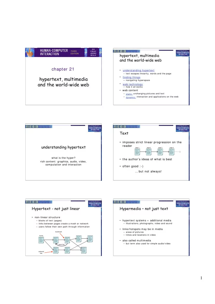

hypertext, multimedia and the world-wide web chapter 21 • understanding hypertext understanding hypertext – text escapes linearity, words and the page hypertext, multimedia • finding things finding things – navigating hyperspace and the world-wide web • web technology web technology – how it all works • web content – static: unchanging pictures and text static: – dynam ic: interaction and applications on the web dynam ic: Text • imposes strict linear progression on the understanding hypertext reader page 1 page 2 page 3 page 4 this is text this is text this is text this is text this is text or is it or is it or is it or is it or is it hypertext hypertext hypertext hypertext hypertext only links only links only links only links only links can tell can tell can tell can tell can tell what is the hyper? • the author’s ideas of what is best rich content: graphics, audio, video, com putation and interaction • often good : -) … but not always! Hypertext - not just linear Hypermedia – not just text • non-linear structure • hypertext systems + additional media – blocks of text (pages) – illustrations, photographs, video and sound – links between pages create a m esh or network – users follow their own path through inform ation • links/ hotspots m ay be in m edia bookmark – areas of pictures – tim es and locations in video home this is text this is text or is it or is it this is text this is text this is text hypertext hypertext or is it or is it or is it only links only links hypertext hypertext hypertext • also called m ultim edia can tell can tell only links only links only links can tell can tell can tell – but term also used for sim ple audio/ video back link this is text this is text this is text or is it or is it or is it hypertext hypertext hypertext only links only links only links external can tell can tell can tell link 1
animation animation (ctd) • adding m otion to im ages – for education and training • let students see things happen … as well as being – for things that change in tim e interesting and entertaining images in their own right • digital faces – seconds tick past or warp into the next – for data visualisation • analogue face – hands sweep around the clock face • abrupt and smooth changes in multi-dimensional data • live displays: e.g. current system load visualised using animated, coloured surfaces • complex molecules and their interactions more easily understood when they are rotated and viewed on the – for showing status and progress screen • flashing carat at text entry location – for anim ated characters • busy cursors (hour-glass, clock, spinning disc) • wizards and help • progress bars video and audio audio issues • now easy to author • form ats – tools to edit sound & video and burn CDs & DVDs – raw sound sam ples • huge … used for mixing and editing • easy to embed in web pages – MI DI – standard form ats (QuickTim e, MP3) • just which notes played and when • still big … but getting m anageable – MP3 – m em ory OK … hand held MP3 players, TiVo etc. • uses psychoacoustics - how the ear hears – but download tim e needs care – tell users how big! • issues • very linear – annoying if unwanted – hard to add ‘links’ often best as sm all clips or – even m ore annoying for others! background computation, intelligence using animation and video and interaction • potentially powerful tools • com puters?? – note the success of television and arcade gam es don’t just show things … do things • but … • examples: – how to harness the full possibilities of such m edia – search – the HCI book web site – different from ‘standard’ interfaces • not just exercises, table of contents … also search – this technology when we have m uch m ore experience. – interaction • embedded applications (e.g, puzzle square) • so … – adaption: – need to learn from film m akers, dram atic theory, • e-commerce sites suggest other things to buy cartoonists, artists, writers 2
interacting in hypertext delivery technology Professor Alan’s puzzle square • on the computer @ http://www.hiraeth.com/alan/misc/game/game.html – help system s installed on hard disk with applications – CD-ROM or DVD based hyperm edia user clicks arrows to move squares • on the web icons to reset – really ubiquitous! arrangement • in many countries, near universal internet access – not just web pages! • e.g. many applications have web-base documentation • … and on the move … hot links to other puzzles delivery (ctd) … on the move application areas • rapid prototyping • platform s – m obile phones, PDAs, laptop com puters – create live storyboards – m ock-up interaction using links • delivery • help and documentation – CD-ROM or DVD (like desktop) – allows hierarchical contents, keyword search or – cached content (e.g. AvantGo) browsing – WiFi access points or m obile phone networks – just in tim e learning – WAP – for m obile phone, tiny web-like pages • what you want when you want it (e.g. technical manual for a photocopier) • context – who and where – technical words linked to their definition in a glossary – tourist guides, directed advertising – links between similar photocopiers application areas (ctd) eClass (formerly Classroom 2000) an ordinary lecture? • education – anim ation and graphics allow students to see things happen – sound adds atm osphere and m eans diagram s can be looked at while hearing explanation – non-linear structure allows students to explore at their own pace – e-learning • letting education out of the classroom!! ... available later • e.g. eClass through web interface slides, pen marks, video are ‘captured’ 3
lost in hyperspace • non-linear structure – very powerful … finding things – but potentially confusing • two aspects of lostness – cognition and content lost in hyperspace • fragmentary information – no integration … confusion – navigation and structure structure and navigation • hyperlinks move across structure – where am I? history and bookmarks indices, directories and search • no easy solutions – but good design helps! designing structure making navigation easier • ideas for structure • m aps – task analysis to for activities and processes – give an overview of the structure – existing paper or organisational structures – show current location – you are here! • going non-linear • recommended routes – paper and organisation single structure – guided tour or bus tour m etaphor – hypertext – m ultiple structures – linear path through non-linear structure • problems with common material, inconsistencies etc. • levels of access • clarity of cross structure links v. important • scent – sum m ary then progressive depth – do hot spots for links m ake it clear where they are • supporting printing! going to?? – needs linearised content, links back to source history, bookmarks, etc. indices, directories and search • revisiting • index – ‘hub and spoke’ access – click-back-click-back – often found ion help, docum entation, … even books – lots of revisiting of pages – selective: not an exhaustive list of words used – ‘back’ is 30% of all browser navigation – but multi-step back and history used less • directories – bookmarks and favourites for longer term revisiting – on web index would be huge! so hand chosen sites • deep links • e.g. open directory project, Yahoo! – bookmarks and external links – into heart of site • web search engines – are pages self explanatory? what site? where in it? – ‘crawl’ the web following links from page to page • e.g. breadcrumbs for context • fram es – build full word index (but ignore common ‘stop’ words) – difficult to bookmark, search and link to – looks up in index when you enter keywords to find pages – but some good reasons for use (see / e3/ online/ frames/ ) 4
Recommend
More recommend