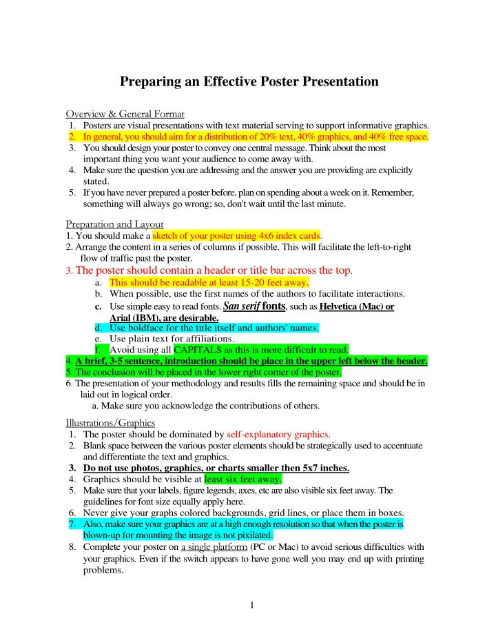

Preparing an Effective Poster Presentation Overview & General Format 1. Posters are visual presentations with text material serving to support informative graphics. 2. In general, you should aim for a distribution of 20% text, 40% graphics, and 40% free space. 3. You should design your poster to convey one central message. Think about the most important thing you want your audience to come away with. 4. Make sure the question you are addressing and the answer you are providing are explicitly stated. 5. If you have never prepared a poster before, plan on spending about a week on it. Remember, something will always go wrong; so, don't wait until the last minute. Preparation and Layout 1. You should make a sketch of your poster using 4x6 index cards. 2. Arrange the content in a series of columns if possible. This will facilitate the left-to-right flow of traffic past the poster. 3. The poster should contain a header or title bar across the top . a. This should be readable at least 15-20 feet away. b. When possible, use the first names of the authors to facilitate interactions. c. Use simple easy to read fonts. San serif fonts , such as Helvetica (Mac) or Arial (IBM), are desirable. d. Use boldface for the title itself and authors' names. e. Use plain text for affiliations. f. Avoid using all CAPITALS as this is more difficult to read. 4. A brief, 3-5 sentence, introduction should be place in the upper left below the header. 5. The conclusion will be placed in the lower right corner of the poster. 6. The presentation of your methodology and results fills the remaining space and should be in laid out in logical order. a. Make sure you acknowledge the contributions of others. Illustrations/Graphics 1. The poster should be dominated by self-explanatory graphics. 2. Blank space between the various poster elements should be strategically used to accentuate and differentiate the text and graphics. 3. Do not use photos, graphics, or charts smaller then 5x7 inches. 4. Graphics should be visible at least six feet away. 5. Make sure that your labels, figure legends, axes, etc are also visible six feet away. The guidelines for font size equally apply here. 6. Never give your graphs colored backgrounds, grid lines, or place them in boxes. 7. Also, make sure your graphics are at a high enough resolution so that when the poster is blown-up for mounting the image is not pixilated. 8. Complete your poster on a single platform (PC or Mac) to avoid serious difficulties with your graphics. Even if the switch appears to have gone well you may end up with printing problems. 1
Text 1. Remember, posters are visual presentations. Thus, as much as possible, devise ways to demonstrate what you did and accomplished rather than explaining it all with text. 2. Limit your textual content. Be concise as possible. When in doubt about the rhetorical utility of a phrase or piece of text delete it. 3. Consider using bullets or lists of sentences rather than blocks of texts. 4. Use the active voice when writing; e.g., "The data demonstrate," rather than "It can be demonstrated." 5. Since the abstract will be published, there is no need to repeat it on the poster. 6. All extraneous information should be excised from the poster. 7. Graphs, figures, and pictures should have explanatory captions and thus need no other labeling. 8. You should certainly outline your methods, but only outline them. Details can be discussed with interested parties during the poster session or even presented via handouts. Fonts 9. San serif fonts (those having characters without cursive or other embellishments) — some claim these are easiest to read; though, there is a good deal of debate on this point since point size, stroke width, letter spacing, and more can effect readability. [Anal, Courier, Geneva, Helvetica, Times New Roman, etc.) 10. Whatever font you select, make sure it is easy to read. 11. Avoid italics. When emphasis is needed underline or use boldface. 12. Most text should be visible at least six feet away. 13. Section headings might employ 36-pt. boldface, Helvetica. 14. For supporting text (intros, figure captions), you might use 24-pt. Helvetica. 15. Avoid font sized below 24 point , excessive font changes, and overly ornate fonts. 16. Be consistent, use one text throughout the poster for headings, one for subheadings, one for the body of the text, etc. Colors 1. Two to three background colors can be used to unify your poster. a. Example, one color can be used for the methods, one for data, and one for interpretation. b. Remember though, the colors should be related for aesthetic reasons. For example, different shades of blue or blue-green might be used. c. A bad choice would be green, yellow, and purple — such a combination would present a discordant image. 2. Picking Color Schemes a. Terminology i. Hue o this is what is commonly called colors o these are pure colors undiluted by white (tint) or black (shade) pigments. ii. Saturation o refers to color purity o the purer the saturation the better the contrast 2
pure hues are clear and bright — adding black makes them muddy or o dark while with the addition of white they become washed out or tinted o highly saturated hues are more vivid and intense o less saturated hues are more muted or grey iii. Value (Intensity, Brightness, or Darkness) o Unlike saturation, there isn't necessarily less of the color, it's just that the color is not as intense. o The higher the intensity the brighter the hue appears. o The lower the intensity the dimmer a hue appears. b. Color Wheel Twelve Hue Color Wheel c. Color Schemes i. Monochromatic ii. Analogous 3
iii. Complimentary iv. Split Complimentary v. Triadic vi. Tetradic (or Double Complimentary) d. Tools for selecting color schemes i. Color Scheme Generator http://wellstyled.com/toolsicolorscheme2/index-en.html ii. Interactive Color Wheel
http://rOk.us/graphics/SIHwheel.html 3. Muted colors or shades of gray are best for the background. 4. Saturated/more intense colors should only be used for borders or emphasis. 5. When necessary, emphasis can be added by outlining figures, graphs, or pictures with an appropriate color. a. The right color can enhance a photograph b. For darker photographs or images use a lighter background. For lighter images use a darker background. c. Grays or some neutral color can be used to bring out color in a photo. d. A white background will reduce the impact of colored photos. 6. Over use of colors can be distracting; so, be conservative and limit their use. 7. Most poster sessions are held in halls with florescent lighting. If color is important for the presentation of data make sure you balance those colors for use under those lighting conditions. Under florescent lighting, all colors are intensified and saturated colors may even become unpleasant to view. 8. Avoid red/green color combinations as red/green color blindness is common. 9. Printing: RGB versus CYMK a. The color mode of a typical monitor is RGB. However, this is different than the printed mix ink mode of CYMK. Make sure that the color mode you are designing in is compatible with the color print mode. b. Thus, know whether you are creating your poster in RGB or CYMK and whether you need to convert from one to the other before printing. c. Make sure that the color mode you are designing in is compatible with the color print mode or your poster colors may not be reproduced correctly. The Presentation 1. Be able to give a 3-5 minute overview of your work without referring to note cards 2. Practice your presentation before hand 3. Anticipate questions and prepare 4. Get feedback from your colleagues 5. Engage your audience but don't badger people a. Don't force information on your audience b. However, if someone is clearly confused or looks like they want to ask a question attend to them as soon as possible c. Do not stray from your poster or spend a lot of time conversing with your friends. If you must leave your poster then have a prepared sign indicating when you expect to be back and where you can be found. 6. While talking about your poster: a. Do not slouch — maintain proper posture. b. Avoid fidgeting c. Do not put your hands in your pockets d. Maintain eye contact — speak to your audience e. Speak clearly f. Maintain an appropriate volume level 5
Recommend
More recommend