1 Sample Poster Arrangements The following three images are sample - PDF document
GUIDELINES FOR POSTER PRESENTATION Usually 10 posters will be presented in a session of about 1 hour. Poster presenter will interact with the audience personally, on a one to one basis. As you plan for your poster, please keep in mind the
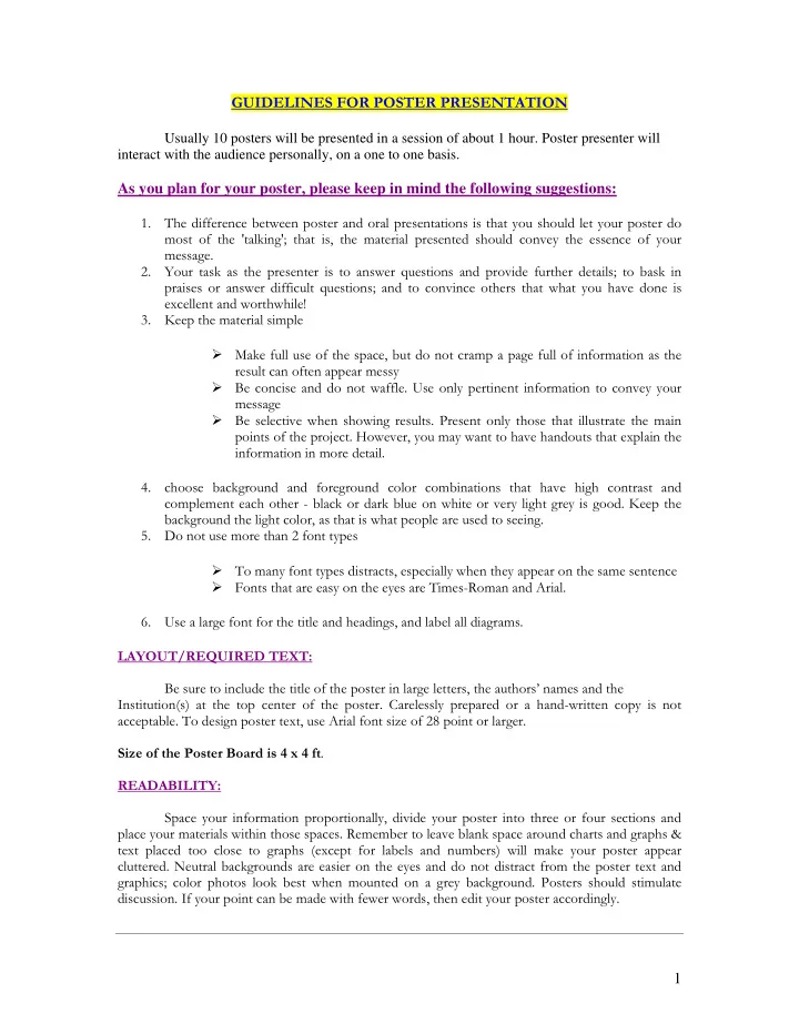
GUIDELINES FOR POSTER PRESENTATION Usually 10 posters will be presented in a session of about 1 hour. Poster presenter will interact with the audience personally, on a one to one basis. As you plan for your poster, please keep in mind the following suggestions: 1. The difference between poster and oral presentations is that you should let your poster do most of the 'talking'; that is, the material presented should convey the essence of your message. 2. Your task as the presenter is to answer questions and provide further details; to bask in praises or answer difficult questions; and to convince others that what you have done is excellent and worthwhile! 3. Keep the material simple � Make full use of the space, but do not cramp a page full of information as the result can often appear messy � Be concise and do not waffle. Use only pertinent information to convey your message � Be selective when showing results. Present only those that illustrate the main points of the project. However, you may want to have handouts that explain the information in more detail. 4. choose background and foreground color combinations that have high contrast and complement each other - black or dark blue on white or very light grey is good. Keep the background the light color, as that is what people are used to seeing. 5. Do not use more than 2 font types � To many font types distracts, especially when they appear on the same sentence � Fonts that are easy on the eyes are Times-Roman and Arial. 6. Use a large font for the title and headings, and label all diagrams. LAYOUT/REQUIRED TEXT: Be sure to include the title of the poster in large letters, the authors’ names and the Institution(s) at the top center of the poster. Carelessly prepared or a hand-written copy is not acceptable. To design poster text, use Arial font size of 28 point or larger. Size of the Poster Board is 4 x 4 ft . READABILITY: Space your information proportionally, divide your poster into three or four sections and place your materials within those spaces. Remember to leave blank space around charts and graphs & text placed too close to graphs (except for labels and numbers) will make your poster appear cluttered. Neutral backgrounds are easier on the eyes and do not distract from the poster text and graphics; color photos look best when mounted on a grey background. Posters should stimulate discussion. If your point can be made with fewer words, then edit your poster accordingly. 1
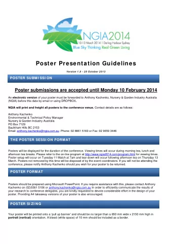
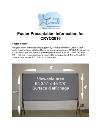
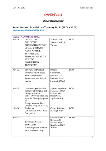
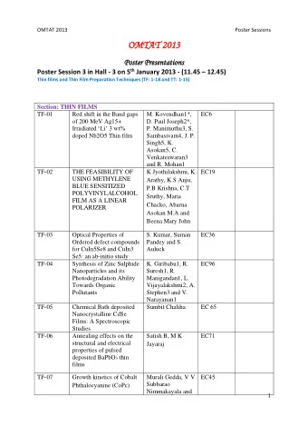
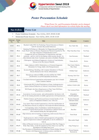
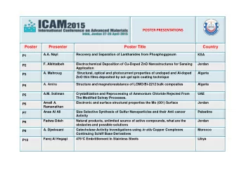
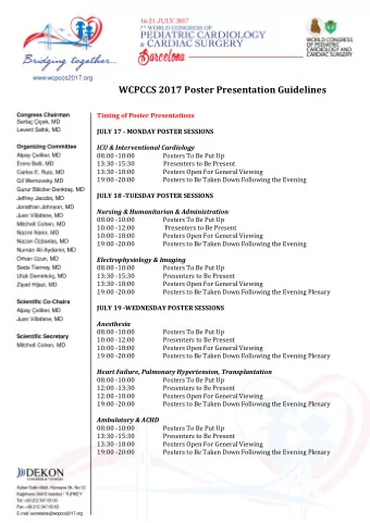
Sample Poster Arrangements The following three images are sample layouts for a poster presentation. EXAMPLE #1: EXAMPLE #2: 2
EXAMPLE #3 : Sample Poster Board 3
Recommend
More recommend
Explore More Topics
Stay informed with curated content and fresh updates.

