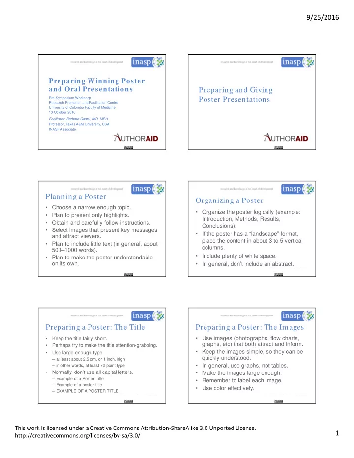

9/25/2016 Preparing Winning Poster and Oral Presentations Preparing and Giving Pre-Symposium Workshop Poster Presentations Research Promotion and Facilitation Centre University of Colombo Faculty of Medicine 13 October 2016 Facilitator: Barbara Gastel, MD, MPH Professor, Texas A&M University, USA INASP Associate Planning a Poster Organizing a Poster • Choose a narrow enough topic. • Organize the poster logically (example: • Plan to present only highlights. Introduction, Methods, Results, • Obtain and carefully follow instructions. Conclusions). • Select images that present key messages • If the poster has a “landscape” format, and attract viewers. place the content in about 3 to 5 vertical • Plan to include little text (in general, about columns. 500–1000 words). • Include plenty of white space. • Plan to make the poster understandable on its own. • In general, don’t include an abstract. Preparing a Poster: The Title Preparing a Poster: The Images • Use images (photographs, flow charts, • Keep the title fairly short. graphs, etc) that both attract and inform. • Perhaps try to make the title attention-grabbing. • Keep the images simple, so they can be • Use large enough type quickly understood. – at least about 2.5 cm, or 1 inch, high • In general, use graphs, not tables. – in other words, at least 72 point type • Normally, don’t use all capital letters. • Make the images large enough. – Example of a Poster Title • Remember to label each image. – Example of a poster title • Use color effectively. – EXAMPLE OF A POSTER TITLE This work is licensed under a Creative Commons Attribution ‐ ShareAlike 3.0 Unported License. 1 http://creativecommons.org/licenses/by ‐ sa/3.0/
9/25/2016 Preparing a Poster: The Text Presenting a Poster • Keep the text brief. • Don’t be shy. • Make the type large enough to read easily • Think ahead about questions you might (in general, probably about 24 point). be asked. • Where feasible, use bulleted or numbered • Maybe prepare talks of various lengths. lists rather than paragraphs. • Perhaps ask some questions. • If paragraphs are used, keep them short. • Take advantage of the chance for • Include your contact information. feedback. • Proofread the text carefully. • Take advantage of the chance to network. Presenting a Poster (cont) Some Newer Aspects • Have business cards available. • Electronic posters • Consider having handouts. – Static (projection of traditional posters) – Dynamic • Consider having people sign up for further • May have animations, videos, etc information. • May be interactive • If you’ll write a paper about the work • Flash poster presentations (see presented, keep in mind comments and http://www.authoraid.info/en/news/details/ questions from the poster session. 406/) Some Resources • “Designing Conference Posters” by Colin Preparing and Giving Purrington (posted at http://colinpurrington.com/tips/poster- Oral Presentations design) • “Better Posters: A Resource for Improving Poster Presentations” (blog at http://betterposters.blogspot.com/) This work is licensed under a Creative Commons Attribution ‐ ShareAlike 3.0 Unported License. 2 http://creativecommons.org/licenses/by ‐ sa/3.0/
9/25/2016 Preparing an Oral Presentation Preparing a Presentation (cont) • Obtain and carefully follow instructions. • Remember: People must be able to • Include much less detail than in a paper understand what you say as you say it. to publish. Therefore, for example: • Stick to the main idea. – Pace the presentation carefully. • Give the presentation a beginning, a – Repeat important points. middle, and an end. • Minimize use of abbreviations/acronyms. • If feasible, structure the presentation • In general, prepare notes, not a full text. largely as a story. Preparing Slides: Some Guidelines Compare this slide and the previous one. • At most one slide per minute, on average In general, do not average more than one slide per minute. Limit each slide to one • One theme or idea per slide theme or idea. Keep slides simple and • Simple and uncrowded uncrowded. Thus, beware of using • Thus, usually no published graphs/tables published graphs and tables. In general, • Bullet points (not paragraphs) for most use bullet points (not paragraphs) for text. text Make sure all lettering is large enough to • Large enough lettering to read read. Rehearsing the Presentation Coping with Stage Fright • Note that a little nervousness can help • Time the presentation carefully. you perform well. • Try to make the presentation slightly • Realize that people will attend to hear the shorter than the allotted time. content, not to judge your speaking style. • Perhaps rehearse for others. • Prepare well, but don’t over-prepare. • Perhaps have others ask you questions. • Exercise a little. • Beware of too much food, water, or caffeine. This work is licensed under a Creative Commons Attribution ‐ ShareAlike 3.0 Unported License. 3 http://creativecommons.org/licenses/by ‐ sa/3.0/
9/25/2016 Coping with Stage Fright (cont) Giving the Presentation • Hide physical signs of anxiety. • Arrive early. • Realize that a presentation need not be • Make sure audiovisuals are working. perfect to be excellent. • Speak slowly enough. • Speak clearly. • Look at the audience. • Show enthusiasm. • Avoid distracting habits. Answering Questions Answering Questions (cont) • If you don’t know an answer, say so. • Lay the groundwork for relevant questions Perhaps (for example, by stating in your talk some – offer to find out, items that people can ask about). – suggest how to find out, or • Perhaps have the moderator or a – see if someone present has the answer. colleague to ask the first question. • If a question seems irrelevant, offer to answer it later, or move to a related item. • Briefly repeat each question. • If a question is hostile, answer politely • Keep answers brief. and briefly; perhaps offer to talk later. Answering Questions (cont) • Make note of questions. Use them to help shape future presentations and publications about the work. This work is licensed under a Creative Commons Attribution ShareAlike 4.0 International licence. 25/ 09/ 2016 24 This work is licensed under a Creative Commons Attribution ‐ ShareAlike 3.0 Unported License. 4 http://creativecommons.org/licenses/by ‐ sa/3.0/
Recommend
More recommend