Information Visualization in HCI SWEN-444 Definitions Visualize: - PowerPoint PPT Presentation
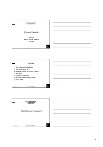
Information Visualization in HCI SWEN-444 Definitions Visualize: To form a mental model or mental image of something To make something visible to the mind or imagination Visualization: Human activit y, not per se with
Information Visualization in HCI SWEN-444
Definitions • Visualize: – To form a mental model or mental image of something – To make something visible to the mind or imagination • Visualization: – Human activit y, not per se with computers – Visual, Auditory or other sensory modalities – Creation of visual images in aid of understanding of complex representations of data
Information Visualization • Pre-attentive processing – Unconscious accumulation of information from the environment – Information that “ stands out ” is selected for attentive ( conscious ) processing – Why does some information “stand out”? • Not exactly sure! • But it has something to do with the stimulus itself, and the person's current intentions or goals
Weber's law • “just noticeable difference” (jnd) D I = k I • I – original intensity of the stimulus • Change in I is the minimum difference required for it to be perceived (jnd) • K constant
What is Information Visualization? • Information visualization: “ the use of interactive visual representations of abstract data to amplify cognition” (Ware, 2008) • Abstract data include both numerical and non- numerical data – Stock prices, social relationships, patient records • Typical concerns: discovery of patterns, trends, clusters, outliers and gaps in data • Design goal: be more than aesthetically pleasing, show measurable usability benefits across different platforms and users
Information Visualization • Data, dimensionality of the data • Presentation of the data • Processing of the data • Interaction with the data • Dynamical view updating
Information Visualization Flow
HCI: disaster story • 1988 : • Iran Air Flight 655 shot down by USS Vincennes • Hostile F-14 aircraft?? • Conclusion: ‘Aegis had provided accurate data. The crew had misinterpreted it.’ • Different radar screens displayed different aspects of the airplane • Correlating information was difficult • Vital data cluttered by trivial data
Data Type by Task Taxonomy
Data Type by Task Taxonomy: 1D Linear Data • Items which can be organized sequentially e.g. text document, list of names • Design issues: – Colors, sizes, layout – Scrolling, selection methods • Example user tasks: check which items have some required attribute
Data Type by Task Taxonomy: 2D Map Data • Items make up some part of the 2D area – Not necessarily rectangular, e.g. Lake on Google Map – e.g. Geographic map, floor plans • Example user tasks: finding items, finding paths between items
Data Type by Task Taxonomy: 3D World Data • Items with complex relationships with other items – e.g. Volume, temperature, density – e.g. Medical imaging, architectural drawing, scientific simulations • Design issues: position, orientation and navigation for viewing 3D application • Example user tasks: temperature, density
Data Type by Task Taxonomy: Multidimensional Data • Items with n attributes in n-dimensional space • Relational database contents can be treated this way • Interface may allow user to view 2 dimensions at a time
Data Type by Task Taxonomy: Temporal Data • Very close idea to 1D sequential data , but warrant a distinct data type in the taxonomy as temporal data is so common – e.g. Stock market data, weather • Items have a beginning and end time, may overlap in time • Example user tasks: finding events during a time period, searching for periodical behavior
Data Type by Task Taxonomy: Temporal Data (cont.) 14-16
Data Type by Task Taxonomy: Tree Data • Non-root items have a link to a parent item Items, links can have multiple attributes e.g. Windows file explorer • Example user tasks: how many items are children of a node, how deep or shallow is the graph
Data Type by Task Taxonomy: Tree Data (cont.) 14-18
Data Type by Task Taxonomy: Network Data • Items linked to arbitrary number of other items • Example user task: shortest path, least costly path • How to visualize, layout the network?
The seven basic tasks 1. Overview : users can gain an overview of the entire collection 2. Zoom : users can zoom in on items of interest 3. Filter : users can filter out uninteresting items 4. Details-on-demand : users can select an item or group to get details 5. Relate : users can relate items or groups within the collection 6. History : users can keep a history of actions to support undo, replay, and progressive refinement 7. Extract : allow user to “save”, publish, examine extracted items 14- 20
Challenges for Information Visualization • Importing and cleaning data • Combining visual representations with textual labels : How to put on text labels (e.g. on a map) without covering what you wish to display? • Finding related information : Proper judgment often requires looking at data derived from multiple sources • Viewing large volumes of data • Integrating data mining • Integrating with analytical reasoning techniques : Use data to support or disclaim hypotheses • Collaborating with others • Achieving universal usability : Text, tactile or sonic representations? • Evaluation
Challenges for Information Visualization • Goal is to separate the “ signal (information) from the noise (data)” • Too much versus too little information • Visualizations pass the eyeball test • Minimalism – emphasize the data rather than the scaffolding – Avoid unnecessary and busy graphics – Readable size, legible – Appropriate use of color – Appropriate scaling, alignment, symmetry
Exercise: A Record Year for Auto Recalls In discussion groups please answer the following questions: • What is the data shown in this visualization? • What questions does this visualization answer? • What do you think about the use of animation? • Is the visualization easy to understand? • Can you read the data from the visualization? • What is the visualization data type? What tasks can be performed? • Why do you like / dislike this visualization? • Can you suggest any improvements? How would you redesign it? NY Times: http://bit.ly/auto-recall
References • Folk, C.L., & Remington, R. Top-down modulation of preattentive processing: Testing the recovery account of contingent capture. Visual Cognition, 14, 445-465. • Ware, Clin, Visual Thinking for Design , Morgan Kaufmann, San Francisco, CA (2008). • http://www.cs.umd.edu/hcil/trs/96-13/96- 13.html • Cuffe, Kirkham, Dent, and Wilson, Data Visualization:The signal and the noise, IEEE Potentials July/August 2018
Recommend
More recommend
Explore More Topics
Stay informed with curated content and fresh updates.
