Human Computer I nterface Design Chapter 8 I nternet-Based I - PowerPoint PPT Presentation
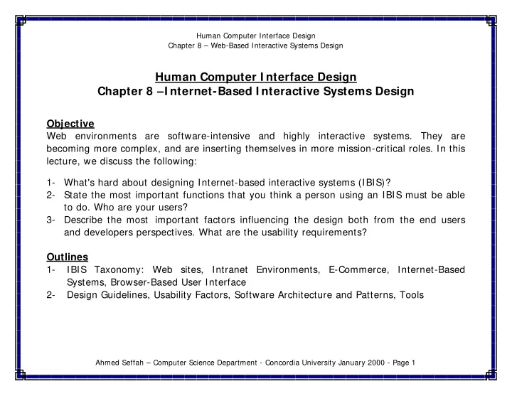
Human Computer Interface Design Chapter 8 Web-Based Interactive Systems Design Human Computer I nterface Design Chapter 8 I nternet-Based I nteractive Systems Design Objective Web environments are software-intensive and highly interactive
Human Computer Interface Design Chapter 8 – Web-Based Interactive Systems Design Human Computer I nterface Design Chapter 8 –I nternet-Based I nteractive Systems Design Objective Web environments are software-intensive and highly interactive systems. They are becoming more complex, and are inserting themselves in more mission-critical roles. In this lecture, we discuss the following: 1- What's hard about designing Internet-based interactive systems (IBIS)? 2- State the most important functions that you think a person using an IBIS must be able to do. Who are your users? 3- Describe the most important factors influencing the design both from the end users and developers perspectives. What are the usability requirements? Outlines 1- IBIS Taxonomy: Web sites, Intranet Environments, E-Commerce, Internet-Based Systems, Browser-Based User Interface 2- Design Guidelines, Usability Factors, Software Architecture and Patterns, Tools Ahmed Seffah – Computer Science Department - Concordia University January 2000 - Page 1
Human Computer Interface Design Chapter 8 – Web-Based Interactive Systems Design I nternet-Based I nteractive System (I BI S) Taxonomy - IBIS Taxonomy includes any software based on (use) the Internet Infrastructure and Technology - Examples: Web sites, corporate Intranet (employees Web site) and extranet environments (clients Web site) Web Servers Manipulates Servers-Based Middleware - HTTP Files (Servlets, CGI Scripts, API - Mail Server: NSAPI, ISAPI) - News Manipulates Java-Based Middleware (JDBC, RMI, ORB, GINI, WAP) Communicates Plug-Ins Viewers API Client Data ActiveX Control Communicates Communicates Communicates Utilizes Programs Web Browsers Others Interface (Netscape Communicator, Internet Explorer) - Mobile Interface - Java-Based Interface Web Browser-based Interface - Small Devices Interface (HTML… Java Applets) Ahmed Seffah – Computer Science Department - Concordia University January 2000 - Page 2
Human Computer Interface Design Chapter 8 – Web-Based Interactive Systems Design Four levels of I BI S sophistication on the I nternet Web Applications: Characterized by a browser-based user interface, which is a mixture of HTML, DHTML, Cascading style sheets, Java and VB, scripts, Java Applets 1- Traditional Web Sites 2- Corporate Intranet and Extranet Sites 3- Portals - Portal for corporate Web site Intranet in big and medium company, e-commerce portals - Establish a single home page for your multiples Web applications. - Make this page the default-starting page in all browsers distributed within your organization. - Traditional Web Applications are highly standards-compliant. They will work in two-years with old browsers with no or minimal use of plug-ins or anything else that goes beyond HTML and a few simple images - The need to stop using Web browsers as the platform for Internet-enabled applications, except when they are targeted purely at casual users. Frequent users will need an optimized interface that takes full advantage of the device they are using. Ahmed Seffah – Computer Science Department - Concordia University January 2000 - Page 3
Human Computer Interface Design Chapter 8 – Web-Based Interactive Systems Design Embedded Internet services in traditional software tools 1- Open URL from FrontPage Explorer 2- Display and navigate though links in Adobe Acrobat Specialized applications that are optimized to provide the best possible user interface to a set of advanced features 1- Email provides an example of the interplay between specialized applications and toned- down web applications: it is often possible to access your email through a browser 2- Headline Viewer is a Windows application that lets you see news headlines from a configurable list of Headline Providers (news sources and weblogs). Instead of continuously jumping from site to site to check on headlines (and using a big fat browser window), you can let Headline Viewer do it for you (http://www.vertexdev.com/HeadlineViewer) 3- Auction Browser: Monitoring a number of ongoing auctions in real timehttp://www.wired.com/news/news/technology/story/20771.html 4- GuruNet: pop-up window to retrieve dictionary definitions and other data across the Internet from inside any application (http://www.gurunet.com). Ahmed Seffah – Computer Science Department - Concordia University January 2000 - Page 4
Human Computer Interface Design Chapter 8 – Web-Based Interactive Systems Design Narrowly focused small devices internet applications that cannot support the full range of features because of a lack of screen space or low bandwidth 1- Mobile Telephone Embedded Internet Applications (Read Mail, Browse the Web, etc.) 2- Palm Pilot Applications for the Net This IBIS application will lead to impoverished user interfaces for two reasons: - A tiny screen cannot show any context, nor can it show menus or visualizations of alternatives - Small devices push-buttons are poor controls for advanced functionality – as evidence just consider how few of the features on your cell phone you use... Ahmed Seffah – Computer Science Department - Concordia University January 2000 - Page 5
Human Computer Interface Design Chapter 8 – Web-Based Interactive Systems Design Multiples User I nterfaces for an I nternet-Based I nteractive System Multiple interfaces should feel like variations of a single system, even though they have different designs: - All information should be the same across interfaces, even if not all information is shown in all versions. For example, prices should be the same, but a product listing may include only the best-selling items on a small screen with the rest relegated to a secondary "more products" page. - All user information must be preserved across the interfaces: if I use one access mechanism today and another tomorrow, then the changes I made in one UI are reflected in what I see in the other. - Unified login, user identification, and user profile (even though not all preference settings may apply to all interfaces, those that do should be respected everywhere so that it is not necessary to manually define such preferences more than once) - Same functionality and side effects of commands even if certain special features or variations are eliminated in some versions. For example, an airline reservation system may make choosing a flight and buying the ticket two separate steps. This separation should be preserved in all versions instead of having the simplified version unify choosing and buying into a single step. Ahmed Seffah – Computer Science Department - Concordia University January 2000 - Page 6
Human Computer Interface Design Chapter 8 – Web-Based Interactive Systems Design Multiples User I nterfaces for an I nternet-Based I nteractive System - It would be OK to have the advanced version include additional features (such as specifying a seating preference) that were not in the simplified version. Missing these features is a trade-off that the user would make in return for the benefits of being able to use the system under various limited circumstances. - It is not necessary for all features to be found in all access mechanisms. For example, a low-end version may eliminate photos or it may show them in black-and-white. Similarly, text may be abbreviated on a small display, though it should be possible to retrieve the full text through a standardized command. - It is a major design challenge to decide what features should be preserved in what versions of the system. Graceful degradation can allow users to always have the features that they really need. Achieving this goal will require careful task analysis to determine how users behave when they are on the road or in other functionally limited circumstances. Ahmed Seffah – Computer Science Department - Concordia University January 2000 - Page 7
Human Computer Interface Design Chapter 8 – Web-Based Interactive Systems Design Web Applications Design: Top Ten Mistakes of Web Design [Jakob Nielsen's Alertbox, May 30, 1999] 1. Breaking or Slowing Down the Back Button - The Back button is the lifeline of the Web user and the second-most used navigation feature after following hypertext links). Users happily know that they can try anything on the Web and always be saved by a click or two on Back to return them to familiar territory. - Except, of course, for those sites that break back by committing one of these design sins: - Opening a new browser window (see mistake # 2) - Using an immediate redirect: every time the user clicks Back, the browser returns o a page that bounces the user forward to the undesired location - Prevents caching such that the Back navigation requires a fresh trip to the server; all hypertext navigation should be sub-second and this goes double for backtracking Ahmed Seffah – Computer Science Department - Concordia University January 2000 - Page 8
Recommend
More recommend
Explore More Topics
Stay informed with curated content and fresh updates.
