Descriptive Statistics Observed data are at the heart of every - PowerPoint PPT Presentation
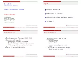
ST 370 Probability and Statistics for Engineers Descriptive Statistics Observed data are at the heart of every application of statistics. We need tools for working with and describing data. To quickly see the main features of a set of data, we
ST 370 Probability and Statistics for Engineers Descriptive Statistics Observed data are at the heart of every application of statistics. We need tools for working with and describing data. To quickly see the main features of a set of data, we need summaries : Numerical summaries: e.g. means, standard deviations; Graphical summaries: e.g. histograms, box-and-whisker plots. 1 / 16 Descriptive Statistics
ST 370 Probability and Statistics for Engineers Numerical Summaries of Data 3 The 8 measurements of pull-off force for 32 inch nylon connectors, in lb f , were 12 . 6 , 12 . 9 , 13 . 4 , 12 . 3 , 13 . 6 , 13 . 5 , 12 . 6 , 13 . 1. We could describe these by saying that they are around 13 lb f , generally plus or minus around 0.5 lb f . That is, we give a typical value and an indication of dispersion around that typical value. 2 / 16 Descriptive Statistics Numerical Summaries of Data
ST 370 Probability and Statistics for Engineers Sample mean For observed values x 1 , x 2 , . . . , x n , the most widely used typical value is the sample mean : n x = x 1 + x 2 + · · · + x n = 1 � ¯ x i . n n i =1 The mean of the pull-off forces ( n = 8) is 13.0 lb f . 3 / 16 Descriptive Statistics Numerical Summaries of Data
ST 370 Probability and Statistics for Engineers Sample standard deviation When the sample mean is used as the typical value, dispersion around it is almost always measured by the sample standard deviation √ s 2 , where s 2 is the sample variance : s = n 1 s 2 = � x ) 2 . ( x i − ¯ n − 1 i =1 The standard deviation of the pull-off forces is 0.48 lb f . Note The sample variance is almost the average of the n values x ) 2 , ( x 2 − ¯ x ) 2 , . . . , ( x n − ¯ x ) 2 ; it differs only in the divisor ( x 1 − ¯ ( n − 1), instead of n . 4 / 16 Descriptive Statistics Numerical Summaries of Data
ST 370 Probability and Statistics for Engineers Sample median An alternative typical value is the sample median : one half of the observations fall below the median, and one half fall above. The ordered pull-off forces are 12 . 3 , 12 . 6 , 12 . 6 , 12 . 9 , 13 . 1 , 13 . 4 , 13 . 5 , 13 . 6 , so any value between 12.9 and 13.1 could be the median; by convention, we use the midpoint, which happens to be the same as the sample mean, 13.0 lb f . In general, the mean and the median will not be the same. 5 / 16 Descriptive Statistics Numerical Summaries of Data
ST 370 Probability and Statistics for Engineers Trimmed mean In some areas, a trimmed mean is used: For some k < n / 2, delete the k highest values and the k lowest values; The trimmed mean is the average of the remaining data. Examples In many sports involving a panel of judges, the highest and lowest scores are omitted ( k = 1). The LIBOR benchmark interest rate is found by averaging rates submitted by 18 banks, with the highest and lowest 4 submissions omitted ( n = 18 , k = 4). If all but the middle one or two values are trimmed ( k ≈ n / 2), the average is the median. 6 / 16 Descriptive Statistics Numerical Summaries of Data
ST 370 Probability and Statistics for Engineers Quantiles and Percentiles Recall that the median divides the data values in half: one half fall below, and one half fall above. More generally, for any 0 ≤ p ≤ 1, the p th quantile divides the data into a fraction p falling below the quantile and (1 − p ) falling above the quantile. The p th quantile is also called the (100 p )% percentile . 7 / 16 Descriptive Statistics Numerical Summaries of Data
ST 370 Probability and Statistics for Engineers Quartiles The most frequently used quantiles are the median ( p = 0 . 5) and the quartiles : lower quartile ( p = 0 . 25) and upper quartile ( p = 0 . 75). The quartiles of the pull-off forces are 12.60 and 13.42 lb f . Interquartile range The difference between the upper and lower quartiles is another measure of the dispersion of the data values. It is called the interquartile range (IQR). For the pull-off forces, the IQR is 0.82 lb f . 8 / 16 Descriptive Statistics Numerical Summaries of Data
ST 370 Probability and Statistics for Engineers Calculation of quantiles For a given data set size n and a given fraction p , how to divide the values into a fraction p and the complementary fraction (1 − p ) may not be obvious. Many different suggestions have been made for the precise calculation. The R function quantile() offers the choice of nine types of calculation; the definition given by Montgomery and Runger appears to be type = 6 ; the default in quantile() is type = 7 . 9 / 16 Descriptive Statistics Numerical Summaries of Data
ST 370 Probability and Statistics for Engineers Stem and Leaf The stem-and-leaf plot is a device for sorting and binning a set of data values. Useful pencil-and-paper method, but irrelevant in computer-based analysis. Example: Compressive strength of Al-Li alloy specimens Compressive strength (psi) of 80 specimens of an aeronautical alloy. alloy <- read.csv("Data/Table-06-02.csv")$Strength; stem(alloy, scale = 2) The number of leaves on each stem is the count from which a histogram is constructed. The outline of the display is a (rotated) histogram. Because the leaves are ordered, the order statistics can be read off from the display. 10 / 16 Descriptive Statistics Stem-and-Leaf Diagram
ST 370 Probability and Statistics for Engineers Frequency Distributions and Histograms The histogram is a display showing the frequency with which data values fall in various ranges. Example: Compressive strength of Al-Li alloy specimens # alloy <- read.csv("Data/Table-06-02.csv")$Strength hist(alloy) # To match Figure 6-7, use some non-default options: hist(alloy, breaks = seq(from = 70, to = 250, by = 20), right = FALSE, col = "wheat") 11 / 16 Descriptive Statistics Frequency Distributions and Histograms
ST 370 Probability and Statistics for Engineers The height of each bar is its “Frequency”: the number of data values that fall in the corresponding “bin”. Variations of histogram Sometimes the height of the bar is the relative frequency: the fraction of data values that fall in the bin, instead of the number . Sometimes the bins are of different widths; in that case, the height of the bar is usually chosen so that the area of the bar is the relative frequency. Then the total area of the histogram bars is 1. 12 / 16 Descriptive Statistics Frequency Distributions and Histograms
ST 370 Probability and Statistics for Engineers Box Plots The histogram shows the distribution of the data values in some detail. We often need a display that summarizes the data more succinctly. The box-and-whisker plot (or boxplot) shows principally: The extremes : lowest and highest values; The lower and upper quartiles; The median. 13 / 16 Descriptive Statistics Box Plots
ST 370 Probability and Statistics for Engineers In R: # alloy <- read.csv("Data/Table-06-02.csv")$Strength boxplot(alloy) The central box goes from the lower quartile to the upper quartile, and the median is shown by a line. Some of the more extreme values may be flagged as outliers , and are shown individually. The whiskers connect the box to the most extreme data point that is not flagged as a possible outlier. 14 / 16 Descriptive Statistics Box Plots
ST 370 Probability and Statistics for Engineers Comparative boxplots A boxplot of a single set of data is a useful graphical tool for displaying the key characteristics of the data: The typical value, represented by the median; The dispersion, represented by the IQR (interquartile range), which is the length of the box; The extreme values, including some that may be highlighted as outliers. Boxplots are much more valuable when comparing more than one set of data, such as the pull-off strengths of the two types of nylon connector. 15 / 16 Descriptive Statistics Box Plots
ST 370 Probability and Statistics for Engineers Example: strength of paper The percentage of hardwood fiber affects the tearing strength of paper. Six test sheets were prepared and tested for each of four levels of hardwood content. In R: paper <- read.csv("Data/Table-13-01.csv") boxplot(Strength ~ Hardwood, paper) The boxplots show: The typical strength increases progressively as the hardwood content increases; The dispersion of strength does not change greatly; No test sheets were out of line with the rest of their sample. 16 / 16 Descriptive Statistics Box Plots
Recommend
More recommend
Explore More Topics
Stay informed with curated content and fresh updates.
