
Session 3: Summarizing data Stats 60/Psych 10 Ismael Lemhadri Summer - PowerPoint PPT Presentation
Session 3: Summarizing data Stats 60/Psych 10 Ismael Lemhadri Summer 2020 This time Summarizing data using frequency distributions Graphically representing frequency distributions Idealized distributions Normal distribution
Session 3: Summarizing data Stats 60/Psych 10 Ismael Lemhadri Summer 2020
This time • Summarizing data using frequency distributions • Graphically representing frequency distributions • Idealized distributions • Normal distribution • Long-tailed distributions
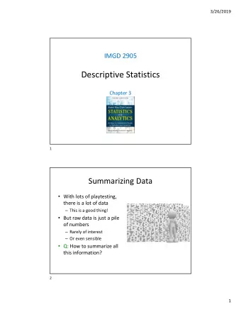
Why do we want to summarize data?
Objections to aggregating data • We are throwing away information! • Order of observations • Individual characteristics of observations • Context of each observation
Counter-objections • One of the central aspects of knowledge is generalization • Looking past the details to see a deeper truth “To think is to forget a difference, to generalize, to abstract. In the overly replete world of Funes, there were nothing but details.”
Counter-objections • One of the central aspects of knowledge is generalization • Looking past the details to see a deeper truth
Simplest data aggregation: The table A reconstruction of a ca. 3000 BCE Sumerian tablet, with modern numbers added. (Reconstruction by Robert K. Englund; from Englund 1998, 63) Stigler, Stephen M.. The Seven Pillars of Statistical Wisdom (p. 25).
Major N Describing data psychology 33 using tables undecided 32 product design 13 nominal variable: biology 9 what is your major? science, technology, and society 9 international relations 8 political science 6 english 4 linguistics 3 symbolic systems 3 communications 2 computer science 2 east asian studies 2 human biology 2 …
Describing data using tables • Ordinal variable • How much do you expect to like this course? Response Frequency I expect to hate it intensely. 1 6 2 14 3 21 4 48 5 53 I expect it to be 6 11 my favorite 7 3 course ever.
Absolute vs relative frequencies absolute frequency relative frequency = total number of observations Response Absolute Frequency Relative Frequency 1 6 0.03846154 2 14 0.08974359 3 21 0.13461538 4 48 0.30769231 5 53 0.33974359 6 11 0.07051282 7 3 0.01923077
Why might you prefer relative (vs absolute) frequency?
Percentages vs. Proportions percentage = 100 ∗ proportion Relative Response Frequency Percentage Frequency 1 6 0.03846154 3.846154 2 14 0.08974359 8.974359 3 21 0.13461538 13.461538 4 48 0.30769231 30.769231 5 53 0.33974359 33.974359 6 11 0.07051282 7.051282 7 3 0.01923077 1.923077
Cumulative representations n X cumulative frequency n = frequency j j =1 What is that thing?
Summation stopping point element being summed n X cumulative frequency n = frequency j j =1 index of summation starting point
1 1 2 3 3 3 3 4 4 4 Value Frequency (f) Cumulative frequency 1 X 1 f j = j =1 2 X 2 f j = j =1 3 X 3 f j = j =1 4 X f j = 4 j =1
Computing cumulative frequency n X cumulative frequency n = frequency j j =1 Cumulative Response Frequency Relative Frequency Frequency 1 6 0.03846154 6 2 14 0.08974359 20 3 21 0.13461538 41 4 48 0.30769231 89 5 53 0.33974359 142 6 11 0.07051282 153 7 3 0.01923077 156
Computing frequency distributions in R 1 1 2 3 3 3 3 4 4 4 # create a list of the data from the lecture slides df <- data.frame(value=c(1, 1, 2, 3, 3, 3, 3, 4, 4, 4)) # first compute the frequency distribution using the table() function freqdist <- table(df) print(freqdist) ## df ## 1 2 3 4 ## 2 1 4 3
Stem and leaf plot - for small datasets only! dfStemLeaf <- data.frame(value=c(8,8,9,10,12,12,14,18,21,22,23,25,25,30,32,51) ) stem(dfStemLeaf$value) The decimal point is 1 digit(s) to the right of the | 0 | 889 1 | 02248 2 | 12355 3 | 02 4 | 5 | 1
Plotting a histogram 1 1 2 3 3 3 3 4 4 4 ggplot(df, aes(value)) + geom_histogram(binwidth=1,fill='blue') print(freqdist) ## df ## 1 2 3 4 ## 2 1 4 3
Draw a frequency polygon for the frequency distribution ggplot(df, aes(value)) + geom_histogram(binwidth=1,fill='blue') + geom_freqpoly(binwidth=1)
Frequency versus density • Density sums to 1 across all entries • each data point contributes 1/n to density
Compute the cumulative distribution cumulative_freq <- cumsum(table(df)) print(cumulative_freq) ## 1 2 3 4 ## 2 3 7 10 Plot the cumulative density. ggplot(df, aes(value)) + stat_ecdf() + ylab('Cumulative density')
Summarizing a more realistic dataset: NHANES ggplot(NHANES, aes(Age)) + geom_histogram(binwidth=1,fill='blue') What’s up with that? Hint: Look at NHANES help ( ?NHANES )
Why would they do that?
NHANES Height (complete sample) • Why is there a long tail on the left?
The distribution of adult height in NHANES data
Grouped frequency distributions Why is this so Is this better? jagged looking? Height 173.1 173.2 173.3 173.4 Freq 38 52 29 22
Choosing an interval width range of scores interval width = number of intervals • There is no single rule for how to choose this
nclass.FD()
Cumulative distributions
Group exercise • Break into groups of ~4 • Draw your best guess as to the shape of the frequency distributions (histograms) of the following variables for adults in the NHANES dataset: • Body weight (in pounds) • Self-reported number of days participant's physical health was not good out of the past 30 days. • Don’t look at the actual data!
NHANES adult weight data Weight (pounds)
NHANES physical health self-report data
Why is this histogram so weird? Days of drinking in a year
NHANES Help: AlcoholYear: Estimated number of days over the past year that participant drank alcoholic beverages. Reported for participants aged 18 years or older.
The importance of knowing where the data came from In the past 12 months , how often did {you/SP} drink any type of alcoholic beverage? ALQ.120 Q/U PROBE: How many days per week, per month, or per year did {you/SP} drink? ENTER '0' FOR NEVER. HARD EDIT: Range – 1-7 days/week, 1-32 days/month, 1-366 days/year CAPI INSTRUCTION: IF QUANTITY CODED ‘0’, GO TO BOX 1. |___|___|___| ENTER QUANTITY REFUSED ...................................................... 777 (BOX 1) DON'T KNOW ................................................ 999 (BOX 1) ENTER UNIT WEEK ............................................................ 1 MONTH .......................................................... 2 YEAR ............................................................. 3 https://wwwn.cdc.gov/nchs/data/nhanes/2015-2016/questionnaires/ALQ_CAPI_I.pdf
Idealized representations of distributions • Certain types of distributions are common in real data • We can describe the data using one of these idealized distributions
The distribution of adult height in NHANES data
The normal distribution of heights 𝛎 : mean (168.8) 1 2 π e − ( x − µ ) 2 / 2 σ 2 f ( x ) = √ 𝛕 : standard deviation (10.1) σ easy to compute in R: dnorm()
Skewness: One tail is longer than the other • Often occurs for Average wait times for security at SFO Terminal A (Jan-Oct 2017) counts or time measurements • why? https://awt.cbp.gov/
Social networks • How do you think the number of friends in a social network is distributed? • https://snap.stanford.edu/data/egonets-Facebook.html • Friendship data for 4039 people
The long tail of friendship 1043 friends!
Income distribution in the US $170,000,000 Sample of 126K households from IPUMS CPS
Plotting percentiles 99% 262048 75% 50% 25% 57936 30045 14015
Percentile plots? • What would this plot look like if everyone made the same income? • What would it look like if income was randomly assigned between $10,000 and $100,000?
Long tailed distributions - the new normal? • Normal(ish) distributions occur when many different factors mix together to generate a variable • Height • Waiting times • Extremely long-tailed distributions occur when the rich get richer • Many different types of real-world networks • social media, power grid, brain connectivity • “small world networks”
Recap • We can summarize data using frequency distributions • There are a few idealized distributions that can describe much of the data in the world • Normal distributions: when many different factors come together to determine a variable • Long-tailed distributions: when the rich get richer
Recommend


More recommend
Explore More Topics
Stay informed with curated content and fresh updates.