Introduction Types of Charts Data Tables Summarizing Data - PowerPoint PPT Presentation
Introduction Types of Charts Data Tables Summarizing Data Cross-Tabulation Data visualization - the process of displaying data (often in large quantities) in a meaningful fashion to provide insights that will support better
Introduction Types of Charts Data Tables Summarizing Data Cross-Tabulation
Data visualization - the process of displaying data (often in large quantities) in a meaningful fashion to provide insights that will support better decisions. ◦ Data visualization improves decision-making, provides managers with better analysis capabilities that reduce reliance on IT professionals, and improves collaboration and information sharing.
Tabular data can be used to determine exactly how many units of a certain product were sold in a particular month, or to compare one month to another. ◦ For example, we see that sales of product A dropped in February, specifically by 6.7% (computed as 1 – B3/B2). Beyond such calculations, however, it is difficult to draw big picture conclusions.
A visual chart provides the means to ◦ easily compare overall sales of different products (Product C sells the least, for example); ◦ identify trends (sales of Product D are increasing), other patterns (sales of Product C is relatively stable while sales of Product B fluctuates more over time), and exceptions (Product E’s sales fell considerably in September).
A dashboard is a visual representation of a set of key business measures. It is derived from the analogy of an automobile’s control panel, which displays speed, gasoline level, temperature, and so on. ◦ Dashboards provide important summaries of key business information to help manage a business process or function.
Introduction Types of Charts Data Tables Summarizing Data Cross-Tabulation
Select the Insert tab. Highlight the data. Click on chart type, then subtype. Use Chart Tools to customize.
Excel distinguishes between vertical and horizontal bar charts, calling the former column charts and the latter bar charts . ◦ A clustered column chart compares values across categories using vertical rectangles; ◦ a stacked column chart displays the contribution of each value to the total by stacking the rectangles; ◦ a 100% stacked column chart compares the percentage that each value contributes to a total. Column and bar charts are useful for comparing categorical or ordinal data, for illustrating differences between sets of values, and for showing proportions or percentages of a whole.
Highlight the range C3:K6, which includes the headings and data for each category. Click on the Column Chart button and then on the first chart type in the list (a clustered column chart). Highlighted Cells
To add a title, click on the first icon in the Chart Layouts group. Click on “Chart Title” in the chart and change it to “EEO Employment Report—Alabama.” The names of the data series can be changed by clicking on the Select Data button in the Data group of the Design tab. In the Select Data Source dialog (see below), click on “Series1” and then the Edit button. Enter the name of the data series, in this case “All Employees.” Change the names of the other data series to “Men” and “Women” in a similar fashion.
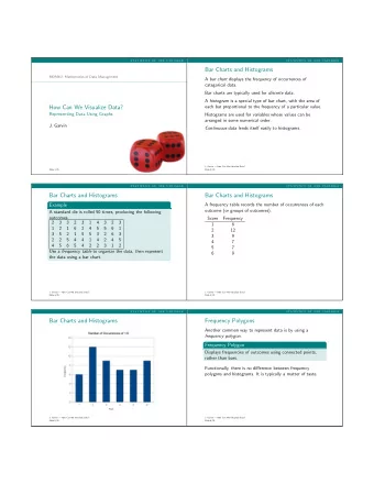
Line charts provide a useful means for displaying data over time. ◦ You may plot multiple data series in line charts; however, they can be difficult to interpret if the magnitude of the data values differs greatly. In that case, it would be advisable to create separate charts for each data series. Example 3.3: A Line Chart for China Export Data
A pie chart displays this by partitioning a circle into pie- shaped areas showing the relative proportion. Example 3.4: A Pie Chart for Census Data
Data visualization professionals don't recommend using pie charts. In a pie chart, it is difficult to compare the relative sizes of areas; however, the bars in the column chart can easily be compared to determine relative ratios of the data. ◦ If you do use pie charts, restrict them to small numbers of categories, always ensure that the numbers add to 100%, and use labels to display the group names and actual percentages. Avoid three-dimensional (3-D) pie charts—especially those that are rotated—and keep them simple.
An area chart combines the features of a pie chart with those of line charts. ◦ Area charts present more information than pie or line charts alone but may clutter the observer’s mind with too many details if too many data series are used; thus, they should be used with care. Example 3.5: An Area Chart for Energy Consumption
Scatter charts show the relationship between two variables. To construct a scatter chart, we need observations that consist of pairs of variables. Example 3.6: A Scatter Chart for Real Estate Data
A bubble chart is a type of scatter chart in which the size of the data marker corresponds to the value of a third variable; consequently, it is a way to plot three variables in two dimensions. Example 3.7: A Bubble Chart for Stock Comparisons
Stock chart Surface chart Doughnut chart Radar chart
Many applications of business analytics involve geographic data. Visualizing geographic data can highlight key data relationships, identify trends, and uncover business opportunities. In addition, it can often help to spot data errors and help end users understand solutions, thus increasing the likelihood of acceptance of decision models. Companies like Nike use geographic data and information systems for visualizing where products are being distributed and how that relates to demographic and sales information. This information is vital to marketing strategies. Geographic mapping capabilities were introduced in Excel 2000 but were not available in Excel 2002 and later versions. These capabilities are now available through Microsoft MapPoint 2010, which must be purchased separately.
Data bars Color scales Icon sets Sparklines Camera tool
Data bars display colored bars that are scaled to the magnitude of the data values (similar to a bar chart) but placed directly within the cells of a range. ◦ Highlight the data in each column, click the Conditional Formatting button in the Styles group within the Home tab, select Data Bars , and choose the fill option and color.
Color scales shade cells based on their numerical value using a color palette. ◦ Color-coding of quantitative data is commonly called a heatmap .
Icon sets provide similar information using various symbols such as arrows or stoplight colors.
Sparklines are graphics that summarize a row or column of data in a single cell. Excel has three types of sparklines: line, column, and win/loss. ◦ Line sparklines are clearly useful for time-series data ◦ Column sparklines are more appropriate for categorical data. ◦ Win-loss sparklines are useful for data that move up or down over time.
Generally you need to expand the row or column widths to display them effectively. Notice, however, that the lengths of the bars are not scaled properly to the data; for example, in the first one, products D and E are roughly one-third the value of Product E yet the bars are not scaled correctly. So be careful when using them.
Introduction Types of Charts Data Tables Summarizing Data Cross-Tabulation
Managers often need to sort and filter data. ◦ Filtering means extracting a set of records having certain characteristics. Excel provides a convenient way of formatting databases to facilitate analysis using sorting and filtering, called Tables .
First, select the range of the data, including headers (a useful shortcut is to select the first cell in the upper left corner, then click Ctrl+Shift+down arrow , and then Ctrl+Shift+right arrow ). Next, click Table from the Tables group on the Insert tab and make sure that the box for My Table Has Headers is checked. (You may also just select a cell within the table and then click on Table from the Insert menu.) The table range will now be formatted and will continue automatically when new data are entered. If you click within a table, the Table Tools Design tab will appear in the ribbon, allowing you to do a variety of things, such as change the color scheme, remove duplicates, change the formatting, and so on.
Suppose that in the Credit Risk Data table, we wish to calculate the total amount of savings in column C. We could, of course, simply use the function =SUM(C4:C428). However, with a table, we could use the formula =SUM( Table1[Savings] ). The table name, Table1 , can be found (and changed) in the Properties group of the Table Tools Design tab. Note that Savings is the name of the header in column C. One of the advantages of doing this is that if we add new records to the table, the calculation will be updated automatically,
The sort buttons in Excel can be found under the Data tab in the Sort & Filter group. Select a single cell in the column you want to sort on and click the “AZ down arrow” button to sort from smallest to largest or the “AZ up arrow” button to sort from largest to smallest. You may also click the Sort button to specify criteria for more advanced sorting capabilities.
Suppose we wish to sort the data by supplier. Click on any cell in column A of the data (but not the header cell A3) and then the “AZ down” button in the Data tab. Excel will select the entire range of the data and sort by name of supplier in column A.
Recommend
More recommend
Explore More Topics
Stay informed with curated content and fresh updates.


