Bar Charts and Histograms MDM4U: Mathematics of Data Management A - PDF document
s t a t i s t i c s o f o n e v a r i a b l e s t a t i s t i c s o f o n e v a r i a b l e Bar Charts and Histograms MDM4U: Mathematics of Data Management A bar chart displays the frequency of occurrences of categorical data. Bar charts are
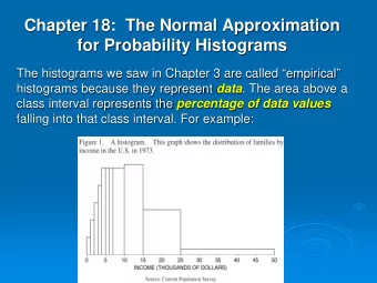
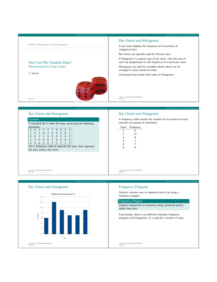
s t a t i s t i c s o f o n e v a r i a b l e s t a t i s t i c s o f o n e v a r i a b l e Bar Charts and Histograms MDM4U: Mathematics of Data Management A bar chart displays the frequency of occurrences of categorical data. Bar charts are typically used for discrete data. A histogram is a special type of bar chart, with the area of each bar proportional to the frequency of a particular value. How Can We Visualize Data? Representing Data Using Graphs Histograms are used for variables whose values can be arranged in some numerical order. J. Garvin Continuous data lends itself easily to histograms. J. Garvin — How Can We Visualize Data? Slide 1/25 Slide 2/25 s t a t i s t i c s o f o n e v a r i a b l e s t a t i s t i c s o f o n e v a r i a b l e Bar Charts and Histograms Bar Charts and Histograms Example A frequency table records the number of occurrences of each outcome (or groups of outcomes). A standard die is rolled 50 times, producing the following outcomes. Score Frequency 2 3 3 2 3 1 4 3 2 3 1 6 1 2 1 6 2 4 5 5 6 1 2 12 3 5 2 1 5 5 3 2 6 3 3 9 2 2 5 4 4 1 4 2 4 5 4 7 4 5 6 5 4 2 2 3 1 2 5 7 Use a frequency table to organize the data, then represent 6 9 the data using a bar chart. J. Garvin — How Can We Visualize Data? J. Garvin — How Can We Visualize Data? Slide 3/25 Slide 4/25 s t a t i s t i c s o f o n e v a r i a b l e s t a t i s t i c s o f o n e v a r i a b l e Bar Charts and Histograms Frequency Polygons Another common way to represent data is by using a frequency polygon . Frequency Polygon Displays frequencies of outcomes using connected points, rather than bars. Functionally, there is no difference between frequency polygons and histograms. It is typically a matter of taste. J. Garvin — How Can We Visualize Data? J. Garvin — How Can We Visualize Data? Slide 5/25 Slide 6/25
s t a t i s t i c s o f o n e v a r i a b l e s t a t i s t i c s o f o n e v a r i a b l e Frequency Polygons Cumulative-Frequency Graphs Another way to represent data is to use a cumulative-frequency polygon . Cumulative-Frequency Polygon Displays a running total of frequencies, beginning from the minimum value. Also called an ogive . Cumulative-frequency polygons are useful when one wants to see an overall increase in the data. J. Garvin — How Can We Visualize Data? J. Garvin — How Can We Visualize Data? Slide 7/25 Slide 8/25 s t a t i s t i c s o f o n e v a r i a b l e s t a t i s t i c s o f o n e v a r i a b l e Cumulative-Frequency Graphs Cumulative-Frequency Graphs Score Frequency 1 6 6 2 12 18 3 9 27 4 7 34 5 7 41 6 9 50 J. Garvin — How Can We Visualize Data? J. Garvin — How Can We Visualize Data? Slide 9/25 Slide 10/25 s t a t i s t i c s o f o n e v a r i a b l e s t a t i s t i c s o f o n e v a r i a b l e Grouped Data Grouped Data Sometimes it is easier, or desirable, to group data in intervals 30 scores from a data management test are recorded below. instead of using individual outcomes. 92 67 89 30 63 95 64 80 73 80 57 70 84 91 31 85 62 86 92 60 Large amounts of data, for example, may be better organized 69 52 61 89 50 77 85 88 58 63 by analyzing the frequency of values within certain ranges . Use a frequency table to organize the data, then represent Typically, 5-20 intervals are used, depending on the spread of the data using both a histogram and a cumulative frequency the data and the desired ranges. polygon. J. Garvin — How Can We Visualize Data? J. Garvin — How Can We Visualize Data? Slide 11/25 Slide 12/25
s t a t i s t i c s o f o n e v a r i a b l e s t a t i s t i c s o f o n e v a r i a b l e Grouped Data Grouped Data Score Midpoint Frequency Cumulative 29.5-40.5 35 2 2 40.5-51.5 46 1 3 51.5-62.5 57 6 9 62.5-73.5 68 7 16 73.5-84.5 79 4 20 84.5-95.5 90 10 30 J. Garvin — How Can We Visualize Data? J. Garvin — How Can We Visualize Data? Slide 13/25 Slide 14/25 s t a t i s t i c s o f o n e v a r i a b l e s t a t i s t i c s o f o n e v a r i a b l e Grouped Data Relative-Frequency Distributions A relative-frequency distribution represents the frequency of a data group as a percentage of the entire data set. Both histograms and frequency polygons can be used. J. Garvin — How Can We Visualize Data? J. Garvin — How Can We Visualize Data? Slide 15/25 Slide 16/25 s t a t i s t i c s o f o n e v a r i a b l e s t a t i s t i c s o f o n e v a r i a b l e Relative-Frequency Distributions Relative-Frequency Distributions Score Midpoint Frequency Rel. Freq. 29.5-40.5 35 2 6.67% 40.5-51.5 46 1 3.33% 51.5-62.5 57 6 20.00% 62.5-73.5 68 7 23.33% 73.5-84.5 79 4 13.33% 84.5-95.5 90 10 33.33% J. Garvin — How Can We Visualize Data? J. Garvin — How Can We Visualize Data? Slide 17/25 Slide 18/25
s t a t i s t i c s o f o n e v a r i a b l e s t a t i s t i c s o f o n e v a r i a b l e Other Graphs and Charts Other Graphs and Charts Pie charts represent data as a percentage of the data set. The percentages of all sectors must total 100%. Pictograms represent data graphically, using pictures relevant to the category. They are not as widely used as other types of graphs. J. Garvin — How Can We Visualize Data? J. Garvin — How Can We Visualize Data? Slide 19/25 Slide 20/25 s t a t i s t i c s o f o n e v a r i a b l e s t a t i s t i c s o f o n e v a r i a b l e Other Graphs and Charts Other Graphs and Charts J. Garvin — How Can We Visualize Data? J. Garvin — How Can We Visualize Data? Slide 21/25 Slide 22/25 s t a t i s t i c s o f o n e v a r i a b l e s t a t i s t i c s o f o n e v a r i a b l e Other Graphs and Charts Other Graphs and Charts J. Garvin — How Can We Visualize Data? J. Garvin — How Can We Visualize Data? Slide 23/25 Slide 24/25
Recommend
More recommend
Explore More Topics
Stay informed with curated content and fresh updates.

