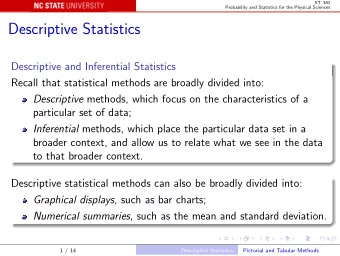
Descriptive Statistics Marc H. Mehlman marcmehlman@yahoo.com - PowerPoint PPT Presentation
Descriptive Statistics Marc H. Mehlman marcmehlman@yahoo.com University of New Haven Marc Mehlman Marc Mehlman (University of New Haven) Descriptive Statistics 1 / 44 Table of Contents Data Distributions 1 Graphical Representation of
Descriptive Statistics Marc H. Mehlman marcmehlman@yahoo.com University of New Haven Marc Mehlman Marc Mehlman (University of New Haven) Descriptive Statistics 1 / 44
Table of Contents Data Distributions 1 Graphical Representation of Distributions 2 Measuring the Center 3 Measuring the Spread 4 Normal Distribution 5 Order Statistics 6 Chapter #1 R Assignment 7 Marc Mehlman Marc Mehlman (University of New Haven) Descriptive Statistics 2 / 44
Data Distributions Data Distributions Data Distributions Marc Mehlman Marc Mehlman (University of New Haven) Descriptive Statistics 3 / 44
Data Distributions Examining Distributions In any graph of data, look for the overall pattern and for striking deviations from that pattern. You can describe the overall pattern by its shape, center, and spread. An important kind of deviation is an outlier, an individual that falls outside the overall pattern. 15 Marc Mehlman Marc Mehlman (University of New Haven) Descriptive Statistics 4 / 44
Data Distributions Examining Distributions A distribution is symmetric if the right and left sides of the graph are approximately mirror images of each other. A distribution is skewed to the right (right-skewed) if the right side of the graph (containing the half of the observations with larger values) is much longer than the left side. It is skewed to the left (left-skewed) if the left side of the graph is much longer than the right side. Symmetric Skewed-left Skewed-right Symmetric Skewed-left Skewed-right 16 Marc Mehlman Marc Mehlman (University of New Haven) Descriptive Statistics 5 / 44
Data Distributions Outliers An important kind of deviation is an outlier. Outliers are observations that lie outside the overall pattern of a distribution. Always look for outliers and try to explain them. The overall pattern is fairly symmetrical except for two states that clearly do not belong to the main trend. Alaska and Florida have unusual representation of the elderly in their Alaska Florida population. A large gap in the distribution is typically a sign of an outlier. Marc Mehlman Marc Mehlman (University of New Haven) Descriptive Statistics 6 / 44
Data Distributions in a class of 200 students let x i = # pts out of 500 possible that student i gets Frequency Table Relative F Table Cumulative F Table 0 – 99 10 0 – 99 5% ≤ 99 10 100 – 199 8 100 – 199 4% ≤ 199 18 200 – 299 22 200 – 299 11% ≤ 299 40 300 – 399 100 300 – 399 50% ≤ 399 140 400 – 500 60 400 – 500 30% ≤ 500 200 1 # classes should be between 5 and 20 inclusive. 2 class width ≈ max value − min value # of classes Marc Mehlman Marc Mehlman (University of New Haven) Descriptive Statistics 7 / 44
Graphical Representation of Distributions Graphical Representation of Distributions Graphical Representation of Distributions Marc Mehlman Marc Mehlman (University of New Haven) Descriptive Statistics 8 / 44
Graphical Representation of Distributions Distribution of a Variable To examine a single variable, we graphically display its distribution. The distribution of a variable tells us what values it takes and how The distribution of a variable tells us what values it takes and how often it takes these values. often it takes these values. Distributions can be displayed using a variety of graphical tools. The Distributions can be displayed using a variety of graphical tools. The proper choice of graph depends on the nature of the variable. proper choice of graph depends on the nature of the variable. Categorical Variable Quantitative Variable Categorical Variable Quantitative Variable Pie chart Histogram Pie chart Histogram Bar graph Stemplot Bar graph Stemplot 6 Marc Mehlman Marc Mehlman (University of New Haven) Descriptive Statistics 9 / 44
Graphical Representation of Distributions Categorical Variables The distribution of a categorical variable lists the categories and gives the count or percent of individuals who fall into that category. Pie Charts show the distribution of a categorical variable as a “pie” whose slices are sized by the counts or percents for the categories. Bar Graphs represent each category as a bar whose heights show the category counts or percents. 7 Marc Mehlman Marc Mehlman (University of New Haven) Descriptive Statistics 10 / 44
Graphical Representation of Distributions > pie.sales = c(0.12, 0.3, 0.26, 0.16, 0.04, 0.12) > lbls = c("Blueberry", "Cherry", "Apple", "Boston Cream", "Other", "Vanilla Cream") > pie(pie.sales, labels = lbls, main="Pie Sales") Pie Sales Cherry Blueberry Apple Vanilla Cream Other Boston Cream Marc Mehlman Marc Mehlman (University of New Haven) Descriptive Statistics 11 / 44
Graphical Representation of Distributions > counts=c(40,30,20,10) > colors=c("Red","Blue","Green","Brown") > barplot(counts,names.arg=colors,main="Favorite Colors") Favorite Colors 40 30 20 10 0 Red Blue Green Brown Marc Mehlman Marc Mehlman (University of New Haven) Descriptive Statistics 12 / 44
Graphical Representation of Distributions Quantitative Variables The distribution of a quantitative variable tells us what values the variable takes on and how often it takes those values. Histograms show the distribution of a quantitative variable by using bars whose height represents the number of individuals who take on a value within a particular class. Stemplots separate each observation into a stem and a leaf that are then plotted to display the distribution while maintaining the original values of the variable. 9 Marc Mehlman Marc Mehlman (University of New Haven) Descriptive Statistics 13 / 44
Graphical Representation of Distributions Histograms For quantitative variables that take many values and/or large datasets. Divide the possible values into classes (equal widths). Count how many observations fall into each interval (may change to percents). Draw picture representing the distribution―bar heights are equivalent to the number (percent) of observations in each interval. 13 Marc Mehlman Marc Mehlman (University of New Haven) Descriptive Statistics 14 / 44
Graphical Representation of Distributions > hist(trees$Girth,main="Girth of Black Cherry Trees",xlab="Diameter in Inches") Girth of Black Cherry Trees 12 10 8 Frequency 6 4 2 0 8 10 12 14 16 18 20 22 Diameter in Inches Marc Mehlman Marc Mehlman (University of New Haven) Descriptive Statistics 15 / 44
Graphical Representation of Distributions Stemplots To construct a stemplot: Separate each observation into a stem (first part of the number) and a leaf (the remaining part of the number). Write the stems in a vertical column; draw a vertical line to the right of the stems. Write each leaf in the row to the right of its stem; order leaves if desired. 10 Marc Mehlman Marc Mehlman (University of New Haven) Descriptive Statistics 16 / 44
Graphical Representation of Distributions > Girth=trees$Girth > stem(Girth) # stem and leaf plot The decimal point is at the | 8 | 368 10 | 57800123447 12 | 099378 14 | 025 16 | 03359 18 | 00 20 | 6 > stem(Girth, scale=2) The decimal point is at the | 8 | 368 9 | 10 | 578 11 | 00123447 12 | 099 13 | 378 14 | 025 15 | 16 | 03 17 | 359 18 | 00 19 | 20 | 6 Marc Mehlman Marc Mehlman (University of New Haven) Descriptive Statistics 17 / 44
Graphical Representation of Distributions Bivariate Data Bivariate data comes from measuring two aspects of the same item/individual. For instance, (70 , 178) , (72 , 192) , (74 , 184) , (68 , 181) is a random sample of size four obtained from four male college students. The bivariate data gives the height in inches and the weight in pounds of each of the for students. The third student sampled is 74 inches high and weighs 184 pounds. Can one variable be used to predict the other? Do tall people tend to weigh more? Definition A response (or dependent ) variable measures the outcome of a study. The explanatory (or independent ) variable is the one that predicts the response variable. Marc Mehlman Marc Mehlman (University of New Haven) Descriptive Statistics 18 / 44
Graphical Representation of Distributions Bivariate data For each individual studied, we record Student Number Blood Alcohol ID of Beers Content data on two variables. 1 5 0.1 2 2 0.03 3 9 0.19 We then examine whether there is a 6 7 0.095 relationship between these two 7 3 0.07 variables: Do changes in one variable 9 3 0.02 tend to be associated with specific 11 4 0.07 changes in the other variables? 13 5 0.085 4 8 0.12 5 3 0.04 8 5 0.06 10 5 0.05 Here we have two quantitative variables 12 6 0.1 recorded for each of 16 students: 14 7 0.09 1. how many beers they drank 15 1 0.01 2. their resulting blood alcohol content (BAC) 16 4 0.05 Marc Mehlman Marc Mehlman (University of New Haven) Descriptive Statistics 19 / 44
Recommend
More recommend
Explore More Topics
Stay informed with curated content and fresh updates.


