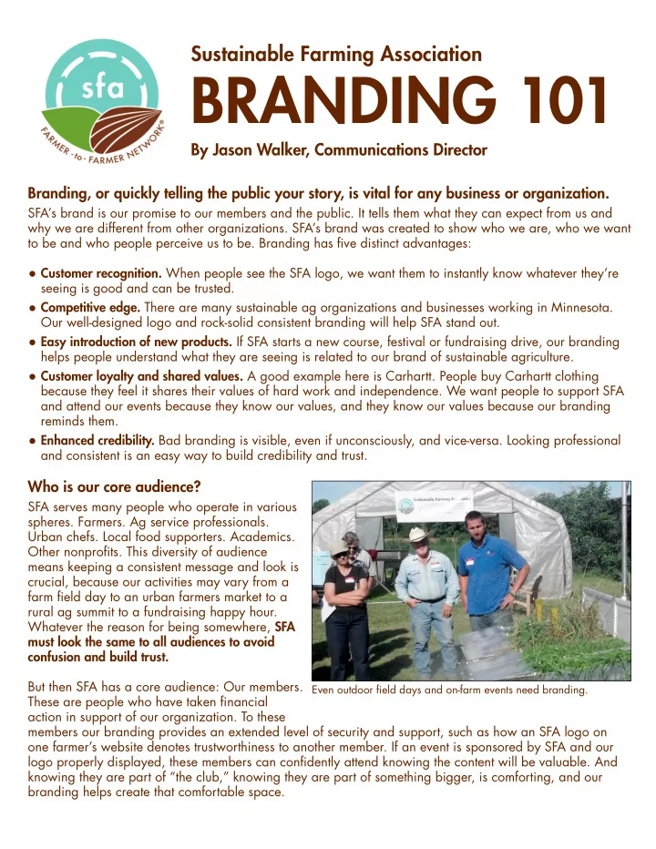

Sustainable Farming Association BRANDING 101 By Jason Walker, Communications Director Branding, or quickly telling the public your story, is vital for any business or organization. SFA’s brand is our promise to our members and the public. It tells them what they can expect from us and why we are different from other organizations. SFA’s brand was created to show who we are, who we want to be and who people perceive us to be. Branding has five distinct advantages: • Customer recognition. When people see the SFA logo, we want them to instantly know whatever they’re seeing is good and can be trusted. • Competitive edge. There are many sustainable ag organizations and businesses working in Minnesota. Our well-designed logo and rock-solid consistent branding will help SFA stand out. • Easy introduction of new products. If SFA starts a new course, festival or fundraising drive, our branding helps people understand what they are seeing is related to our brand of sustainable agriculture. • Customer loyalty and shared values. A good example here is Carhartt. People buy Carhartt clothing because they feel it shares their values of hard work and independence. We want people to support SFA and attend our events because they know our values, and they know our values because our branding reminds them. • Enhanced credibility. Bad branding is visible, even if unconsciously, and vice-versa. Looking professional and consistent is an easy way to build credibility and trust. Who is our core audience? SFA serves many people who operate in various spheres. Farmers. Ag service professionals. Urban chefs. Local food supporters. Academics. Other nonprofits. This diversity of audience means keeping a consistent message and look is crucial, because our activities may vary from a farm field day to an urban farmers market to a rural ag summit to a fundraising happy hour. Whatever the reason for being somewhere, SFA must look the same to all audiences to avoid confusion and build trust. But then SFA has a core audience: Our members. Even outdoor field days and on-farm events need branding. These are people who have taken financial action in support of our organization. To these members our branding provides an extended level of security and support, such as how an SFA logo on one farmer’s website denotes trustworthiness to another member. If an event is sponsored by SFA and our logo properly displayed, these members can confidently attend knowing the content will be valuable. And knowing they are part of “the club,” knowing they are part of something bigger, is comforting, and our branding helps create that comfortable space.
SUSTAINABLE FARMING ASSOCIATION BRANDING 101 Who do we need to reach? Organizations must grow or wither, and to grow SFA must attract new members, donors and collaborators. SFA farmers and members will find us automatically because we are a familiar outpost of support, but why should new donors take action? Our branding and language must state, clearly, why both farmers and non- farmers should donate. People don’t want to read a lot of words. A first impression of an SFA website, flyer or poster can make-or- break a donor for life. It’s critically important to reduce our messages into simple, easily digestible pieces. Here are some talking points, starting with our mission statement: • SFA supports the development and enhancement of sustainable farming systems through farmer-to-farmer networking, innovation, demonstration, and education. • SFA is an inclusive farmer networking organization that works for anyone seeking innovative methods to protect Minnesota's food-producing resources. From urban farmers to rural grain producers, SFA promotes soil health and sustainable techniques that boost farmer profitability and local food availability. • SFA membership dues also support specialty crop work, notably “Growing and Marketing Premium Minnesota Garlic,” a project that mentors farmers to grow great garlic, expand markets and build supply chains. • SFA’s array of soil health programming embraces Five Principles: minimize soil disturbance, keep the soil covered, nurture living roots, diversify plant life and add livestock to the landscape. • SFA recognizes the variation in agriculture and the need for each farmer to make their own decisions. Regardless of crops grown, soil type, or farming style, the principles of cover crops and soil health apply anywhere farming occurs. These statements are examples of terse yet effective means of communication. Upon reading, strangers to SFA can quickly understand we are a group of farmers and food supporters looking to make Minnesota better and connect with who we are. Why is our logo so important? Using our logo is the baseline for everything SFA-related. It should be on every piece of printed or online material we produce, period. Good logos work. You don’t need words to know what the following logos represent. They are well-designed and emblematic of their overall mission or business. SFA is lucky to have a well-designed logo that achieves this, and we must capitalize on it.
SUSTAINABLE FARMING ASSOCIATION BRANDING 101 Don’t mix it up. Change is good for presidents and diapers, but not for businesses and organizations. The world wants consistency. Take McDonalds. The Golden Arches logo is one of the greatest of all-time, and undoubtedly plenty of people still eat there, but the company is struggling to grow and is losing focus on its core products. People don’t visit McDonalds for a “new garden-fresh salad,” they visit McDonalds because it’s affordable and because the Big Mac they get in Brainerd or Bangkok tastes the same as it always has. Recently, I was driving past a McDonald’s and my 4-year-old, who has never eaten there, said, “Look, the yellow M means hamburgers!” The world wants consistency. Talking points like those listed above add to SFA’s consistent message. It may get repetitive to say “SFA promotes soil health and sustainable techniques that boost farmer profitability and local food availability” on every flyer you make, but it won’t be to the masses reading it for the first time. Beyond logo and message, fonts and colors are very important to this. Every SFA-branded item that includes text should be in one of three fonts: Futura Std Book, Futura Std Heavy or Futura Std Bold . Every SFA- branded item should include only three colors other than black or white: SFA blue , SFA green and, especially, SFA brown . Why is SFA brown so important? Because while they are wonderful colors, the world has enough green and blue. They are, for good reason, the two most popular logo colors in the world. Brown, however, has cache. What other company uses brown? I can think of only one: UPS, which ran with it to great effect with the “What can brown do for you” campaign that worked for over a decade. UPS even trademarked its precise shade of brown. SFA should focus on our brown as our main color, both for its connonation to soil and its uniqueness. Summary Following SFA branding is not only important, it is required. Using the appropriate SFA logo, fonts, colors and messages will help grow the organization and achieve our mission: support the development and enhancement of sustainable farming systems through farmer-to-farmer networking, innovation, demonstration, and education. Questions about SFA branding or requests for logos or fonts? First, check the Chapter Resource Portal, where chapter-specific logos and other branding resources are available for download. Requests for fonts or other questions should be directed to Jason Walker at jason@sfa-mn.org. Where to begin Anyone looking to create a printed item must use SFA’s colors and fonts that are detailed on the following worksheet. While not comprehensive, this is a quick-and-dirty guide for anyone looking to create an SFA flyer, poster, banner, t-shirt or anything that carries the SFA brand.
SFA Branding Worksheet Fonts SFA has three acceptable fonts available. Futura Std Book For body text on a website or other publication, Futura Std Heavy Open Sans is also acceptable but not preferable. Futura Std Bold If you lack any of these fonts, email jason@sfa-mn.org. Logos SFA has one acceptable logo family. All SFA publications that are NOT event-specific must use the following SFA Main Logo (or the chapter variant) as the dominant logo on any document, banner or website: Do not make any alterations to the logo – changing colors, tints, fonts, type placement or proportions. Logos are available on the SFA Intranet Site or from jason@sfa-mn.org. SFA also has event logos to be used dominantly in event-specific documents, banners or websites. In these cases, the main SFA logo must also be used in a secondary manner. Colors SFA has three acceptable colors. Other than black and white, use only these colors in official SFA publications Questions? Email Jason Walker at jason@sfa-mn.org
Recommend
More recommend