Animation in the Interface Reading assignment: This section based - PowerPoint PPT Presentation
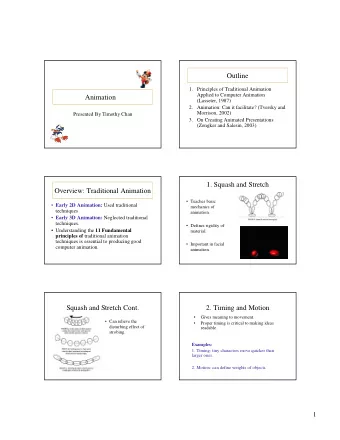
Animation in the Interface Reading assignment: This section based on 2 papers Bay-Wei Chang, David Ungar, Animation: From Cartoons to the User Interface, Proceedings of UIST 93 , pp.45-55.
Animation in the Interface
Reading assignment: This section based on 2 papers Bay-Wei Chang, David Ungar, “Animation: From Cartoons to the User Interface”, Proceedings of UIST’ 93 , pp.45-55. http://www.acm.org/pubs/articles/proceedings/uist/168642/p45-chang/p45-chang.pdf Scott E. Hudson, John T. Stasko, “Animation Support in a User Interface Toolkit: Flexible, Robust and Reusable Abstractions”, Proceedings of UIST ‘93 , pp.57-67. http://www.acm.org/pubs/articles/proceedings/uist/168642/p57-hudson/p57-hudson.pdf Good related paper: John Lasseter, “Principles of traditional animation applied to 3D computer animation”, Proceedings of SIGGRAPH ‘87, pp. 35 - 44 2
Animation is of increasing interest Perceptual advantages Just recently had enough spare horsepower (circa Win98) Now seeing this in the mainstream (Vista, MacOS X) 3
Why animation? Gives a feeling of reality and liveness “animation” = “bring to life” make inanimate object animate 4
Why animation? Provides visual continuity (and other effects) enhancing perception particularly perception of change hard to follow things that just flash into & out of existence real world doesn’t act this way 5
Why Animation? Can also be used to direct attention movement draws attention strong evolutionary reasons therein lies a danger overuse tends to demand too much attention e.g., the dreaded paper clip 6
Why Animation? Used sparingly and understandingly, animation can enhance the interface Draw attention to important details Provide a sense of realism Provide important affordances and feedback to user actions 7
Three principles from traditional animation Not mutually exclusive: Solidity make objects appear to be solid, have mass Exaggeration exaggerate certain physical actions to enhance perception paradoxically, increases realism (liveness) by being less literal Reinforcement effects to drive home feeling of reality...often more subtle than the above We’ll discuss a set of techniques that build on these... each technique may draw from multiple principles 8
Specific techniques drawn from these principles Solid drawing Want objects to appear solid and appear to have mass Solid (filled) drawing now common place 9
Specific techniques drawn from these principles No teleportation objects must come from somewhere not just “pop into existence” nothing in the real world does this (things with mass can’t do this) E.g., OS X Dock (new windows still materialize though) 10
Specific techniques drawn from these principles Motion blur if objects move more than their own length (some say 1/2 length) in one frame, motion blur should be used matches real world perception of solid objects makes movement look smoother doesn’t need to be realistic 11
Specific techniques drawn from these principles Squash and stretch Cartoon objects are typically designed to look “squishy” When they stop, hit something, land, they tend to squash like water balloon compress in direction of travel 12
Specific techniques drawn from these principles Squash and stretch Also stretch when they accelerate opposite direction Basically an approximation of inertia + conservation of volume (area) 13
Specific techniques drawn from these principles Squash and stretch Conveys solidity Although S&S makes things look “squishy” they reinforce solidity because they show mass (This is tends to be exaggerated ) 14
Specific techniques drawn from these principles Follow through (& secondary action) Emphasize termination of an action Solid objects don’t just stop, they continue parts of the motion e.g., clothes keep moving, body parts keep moving Reinforces that object has mass via inertia (also tends to be exaggerated ) 15
Example of Follow Through Notice feather lags behind character Also S&S here From: Thomas & Johnston “The Illusion of Life: Disney Animation”, Hyperion, 1981 16
Specific techniques drawn from these principles Anticipation Example of exaggeration in the interface small counter movement just prior to the main movement this sets our attention on the object where the action is (or will be) Contrast to follow-through (which is about termination of movement)... anticipation is about the start of movement 17
Specific techniques drawn from these principles Slow-in / Slow-out Movement between two points starts slow, is fast in the middle, and ends slow Two effects here objects with mass must accelerate... thus reinforces solidity interesting parts typically @ ends tweaking perception to draw attention to most salient aspects of motion from a UI perspective 18
Specific techniques drawn from these principles Movement in arcs Subtle reinforcement effect Objects in the real world rarely move in a straight line Animate objects to move in gently curving paths, not straight lines Why? Movements by animate objects are in arcs (due to mechanics of joints) Most movements in gravity also in arcs 19
Recap Appearance of mass solidity & conservation of volume several ways to show inertia Tweak perception direct attention to things that count time on conceptually important parts Caricature of reality 20
Examples From Video 21
Reminder Animation can bring otherwise boring things to life, but… Its not a uniformly good thing demands a lot of attention can take time Needs to be used wisely (and probably sparingly) 22
Making animation happen in a toolkit Paper describes model in subArctic (and predecessor) high to middle level model robust to timing issues Primary abstraction: transition models movement over time arbitrary space of values (eg, color) screen space is most common 23
Transition consists of Reference to obj being animated passage of time modeled as events Time interval period of time animation occurs Trajectory path taken through value space timing of changes through values 24
Trajectory has two parts Curve set of values we pass through typically in 2D space, but could be in any space of values (e.g., font size) Pacing function mapping from time interval (0…1) to “parameter space” of curve (0…1) determines pacing along curve e.g., slow-in / slow-out 25
Mapping from time to value Time normalized with respect to animation interval (0...1) Normalized time is transformed by pacing function (0…1) Paced value is then fed to curve function to get final value 26
To get a movement Create and schedule a transition several predefined types (i.e., linear) scheduling can be done absolute start stop at the following wall clock times or relative D seconds from now D seconds from start / end of that 27
System action Transition will deliver time as input using animatable interface transition_start() transition_step() transition_end() Each delivers: trajectory object, relative time & value 28
Transition steps Steps represent intervals of time, not points in time deliver start and end times & values Typical OS can’t deliver uniform time intervals Number of steps (delivery rate) is not fixed in advance (animation system sends as many as it can) system delivers as many as it can 29
Recap Transition Object to animate Time interval to work over Time (0…1) Trajectory to pass through Pacing function (0…1) (0… 1) Curve (0...1) Value 30
Animation in Swing Unfortunately, no nice API custom built for animation Animation usually cobbled together using a grab bag of tricks Separate thread to update positions or other attributes of animated components Custom repaint code Graphical trickery Understanding/using the Swing threading model (Depending on what you want to do...) 31
Good Animation Examples Excellent book: Swing Hacks , Marinacci and Adamson, O’Reilly Press Hack #8: Animated transitions between tabs Hack #18: Animated fade-ins of JList selections Hack #42: Animated dissolving JFrames Plus several others Most involve: Subclassing existing components to override their painting behavior (overriding paintComponent() for example) Capturing on-screen regions in an Image, and then: Fiddle with the image Blit it to the screen Lather, rinse, repeat as necessary to do a transition Simply using a thread to update existing properties on normal components 32
Recommend
More recommend
Explore More Topics
Stay informed with curated content and fresh updates.
