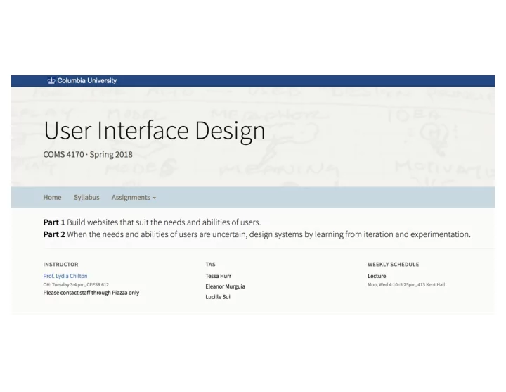

4170 Staff • Prof. Lydia Chilton • Office hours: Tuesdays 3-4 in CEPSR 612 • IAs: • Tessa Hurr • Eleanor Murguia • Lucille Sui • http://coms4170.cs.columbia.edu/2018-spring/
Why are user interfaces important?
1613 – 1940s Co Computers : people who performed calculations
1940s – 1960s Computers : Tools for Calculation and Co Symbolic Manipulation
1945 Co Computer ers : tools to augment human cognition Vannevar Bush’s vision of computers
1963: First Graphical User Interface Ivan Sutherland’s CAD software, Sketchpad
1968: Interaction devices for computer use. Douglas Engelbart’s mouse
Com Computers : Tools for Com Computers : Tools to augment calculation. human intelligence.
Com Computers : Com Computers : Tools to augment human Tools for calculation. intelligence. Computers augment human intelligence best when they suit the needs and abilities of people.
The Internet: The Rise of Usability For physical products, users did For desktop software, users call On the Web, users experience the not get to experience the expensive support centers, but the usability of a site before they have usability of the product until costs aren’t “charged” to the committed to using it and after they bought it . software engineers, so they have no before they buy it. motivation to ship great UIs. Nielsen, Jakob. Designing Web Usability: The Practice of Simplicity . (1999)
Goals of COMS 4170 1. Build websites that suit the needs and abilities of users. 2. When the needs and abilities of users are unclear, design systems by learning from iteration and experimentation.
Grade breakdown • HW 1: Theory 5% • HW 2: Practice 10% • HW 3: Theory 5% • HW 4: Practice 10% • Final Project 35% • Brainstorming • 3 designs • Paper Prototype • Implementation • Final presentation • Final Exam 20% • Participation 15%
Your commitments Portion of grade Four individual 30% assignments Team Project with 4 35% intermediate deliverables Final Exam 20% Participation 15%
Attendance is crucial. No Screens. Portion of grade Four individual 30% assignments Team Project with 4 35% intermediate deliverables Final Exam 20% Participation 15%
Why is participation 15% of my grade?
Human memory is tree-structured
New knowledge gets appended to the tree.
Where does new knowledge get appended? To where nodes of tree are currently active.
By guessing about new knowledge before it is presented, you warm up the right place for it in memory. Gen Gener eratio tion : Guessing before you hear the answer
Once you hear the new knowledge, you want to connect it to connect other to other knowledge so it will trigger when relevant. Elaboration : Relating new knowledge to old topics.
tion & El Gen Gener eratio Elabo boration Relate new knowledge to old topics. Guess about the new knowledge. This aspect of participation is about providing Must take risks, you will probably be (partially) insights. wrong.
Learning from mistakes is good
Learning from mistakes is good You are here because you expressed an insight about a time you learned from a mistake. You were admitted to the this class because you were able to express an insight from a time you made a mistake.
Lecture 1: 10 Usability Heuristics
1. 1. Visibility of system m status The system should always keep users informed about what is going on, through appropriate feedback within reasonable time.
1. 1. Visibility of system m status The system should always keep users informed about what is going on, through appropriate feedback within reasonable time.
1. 1. Visibility of system m status The system should always keep users informed about what is going on, through appropriate feedback within reasonable time.
1. 1. Visibility of system m status The system should always keep users informed about what is going on, through appropriate feedback within reasonable time.
1. Visibility of the system status What user need does this UI serve?
2. Ma Match between system m and the real wo world The system should speak the users' language, with words, phrases and concepts familiar to the user, rather than system-oriented terms. Follow real-world conventions, making information appear in a natural and logical order.
2. Ma Match between system m and the real wo world The system should speak the users' language, with words, phrases and concepts familiar to the user, rather than system-oriented terms. Follow real-world conventions, making information appear in a natural and logical order.
2. Ma Match between system m and the real wo world
2. Ma Match between system m and the real wo world
2. Ma Match between system m and the real wo world " I'd spell creat creat with an e . "
3. Us User er control and and freed eedom (Navig vigatio tion) Users often choose system functions by mistake and will need a clearly marked "emergency exit" to leave the unwanted state without having to go through an extended dialogue. Support undo and redo.
3. Us User er control and and freed eedom (Navig vigatio tion) Users often choose system functions by mistake and will need a clearly marked "emergency exit" to leave the unwanted state without having to go through an extended dialogue. Support undo and redo.
3. Us User er control and and freedo eedom (Navi vigation) n) Users often choose system functions by mistake and will need a clearly marked "emergency exit" to leave the unwanted state without having to go through an extended dialogue. Support undo and redo.
3. Us User er control and and freed eedom (Navig vigatio tion)
4. Co Consistency y and standards Users should not have to wonder whether different words, situations, or actions mean the same thing. Follow platform conventions.
4. Co Consistency y and standards Users should not have to wonder whether different words, situations, or actions mean the same thing. Follow platform conventions.
4. Co Consistency y and standards Users should not have to wonder whether different words, situations, or actions mean the same thing. Follow platform conventions.
5. Er Error pr prevention Even better than good error messages is a careful design which prevents a problem from occurring in the first place. Either eliminate error-prone conditions or check for them and present users with a confirmation option before they commit to the action.
5. Er Error pr prevention Even better than good error messages is a careful design which prevents a problem from occurring in the first place. Either eliminate error-prone conditions or check for them and present users with a confirmation option before they commit to the action.
5. Er Error pr prevention Even better than good error messages is a careful design which prevents a problem from occurring in the first place. Either eliminate error-prone conditions or check for them and present users with a confirmation option before they commit to the action.
5. Er Error pr prevention Even better than good error messages is a careful design which prevents a problem from occurring in the first place. Either eliminate error-prone conditions or check for them and present users with a confirmation option before they commit to the action.
5. Er Error pr prevention Even better than good error messages is a careful design which prevents a problem from occurring in the first place. Either eliminate error-prone conditions or check for them and present users with a confirmation option before they commit to the action.
6. Re Recognition ra rather than recall Minimize the user's memory load by making objects, actions, and options visible. The user should not have to remember information from one part of the dialogue to another. Instructions for use of the system should be visible or easily retrievable whenever appropriate.
6. Re Recognition ra rather than recall Minimize the user's memory load by making objects, actions, and options visible. The user should not have to remember information from one part of the dialogue to another. Instructions for use of the system should be visible or easily retrievable whenever appropriate.
6. Re Recognition ra rather than recall Minimize the user's memory load by making objects, actions, and options visible. The user should not have to remember information from one part of the dialogue to another. Instructions for use of the system should be visible or easily retrievable whenever appropriate.
7. Fl Flexibi bility and and efficienc ency of us use Accelerators — unseen by the novice user — may often speed up the interaction for the expert user such that the system can cater to both inexperienced and experienced users. Allow users to tailor frequent actions. Flash fill
7. Fl Flexibi bility and and efficienc ency of us use Accelerators — unseen by the novice user — may often speed up the interaction for the expert user such that the system can cater to both inexperienced and experienced users. Allow users to tailor frequent actions.
Recommend
More recommend