Week 5: Manipulate, Facet, Reduce Demo: Text Tamara Munzner - PowerPoint PPT Presentation
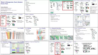
Week 5: Manipulate, Facet, Reduce Demo: Text Tamara Munzner Department of Computer Science University of British Columbia JRNL 520M, Special Topics in Contemporary Journalism: Visualization for Journalists Week 5: 13 October 2015
Week 5: Manipulate, Facet, Reduce Demo: Text Tamara Munzner Department of Computer Science University of British Columbia JRNL 520M, Special Topics in Contemporary Journalism: Visualization for Journalists Week 5: 13 October 2015 http://www.cs.ubc.ca/~tmm/courses/journ15
Now • Manipulate • Facet (not covered last week) • Reduce • Demos/Videos – LineUp – LiveRAC – Cerebral • Demos: Text – Overview – TimeLineCurator 2
How? Encode Manipulate Facet Encode Manipulate Facet Reduce Map Arrange Change Juxtapose Filter from categorical and ordered Express Separate attributes Color Hue Saturation Luminance Select Partition Aggregate Order Align Size, Angle, Curvature, ... Use Navigate Superimpose Embed Shape Motion Direction, Rate, Frequency, ... 3
How to handle complexity: 3 more strategies + 1 previous Manipulate Facet Reduce Derive Change Juxtapose Filter • change view over time Select Partition Aggregate • facet across multiple views • reduce items/attributes Navigate Superimpose Embed within single view • derive new data to show within view 4
How to handle complexity: 3 more strategies + 1 previous Manipulate Facet Reduce Derive Change Juxtapose Filter • change over time Select Partition Aggregate - most obvious & flexible of the 4 strategies Navigate Superimpose Embed 5
VAD Ch 11: Manipulate Change over Time Navigate Item Reduction Zoom Geometric or Semantic Select Pan/Translate Constrained 6
Change over time • change any of the other choices – encoding itself – parameters – arrange: rearrange, reorder – aggregation level, what is filtered... – interaction entails change 7
Idiom: Re-encode System: Tableau made using Tableau, http://tableausoftware.com 8
Idiom: Reorder System: LineUp • data: tables with many attributes • task: compare rankings [LineUp: Visual Analysis of Multi-Attribute Rankings. Gratzl, Lex, Gehlenborg, Pfister, and Streit. IEEE Trans. Visualization and Computer Graphics (Proc. InfoVis 2013) 19:12 (2013), 2277–2286.] 9
Idiom: Realign System: LineUp • stacked bars – easy to compare • first segment • total bar • align to different segment – supports flexible comparison [LineUp: Visual Analysis of Multi-Attribute Rankings.Gratzl, Lex, Gehlenborg, Pfister, and Streit. IEEE Trans. Visualization and Computer Graphics (Proc. InfoVis 2013) 19:12 (2013), 2277–2286.] 10
Idiom: Animated transitions • smooth transition from one state to another – alternative to jump cuts – support for item tracking when amount of change is limited • example: multilevel matrix views – scope of what is shown narrows down • middle block stretches to fill space, additional structure appears within • other blocks squish down to increasingly aggregated representations [Using Multilevel Call Matrices in Large Software Projects. van Ham. Proc. IEEE Symp. Information Visualization (InfoVis), pp. 227–232, 2003.] 11
Navigate: Changing item visibility Navigate • change viewpoint Item Reduction – changes which items are visible within view Zoom – camera metaphor Geometric or Semantic • zoom – geometric zoom: familiar semantics – semantic zoom: adapt object representation based on available pixels » dramatic change, or more subtle one Pan/Translate • pan/translate • rotate – especially in 3D Constrained – constrained navigation • often with animated transitions • often based on selection set 12
Idiom: Semantic zooming System: LiveRAC • visual encoding change – colored box – sparkline – simple line chart – full chart: axes and tickmarks [LiveRAC - Interactive Visual Exploration of System Management Time-Series Data. McLachlan, Munzner, Koutsofios, and North. Proc. ACM Conf. Human Factors in Computing Systems (CHI), pp. 1483–1492, 2008.] 13
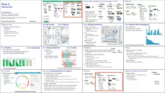
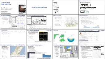
VAD Chap 11: Facet Into Multiple Views Juxtapose Partition Superimpose 14
How to handle complexity: 3 more strategies + 1 previous Manipulate Facet Reduce Derive Change Juxtapose Filter • facet data across Select Partition Aggregate multiple views Navigate Superimpose Embed 15
Facet Coordinate Multiple Side By Side Views Juxtapose Share Encoding: Same/Di ff erent Linked Highlighting Partition Share Data: All/Subset/None Superimpose Share Navigation 16
Idiom: Linked highlighting System: EDV • see how regions contiguous in one view are distributed within another – powerful and pervasive interaction idiom • encoding: different – multiform • data: all shared [Visual Exploration of Large Structured Datasets. Wills. Proc. New Techniques and Trends in Statistics (NTTS), pp. 237–246. IOS Press, 1995.] 17
System: Google Maps Idiom: bird’s-eye maps • encoding: same • data: subset shared • navigation: shared – bidirectional linking • differences – viewpoint – (size) • overview-detail [A Review of Overview+Detail, Zooming, and Focus+Context Interfaces. Cockburn, Karlson, and Bederson. ACM Computing Surveys 41:1 (2008), 1–31.] 18
System: Cerebral Idiom: Small multiples • encoding: same • data: none shared – different attributes for node colors – (same network layout) • navigation: shared [Cerebral: Visualizing Multiple Experimental Conditions on a Graph with Biological Context. Barsky, Munzner, Gardy, and Kincaid. IEEE Trans. Visualization and Computer Graphics (Proc. InfoVis 2008) 14:6 (2008), 1253–1260.] 19
Coordinate views: Design choice interaction All Subset None Overview/ Same Redundant Detail Small Multiples Multiform, No Linkage Overview/ Multiform Detail • why juxtapose views? – benefits: eyes vs memory • lower cognitive load to move eyes between 2 views than remembering previous state with single changing view – costs: display area, 2 views side by side each have only half the area of one view 20
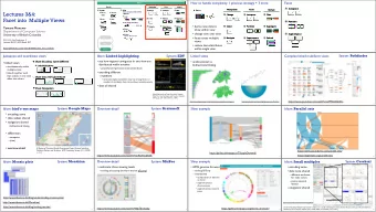
Partition into views • how to divide data between views Partition into Side-by-Side Views – encodes association between items using spatial proximity – major implications for what patterns are visible – split according to attributes • design choices – how many splits • all the way down: one mark per region? • stop earlier, for more complex structure within region? – order in which attribs used to split – how many views 21
Partitioning: List alignment • single bar chart with grouped bars • small-multiple bar charts – split by state into regions – split by age into regions • complex glyph within each region showing all ages • one chart per region – compare: easy within state, hard across ages – compare: easy within age, harder across states 11.0 11 65 Years and Over 45 to 64 Years 5 10.0 25 to 44 Years 0 18 to 24 Years 11 9.0 14 to 17 Years 5 5 to 13 Years 0 8.0 Under 5 Years 11 5 7.0 0 6.0 11 5 5.0 0 11 4.0 5 0 3.0 11 5 2.0 0 11 1.0 5 0.0 0 22 CA TK NY FL IL PA CA TK NY FL IL PA
Partitioning: Recursive subdivision System: HIVE • split by neighborhood • then by type • then time – years as rows – months as columns • color by price • neighborhood patterns – where it’s expensive – where you pay much more for detached type [Configuring Hierarchical Layouts to Address Research Questions. Slingsby, Dykes, and Wood. IEEE Transactions on Visualization and Computer Graphics 23 (Proc. InfoVis 2009) 15:6 (2009), 977–984.]
Partitioning: Recursive subdivision System: HIVE • switch order of splits – type then neighborhood • switch color – by price variation • type patterns – within specific type, which neighborhoods inconsistent [Configuring Hierarchical Layouts to Address Research Questions. Slingsby, Dykes, and Wood. IEEE Transactions on Visualization and Computer Graphics 24 (Proc. InfoVis 2009) 15:6 (2009), 977–984.]
Partitioning: Recursive subdivision System: HIVE • different encoding for second-level regions – choropleth maps [Configuring Hierarchical Layouts to Address Research Questions. Slingsby, Dykes, and Wood. IEEE Transactions on Visualization and Computer Graphics 25 (Proc. InfoVis 2009) 15:6 (2009), 977–984.]
Superimpose layers • layer : set of objects spread out over region – each set is visually distinguishable group – extent: whole view Superimpose Layers • design choices – how many layers? – how are layers distinguished? – small static set or dynamic from many possible? – how partitioned? • heavyweight with attribs vs lightweight with selection • distinguishable layers – encode with different, nonoverlapping channels • two layers achieveable, three with careful design 26
Static visual layering • foreground layer: roads – hue, size distinguishing main from minor – high luminance contrast from background • background layer: regions – desaturated colors for water, parks, land areas • user can selectively focus attention • “get it right in black and white” – check luminance contrast with greyscale view [Get it right in black and white. Stone. 2010. http://www.stonesc.com/wordpress/2010/03/get-it-right-in-black-and-white] 27
Recommend
More recommend
Explore More Topics
Stay informed with curated content and fresh updates.

![Neural Facet Detection on Medical Resources Thomas Steffek, WS 18/19 Source: [pub] Thomas](https://c.sambuz.com/701196/neural-facet-detection-on-medical-resources-s.webp)
