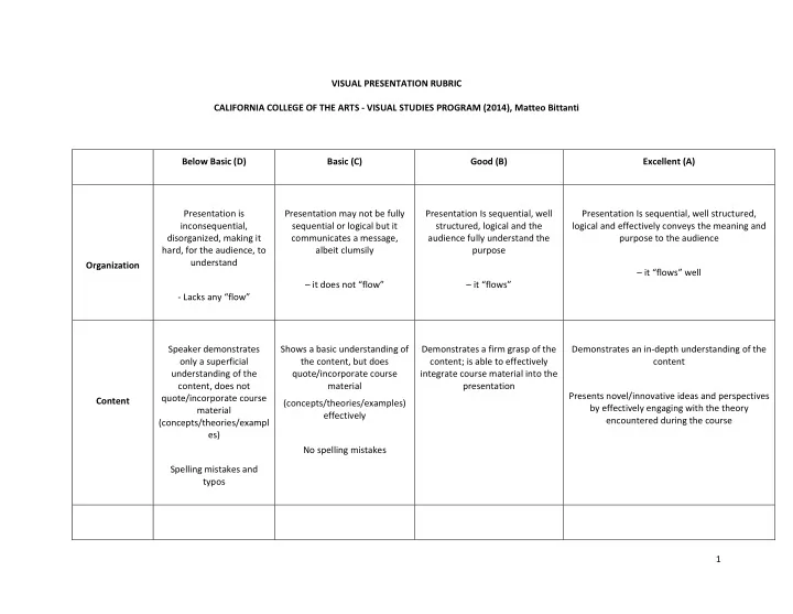

VISUAL PRESENTATION RUBRIC CALIFORNIA COLLEGE OF THE ARTS ‐ VISUAL STUDIES PROGRAM (2014), Matteo Bittanti Below Basic (D) Basic (C) Good (B) Excellent (A) Presentation is Presentation may not be fully Presentation Is sequential, well Presentation Is sequential, well structured, inconsequential, sequential or logical but it structured, logical and the logical and effectively conveys the meaning and disorganized, making it communicates a message, audience fully understand the purpose to the audience hard, for the audience, to albeit clumsily purpose understand Organization – it “flows” well – it does not “flow” – it “flows” ‐ Lacks any “flow” Speaker demonstrates Shows a basic understanding of Demonstrates a firm grasp of the Demonstrates an in ‐ depth understanding of the only a superficial the content, but does content; is able to effectively content understanding of the quote/incorporate course integrate course material into the content, does not material presentation Presents novel/innovative ideas and perspectives quote/incorporate course Content (concepts/theories/examples) by effectively engaging with the theory material effectively encountered during the course (concepts/theories/exampl es) No spelling mistakes Spelling mistakes and typos 1
Many graphics and Graphics and content are clear Graphics and content are clear Graphics and content are clear and unambiguous content are too small or and unambiguous and unambiguous and easily viewed Graphics–Clarity unclear Speaker shows a basic Shows a good understanding of Speaker demonstrates expertise in visual The slides are cluttered understanding of visual visual presentation design presentation designs presentation design Too much text on the Elegant graphics, created ex novo Minimal text on screen (<3 words per slide) screen/slide; uneven or Consistent style by the presenter erratic use of typefaces Minimal text on screen (<6 words Lack of understanding of per slide) visual presentation design Spelling mistakes and typos The presentation includes – gosh – a bullet ‐ point list Graphics do not directly Most graphics relate to the All graphics and content are All graphics are related to the topic relate to the topic topic related to the topic and support the speaker’s main argument make it easier for the audience to understand the presentation Detract from the Basic graphic style presentation Graphics are elegant and Graphics ‐ style/color/size are consistent Introduce new, unusual, different, effective ways Relevance Episodic lack of consistency in of visualizing information Show a systematic lack of term of size, color, style. consistency in size, color, style 2
The presentation is not The presentation may not be The presentation Is effective, The presentation is professionally produced, effective effective but utilizes available utilizes available tools effectively effective, and utilizes available technology tools effectively AND/OR AND BUT AND Visual Is technically flawless does not make use of is technically flawless Product available tools effectively has visual errors or bugs/technical glitches that Is elegant, well crafted, original, innovative in detract from its effectiveness both style and content AND/OR (e.g. non embedded videos, missing video, missing audio, audio out of sync, poor editing, has visual errors or cropping) bugs/technical glitches that detract from its effectiveness (e.g. non embedded videos, missing video, missing audio, audio out of sync, poor editing, cropping) Speaker’s tone is too low Speaker’s tone is effective Speaker’s tone, pace, and pitch Speaker’s tone is effective or too loud, monotone or are effective Speaker’s skills dull Speaker is articulate, save Speaker is very articulate, persuasive, and fluent occasional disfluencies (e.g. Speaker is articulate and Speaker is inarticulate or “like,”, “right”, “uhm”) convincing Speaker maintains eye contact with the audience disfluent and does not read notes Speaker’s pace is adequate Speaker maintains eye contact speaks too fast/slow with the audience Presenter is relaxed, passionate about the subject, engaging, convincing and confident 3
stops during the The talk is performed as a Speaker reads her/his notes only presentation prepared speech – speaker occasionally The performance seems effortless reads notes for the entire duration of the presentation reads the slides Speaker’s body language is Speaker’s body language is effective effective Speaker’s body language is talks to projector or the effective Speaker’s skills screen but not to the (cont.) audience Speaker’s body language is ineffective (e.g. speaker covers his mouth, hides behind the podium etc.) Speaker is unable to begin Speaker is able to conclude the Speaker is able to conclude the Speaker is not only able to conclude the the presentation of time presentation in the allotted presentation in the allotted time presentation in the allotted time but also to due to unforeseen issues time but does not leave any and leaves a few minutes for leave a couple of minutes for questions (technical glitches, missing time for questions questions files, wrong cables etc.) Professionalism The presentation has not been The presentation has been Speaker is unable to well rehearsed rehearsed conclude the presentation in the allotted time The presentation has not been rehearsed 4
The presentation does not The presentation demonstrates The presentation reflects The presentation reflects wide ranging research demonstrate adequate a superficial research, but adequate research (print and (print and online), shows use of reliable research relies heavily on online) research resources annotated Resource Page, Online, non ‐ academic Works Cited, resources, some of which Image Captions, The resources listed are Images are accompanied by Images are accompanied by captions with the Image Source not academic may be unreliable or captions with the proper proper formatting style (credits/works cited inadequate formatting style slide) Images are not accompanied by captions Images are accompanied by All sources for image/audio/video No information missing captions, but the formatting used in the presentation are style is either wrong or some correctly indicated either in the Images, audio or video information is missing slide or at the end of the sources used in the (title/author/date/medium/so presentation (credits/works cited presentation are not urce etc.) slide) indicated 5
Recommend
More recommend