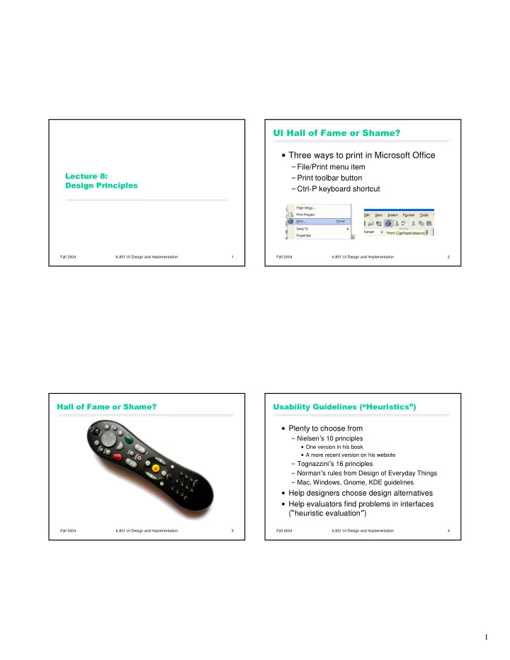

������������������������� � Three ways to print in Microsoft Office � File/Print menu item ����������� � Print toolbar button ����������������� � Ctrl-P keyboard shortcut Fall 2004 6.831 UI Design and Implementation 1 Fall 2004 6.831 UI Design and Implementation 2 ���������������������� ������������� �������!"����������#$ � Plenty to choose from � Nielsen � s 10 principles � One version in his book � A more recent version on his website � Tognazzini � s 16 principles � Norman � s rules from Design of Everyday Things � Mac, Windows, Gnome, KDE guidelines � Help designers choose design alternatives � Help evaluators find problems in interfaces ( � heuristic evaluation � ) Fall 2004 6.831 UI Design and Implementation 3 Fall 2004 6.831 UI Design and Implementation 4 1
��� ������������%��������������� &'�(���������)����*��� � � Use common words, User-centered design � Know your users not techie jargon � Understand their tasks � Fitts � s Law � But use domain-specific � Size and proximity of controls should relate to their importance terms where appropriate � Tiny controls are hard to hit � � Don � t put limits on user- Screen edges are precious � Memory defined names � Use chunking to simplify information presentation � Minimize working memory � Allow aliases/synonyms � Color guidelines � Don � t depend solely on color distinctions (color blindness) in command languages � Avoid red on blue text (chromatic aberration) � Metaphors are useful � Avoid small blue details � Norman � s principles of direct manipulation ������������������������������� but may mislead � Affordances � Natural mapping � Visibility � Feedback Fall 2004 6.831 UI Design and Implementation 5 Fall 2004 6.831 UI Design and Implementation 6 +'�,������������� ����� �� � -�� �����,���������� � Principle of Least Surprise � Internal � Similar things should look and act similar � External � Different things should look different � Other properties � Metaphorical � Size, location, color, wording, ordering, � � Command/argument order � Prefix vs. postfix � Follow platform standards ������������������������������� Fall 2004 6.831 UI Design and Implementation 7 Fall 2004 6.831 UI Design and Implementation 8 2
,����.�������,�����������!��� ��$ /'�������� �������������� � Users don � t read manuals � Inconsistency is appropriate when � Prefer to spend time working toward their task context and task demand it goals, not learning about your system � Arrow keys � But manuals and online help are vital � But if all else is equal, consistency wins � Usually when user is frustrated or in crisis � Help should be: � QWERTY vs. Dvorak � Searchable � Context-sensitive � Task-oriented � Concrete � Short Fall 2004 6.831 UI Design and Implementation 9 Fall 2004 6.831 UI Design and Implementation 10 0'������,��������� ����� �� 1'�2�������������������������� � Keep user informed of system state � Provide undo � Cursor change � Long operations should be cancelable � Selection highlight � All dialogs should have a cancel button � Status bar � Don � t overdo it � � Response time ������������������������������� � < 0.1 s: seems instantaneous � 0.1-1 s: user notices, but no feedback needed � 1-5 s: display busy cursor � > 1-5 s: display progress bar ������������������������������� Fall 2004 6.831 UI Design and Implementation 11 Fall 2004 6.831 UI Design and Implementation 12 3
3'����4���������� �%��������� 5'�%��������6������ � Provide easily-learned shortcuts for frequent � Selection is less error-prone than typing operations � Keyboard accelerators � But don � t go overboard � � Command abbreviations � Styles � Bookmarks � History ������������������������������� � Disable illegal commands ������������������������������� Fall 2004 6.831 UI Design and Implementation 13 Fall 2004 6.831 UI Design and Implementation 14 ������������%���� ,�������%���� � Intended action is replaced by another action � A sequence of actions is replaced by with many features in common another sequence that starts the same � Pouring orange juice into your cereal way � Putting the wrong lid on a bowl � Leave your house and find yourself walking � Throwing shirt into toilet instead of hamper to school instead of where you meant to go � Going to Kendall Square instead of Kenmore � Vi :wq command Square � Avoid habitual action sequences with � Avoid actions with very similar descriptions � Long rows of identical switches common prefixes � Adjacent menu items that look similar Fall 2004 6.831 UI Design and Implementation 15 Fall 2004 6.831 UI Design and Implementation 16 4
(� ��%���� �'�)����������7�8���)����� � Use menus, not command languages � Modes: states in which actions have different � Use combo boxes, not textboxes meanings � Use generic commands where possible � Vi � s insert mode vs. command mode � Caps Lock (Open, Save, Copy Paste) � All needed information should be visible � Drawing palette � Avoiding mode errors � Eliminate modes � Visibility of mode � Spring-loaded or temporary modes � Disjoint action sets in different modes ������������������������������� Fall 2004 6.831 UI Design and Implementation 17 Fall 2004 6.831 UI Design and Implementation 18 9'�%�����)��������7����������7�)���6��� &:'�.����������� �(���������������� � Be precise; restate user � s input � � Less is More � � Not � Cannot open file � , but � Cannot open file named paper.doc � � Omit extraneous info, graphics, features � Give constructive help � why error occurred and how to fix it � Be polite and nonblaming � Not � fatal error � , not � illegal � � Hide technical details (stack trace) until requested ������������������������������� Fall 2004 6.831 UI Design and Implementation 19 Fall 2004 6.831 UI Design and Implementation 20 5
&:'�.����������� �(���������������� ,���;�������������������������� � Meet expectations � Good graphic design 1. Match the real world � Few, well-chosen colors and fonts 2. Consistency & standards 3. Help & documentation � User is the boss 4. User control & freedom 5. Visibility of system status � Group with whitespace 6. Flexibility & efficiency � Align controls sensibly � Handle errors � Use concise language 7. Error prevention 8. Recognition, not recall � Choose labels carefully 9. Error reporting, diagnosis, and recovery � Keep it simple ������������������������������� 10. Aesthetic & minimalist design Fall 2004 6.831 UI Design and Implementation 21 Fall 2004 6.831 UI Design and Implementation 22 <��=��&3����������� ����� �����=� ����� ���)���� � Anticipation � Human interface � Consistency objects � Autonomy � Shortcuts � Latency reduction � Color blindness � Feedback � Learnability � Consistency � Dialog closure � Metaphors � Defaults � Simple error handling � Protect users � � Efficiency � Reversible actions work � Explorable � Readability � Put user in control interfaces � Track state � Reduce short-term memory load � Fitts � s Law � Visible navigation Fall 2004 6.831 UI Design and Implementation 23 Fall 2004 6.831 UI Design and Implementation 24 6
Recommend
More recommend