The Design of Everyday Things Week 1 Luc Renambot renambot@uic.edu - PowerPoint PPT Presentation
User Interface Design and Programming CS422 The Design of Everyday Things Week 1 Luc Renambot renambot@uic.edu Homework The purpose of this assignment is to give you a bit of practice with the material presented in the first week of the class
User Interface Design and Programming CS422 The Design of Everyday Things Week 1 Luc Renambot renambot@uic.edu
Homework The purpose of this assignment is to give you a bit of practice with the material presented in the first week of the class - the design of everyday things. * find a vending machine on campus or surrounding * note down where it is located and what kind of machine it is (pop, coffee, snack, postage stamps, DVD, CTA, etc) * think about how the user interacts with the vending machine. o How does the machine present its capabilities to the user? o What can the user do? o What affordances does the machine present? o How does the user know what to do first? o What kind of feedback does the vending machine give to tell the user about its state?
Homework * draw a 1 page sketch (by hand, no photography allowed) of the vending machine, stressing the user interface details (what does the user see, what can the user press, what is the mapping, etc) * redraw the sketch using a computer and make a printout of it (no scanning allowed) * type a 1 page (8.5 x 11", 10 point font, single spaced) discussion of what is good and what is bad about the interface. Be sure to include your name at the top, and the information on the vending machine itself. Turn in your sketch, the redrawn version, and the 1 page discussion, stapled together.
Course • First we will look at good and bad design in general, independent of computer programs. • We will look at how to effectively present information spending most of the course looking at how to effectively design interfaces. • We will finally look at how to perform evaluation of these traditional interfaces and look at specific case studies.
Plan for Coming Weeks • Introduction & Design of Everyday Things • Information Exploration & Presentation Styles • Principles & Golden Rules • Interaction Devices & Direct Manipulation
Design of Everyday Things • It examines the effect of poor design and equipment failure on human behavior • It covers user-centered design, on everyday things and on everyday actions
Design of Everyday Things • “I just found a Norman door: It was really difficult to open” • “Science Finds, Industry Applies, Man Conforms” • 1933 Chicago World's Fair • More about assimilation
Look around you... • Start by looking at Interfaces for • Doors, Windows • Stove • Projectors • DVD players
Affordances • Perceived and actual properties of a thing, primarily those fundamental properties that determine just how the thing could possibly be used • Affordances provide strong clues to the operation of a thing • Knobs are for turning • Slots are for inserting things into • Provide a good conceptual model and make things visible
Example: Door
Example: Door
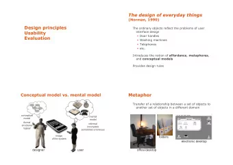
Two conceptual models • The designer's conceptual model • The user's conceptual model
System Image • The system image is the visible part of a device (including the physical structure, the documentation, instructions, etc) • The designer only talks to the user through the system image • If the system image doesn't make the design model clear, then the user will create a different model through their interaction.
Mental Model • Conceptual model of the way something works • Often constructed from fragmentary evidence
Example: Thermostat • Will a room or oven heat (or cool) faster if the thermostat is turned all the way to the maximum setting?
Thermostat • Two 'folk' theories of thermostats • timer theory - thermostat controls the relative proportion of time that the device stays on • valve theory - thermostat controls how much heat (cold) comes out of the device
Thermostat • Both are wrong • Thermostat is an on/off switch • Fully on or fully off - no in between • Design gives no hint to the actual model • User's form their own theories
Automobile • Why is the basic automobile easy to figure out? • Things are visible • Good mappings between controls and things controlled • Single controls have single functions • at least for driving - the radio is another story • Good feedback - immediate and obvious effect
Mapping • Relationship between controls and their affects • Want the mapping to be 'natural' • taking advantage of physical analogies and cultural standards. • Steering wheel • Digital alarm clocks • Stove burners • Light switches
Connector
Connector
Home Examples • No writeups on the appliances • Trial and error • Light switches
Home Examples
Home Examples light switch for fan/lights
Home Examples Porch lights
Home Examples Fuse box and circuit breakers
More Examples • Look at home, around you... • http://www.baddesigns.com • Things that don't work the way you expect • Different things that are too similar • Things that are hard to see • Things that don't work well together • Things that get in your way • Things that are hard to remember • ....
Constraints • Physical • Semantic • Cultural • Logical
Example: Toy
Example: Toy
Forcing function • Up until the late 1940s it was possible to try and start car without the key in the ignition • The key was put in the dashboard to unlock the car and then you pressed the starter button • Now you insert the key and turn it to start the car • Separating these functions is making a comeback, since you can now remotely start some cars without having the key in the ignition
Forcing function • In some cars you need to use the keys to lock the door • Can’t lock keys inside
Forcing function • Interlocks - prevent accidental use of a device • force operations to take place in proper sequence • pin on fire extinguisher or hand grenade • Lockins - keeps operation active preventing someone from permanently stopping it • if you ask a word processor to quit it should ask you if you want to save the modified file you have been working on or discard the changes • Lockouts - prevents an event from occurring • in case of fire, cant go below the first floor on stairs
7 Stages of Action • Forming the goal - state to be achieved (often ill-formed) • Forming the intention - goal translated into intention to perform some action • Specifying an action - translate intention into set of internal commands • Executing the action • Perceiving the state of the world • Interpreting the state of the world • Evaluating the outcome
Example • You reading a book at dusk and its getting dark • Goal • get more light • Forming intention • push the switch on the lamp • Specifying action • how to move body
7 Stages as Design Aid • How easily can a person • Determine the function of the device • Tell what actions are possible • Determine mapping from intention to physical movement • Perform the action • Tell if system is in desired state • Determine mapping from system state to interpretation • Tell what state system is in
Examples • Faucets • Airline rapid check-in machines • Think about these in terms of • Visibility • Mapping • Feedback • 7 Stages of Action
Gulf of Execution • How well does the system allow someone to do their intended actions directly • Do the affordances provided by the system match the actions intended by the person • Bad if not clear what actions need to be done to accomplish the intention
Gulf of Evaluation • How well does the system provide a visible state that can be directly perceived and that is interpretable in terms of the intentions and expectations of the user • How much effort user must exert to interpret the state of the system and determine how well the expectations and intentions have been met
Designing for Error 1. Understand the cause of error and design to minimize those causes 2. Make it possible to reverse (undo) actions, or make it harder to do what cannot be reversed 3. Make it easier to discover errors that do occur and make them easier to correct 4. Think of an object's user as attempting to do a task, getting there by imperfect approximations, Don't think of the user as making errors, think of the actions as approximations of what is desired
Design • Visibility - User can tell the state of the device and the alternatives for action • Good conceptual model - User given consistent in presentation of operations and results • Good Mappings - easy to determine relationships between actions and results, controls and their effects, system state and what's visible • Feedback - User receives full and continuous feedback
Coming Next Time • Information Exploration • Presentation Styles
Recommend
More recommend
Explore More Topics
Stay informed with curated content and fresh updates.
