Slide Design Presentation The campaign for Monster Energy Monster - PowerPoint PPT Presentation
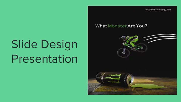
Slide Design Presentation The campaign for Monster Energy Monster Energy Drinks show things such as BMX racing and such while keeping with their consistent color scheme. Advertisement for Monster Energy Drinks COLOR A Closer Look
Slide Design Presentation
The campaign for Monster Energy Monster Energy Drinks show things such as BMX racing and such while keeping with their consistent color scheme. Advertisement for Monster Energy Drinks
COLOR A Closer Look
Consistent use of green, white, and black.
TYPOGRAPHY A Closer Look
The font used here is a Sans-Serif font.
DESIGN A Closer Look
Contrast Repetition Alignment Proximity
New Ad Monster Energy Drink
In comparison to the old ad, the new ad is very similar. They both include BMX. The main difference is the New Ad new ad looks more real. It doesn’t have the spilled drink and the racer coming out of nowhere. The new ad The new ad for Monster Energy also has the slogan for monster, Drinks fits the same campaign as “Unleash the Beast” included. the old.
Recommend
More recommend
Explore More Topics
Stay informed with curated content and fresh updates.
