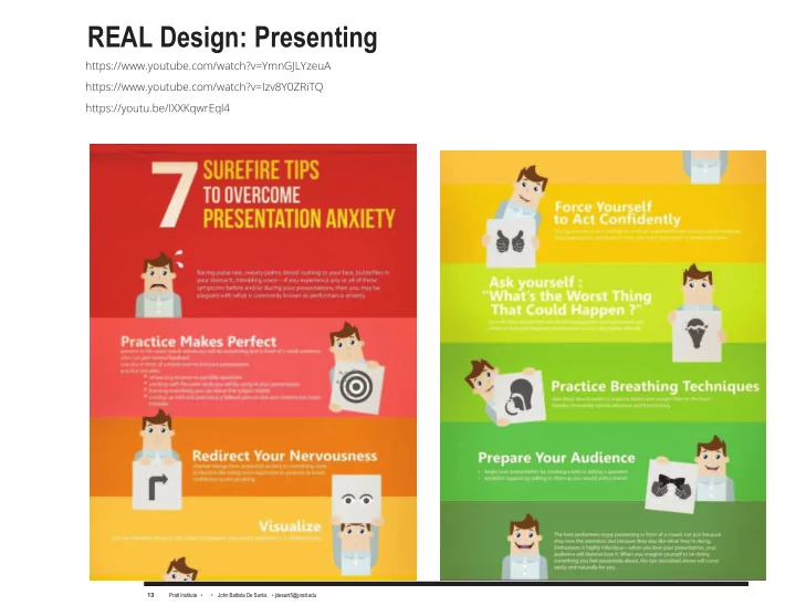

REAL Design: Presenting https://www.youtube.com/watch?v=YmnGJLYzeuA https://www.youtube.com/watch?v=Izv8Y0ZRiTQ https://youtu.be/IXXKqwrEql4 Pratt Institute • ASGR-102-04 Communication Design II • John Battista De Santis • https://commons.pratt.edu/gr20201 • jdesant5@pratt.edu Pratt Institute • • John Battista De Santis • jdesant5@pratt.edu 13 13
Design Technique: Present like a Pro https://www.linkedin.com/pulse/5-rules-presenting-design-concepts-clients-dave-holston Dave Holston Communication, Design and Brand Strategist, Author, 1. The Rule of Good Work The fjrst and most important rule is that you should never show work that you would not want to be associated with. The phenomena of the client choosing the least favorite design is more than legend it is fact “Never, ever, show something you don’t want the client to choose. If in doubt, take it out.” Pratt Institute • ASGR-102-04 Communication Design II • John Battista De Santis • https://commons.pratt.edu/gr20201 • jdesant5@pratt.edu Pratt Institute • • John Battista De Santis • jdesant5@pratt.edu 14 14
Design Technique: Present like a Pro 2. The Rule of Three The rule of three is the most tried and true method for presenting ideas. Creating three options means added work as the designer is required to produce ideas that may not refmect their ideal solution Client’s choice: This is a solid design, that’s not boring, but doesn’t challenge the client too much. This generally falls into the category of “what the client asked for.” Designer’s choice : This is the design that the designer thinks is the best solution. This is generally a highly creative solution that squarely balances business and audience needs. “Wow” design: This option pulls out the stops, pushes boundaries and challenges the client to think beyond the norm. This option probably won't get chosen but it gives you room to expand the conversa- tion about what is possible. Pratt Institute • ASGR-102-04 Communication Design II • John Battista De Santis • https://commons.pratt.edu/gr20201 • jdesant5@pratt.edu Pratt Institute • • John Battista De Santis • jdesant5@pratt.edu 15 15
3. Present in Context It turns the presentation into a “beauty contest ” that pits design aesthetic against design aesthetic, as opposed to staying focused on design strategy. A better approach is to show work in relation to competitors, thereby switching the conversation from “which concept looks best,” to “which concept provides us a competitive advantage.” it’s bet- ter to avoid conversations about the design aesthetic and rather focus on the brand and its meaning in a holistic way. Pratt Institute • ASGR-102-04 Communication Design II • John Battista De Santis • https://commons.pratt.edu/gr20201 • jdesant5@pratt.edu Pratt Institute • • John Battista De Santis • jdesant5@pratt.edu 16 16
4. Name the Concept Rob Swan, senior vice president and executive creative director at BrandImage, has a fjrm rule in his studio: Every concept that is presented to a client has a name. “If you can’t name a con- cept, then there is no idea there,” explains Swan. “ If you can’t name the driving concept behind the design, then it’s just pure aesthetics .” The name provides a clear line of sight from what you are seeing in the design all the way back to the strategy. Pratt Institute • ASGR-102-04 Communication Design II • John Battista De Santis • https://commons.pratt.edu/gr20201 • jdesant5@pratt.edu Pratt Institute • • John Battista De Santis • jdesant5@pratt.edu 17 17
5. Focus On the Problem, Not the Aesthetic The fjrst step in presenting is to show the client that you understand the problem that the design is intended to solve. By reviewing the criteria for success that was established at the beginning of the project, you align the client’s thinking, so that you share a common mind-set. As you show the work, focus on just a few key ideas that support the success criteria. Do not dwell on design elements, like typography or other design specifjcs, unless the client asks. What the client more likely wants to know is how the design meets his need. Discussing de- sign is a trap that many designers fall into. They believe the client is as interested in the layout grid and typography as they are. Discussing such things invites the client to art direct the project, which is never desirable. Pratt Institute • ASGR-102-04 Communication Design II • John Battista De Santis • https://commons.pratt.edu/gr20201 • jdesant5@pratt.edu Pratt Institute • • John Battista De Santis • jdesant5@pratt.edu 18 18
6. Present in Person “I hate to present in PDF form. It is the weakest way to put your work out into the world. You have no con- trol over the way the client looks at the PDF and handles the PDF They show it to a bunch of people who haven’t been involved and get scattered opinions.” Vrontikis presents comps and discusses them with the client, but usually takes the comps with her when she leaves the meeting. Her rationale for doing so is not one of distrust of her client, but that the purpose of the meeting is to review the comps in a professional atmosphere, where she can be present to answer questions. Be a Presentation Pro Presenting concepts is a combination of strategy and theater. The ability to present ideas clearly to the client is often the difgerence between success and failure, so it’s worth planning and rehearsing. Presenting your work in a professional manner with set standards and protocols establishes you as an expert and author- ity. Regardless of how good the design solution is, it must be communicated in such a way that the client has a rationale for liking it. Pratt Institute • ASGR-102-04 Communication Design II • John Battista De Santis • https://commons.pratt.edu/gr20201 • jdesant5@pratt.edu Pratt Institute • • John Battista De Santis • jdesant5@pratt.edu 19 19
Lecture: 11 Ways to Screw Up Client Presentations by Mike Monteiro https://youtu.be/IXXKqwrEql4 The hardest part of design is presenting work. You can't even argue about this. I've seen people who did amazing work get up in front of a client and lay eggs. I've also seen people do alright work and work clients around their little fjnger. Optimally, you want to do good work and present it well. But I'd rather have a good designer who can present well than a great designer who can't. Can you to be a good designer if you can't present your work to a client. Work that can't be sold is as useless as the de- signer who can't sell it. It is not an additional skill. Presenting is a core design skill. Pratt Institute • ASGR-102-04 Communication Design II • John Battista De Santis • https://commons.pratt.edu/gr20201 • jdesant5@pratt.edu Pratt Institute • • John Battista De Santis • jdesant5@pratt.edu 20 20
Ways to Screw Up Client Presentations 1. Seeing the client as someone they have to please Your client hired you because you are the ex- pert at what you do . They are the expert at the thing they do. And you have been brought in to add your expertise to the client's expertise to help them accomplish their goal. (If you're presenting work and unclear on what that goal is we have a bigger problem than this article is going to address.) What they didn't hire you to do is make them happy, or be their friend. Your decisions should revolve around achieving that goal, not pleasing the client. And while you should do everything in a professional and pleasing manner, never confmate helping the client achieve their goal with making them happy. They will ask you to do things that run counter, in your expertise, to achieving the goal. Your job is to convince them oth- erwise. In the end, they will be better served if you see yourself as the expert they believe they hired. And while this may Pratt Institute • • John Battista De Santis • jdesant5@pratt.edu Pratt Institute • ASGR-102-04 Communication Design II • John Battista De Santis • https://commons.pratt.edu/gr20201 • jdesant5@pratt.edu 21 21
Ways to Screw Up Client Presentations result in some unpleasant conversations during the project, having unpleasant conversations is sometimes part of the job. 2. Not getting off your butt This is your room. Your fjrst job is to inspire confjdence. Not just confjdence in your work, but also confjdence in your client that they hired the right person. Every interaction is an opportunity to reaffjrm their decision in hiring you. Get ofg your ass and lead this meeting. You'll seem more confjdent if you're standing up. Your voice will carry better. Be the authority on design your client hired. Work the room. Walk to where you're needed. Being on your feet will allow you to walk from person to person as they ask questions, simultaneously making you look more confjdent and allowing for more intimacy. It should go without saying that you dressed nicely and your hands are out of your pockets. Now run your presentation, sport. Pratt Institute • ASGR-102-04 Communication Design II • John Battista De Santis • https://commons.pratt.edu/gr20201 • jdesant5@pratt.edu Pratt Institute • • John Battista De Santis • jdesant5@pratt.edu 22 22
Recommend
More recommend