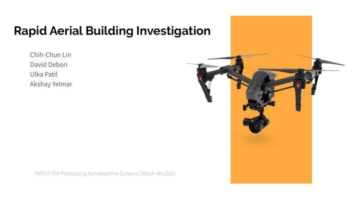

Rapid Aerial Building Investigation Chih-Chun Lin David Debon Ulka Patil Akshay Yelmar
Problem Space
Design Scenario Fire alarm reported at a high rise apartment ● Target users ● ○ First Due Officer Incident Commander ○ Scene size-up - 360 walkaround ● Are people in danger? ○ ○ Where is the fire located and its size What is the structure status? ○ No visible sign of fire from the ground ● Building Intelligence ●
Current Options Helicopter ● Costly to operate ○ Restricted airspace ○ Dangerous operating conditions ○ Slow to the scene ○ Aerial Apparatus ● Has a large footprint ○ Immobile once set ○ Limited view ○ Drones? ●
Calamas, Sarah. “6 Takeaways on How Fire Departments Are Using Drones and the Barriers Preventing Purchase.” FireRescue1 , 20 Feb. 2018, www.firerescue1.com/emergency-response-in-the-drone-age/articles/6-takeaways-on-how-fire-departm ents-are-using-drones-and-the-barriers-preventing-purchase-CDQozj7OMa49hjHd/.
Calamas, Sarah. “6 Takeaways on How Fire Departments Are Using Drones and the Barriers Preventing Purchase.” FireRescue1 , 20 Feb. 2018, www.firerescue1.com/emergency-response-in-the-drone-age/articles/6-takeaways-on-how-fire-departm ents-are-using-drones-and-the-barriers-preventing-purchase-CDQozj7OMa49hjHd/.
Barriers to Entry Cost ● Training ● Regulations ● Calamas, Sarah. “6 Takeaways on How Fire Departments Are Using Drones and the Barriers Preventing Purchase.” FireRescue1 , 20 Feb. 2018, www.firerescue1.com/emergency-response-in-the-drone-age/articles/6-takeaways-on-how-fire-departm ents-are-using-drones-and-the-barriers-preventing-purchase-CDQozj7OMa49hjHd/.
Design Focus Perform Scene Size-up and Building ● Investigation quickly Keep costs low ● Simplified controls to lessen training time ●
Ideation
10x10 sketches - devices
Foldable Wearable
Projector Gesture
Deciding the approach- Hand-held - Portable - Easy to grip - Sturdy - Weather proof
10x10 sketches - interface
Scenario/Storyboard
Takeaways from sketching/storyboarding - Hand-held, portable device for emergency situation - Physical buttons for easy operation - Different camera modes to monitor various situation
Building the initial prototypes Option A Option B Option C
Option A - front and back buttons Zoom in/out Changing camera mode flight control Power on/fail safe Front buttons Back buttons Camera control
Option B - Voice control flight control camera control
Option C - Voice and gesture control camera control Dial switch camera mode
Evaluation
Multivariate user testing Variants: 3 models ● Participant details: Masters in HCI student ● Female ● 24 years old ● User is a beginner with drone controls ● Tasks performed: Take off - Find the target - Detect Fire - Hover - Adjust Camera - Monitor Scenes ●
User testing Feedback on Physical device Camera controls were confused as flight controls Did not understand the hover button Chose the Option C ●
User testing Feedback on Screens User did not understand what ‘HD’ meant User was not able to recognize the button for hover User was not able to recognize the buttons for zoom User required guidance in completing the tasks ●
Going ahead with the Option C
Self-walkthrough Feedback on Physical device Buttons required for Altitude, Flight Take off, Flight land and Record ● No need of the controls for flight ● The model needs to be more sturdy ●
Self-walkthrough Feedback on Screens No need of the screen buttons for flight take off and land ● Need information on wind speed, wind direction, heat and humidity ● No need of the screen zoom controls, voice and gesture commands ●
Final Design Direction
Final Prototype Core functions - Control video/thermal imaging camera - Adjustment and zoom - Switching camera modes - Display mission-critical data
Camera adjustment and zoom Tasks - Assess fire from various angles and viewpoints Slider for zoom Joystick for adjusting camera view
Switching camera modes Tasks - Look for people in danger - Look for hotspots - Assess size of the fire Dial switch for camera modes
Monitoring the scene Tasks - View critical data - Look for openings - Monitor structural integrity Mission-critical Structural data information
Why this design approach? - Simple design > Avoids steep learning curve - Portable solution - Physical buttons - Robust design (water/shock proof) - Fail-safe options - Scope for adding functionalities in future
Process
Materials - Paper - Cardboard - Foam - Plastic
Challenges faced - Organizing the small components - Drawing icons and labels by hand - Size and placement of the buttons - Hand-drawn wireframes
Learn Iterate
Thank You
Recommend
More recommend