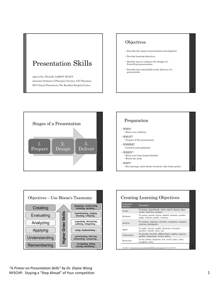

Objectives • Describe the stages of presentation development • Develop learning objectives Presentation Skills • Identify ways to enhance the design of a PowerPoint presentation • Describe tips and pitfalls in the delivery of a presentation Agnes Cha, PharmD, AAHIVP, BCACP Associate Professor of Pharmacy Practice, LIU Pharmacy HIV Clinical Pharmacist, The Brooklyn Hospital Center 2 Preparation Stages of a Presentation • WHO? Know your audience • WHAT? Purpose of the presentation 1. 2. 3. • WHERE? Prepare Design Deliver Location and equipment • WHEN? Know your time frame/schedule Watch the clock • WHY? Key message, main theme (content), take home points 3 4 Creating Learning Objectives Objectives – Use Bloom’s Taxonomy Cognitive Examples Domain To design, hypothesize, write, report, disucss, plan, Create create, construct, prepare. To assess, attach, choose, defend, estimate, predict, Evaluate judge, criticize, justify, evaluate. To analyze, organize, calculate, categorize, compare, Analyze contrast, distinguish. To apply, choose, modify, illustrate, interpret, Apply practice, classify, solve, use. To classify, describe, differentiate, explain, express, Understand outline, summarize, review, select. To list, define, duplicate, list, recall, name, order, Remember recognize, state. 6 Available at: https://www.acpe-accredit.org/pdf/Blooms_Taxonomy.pdf Accessed 8/8/17 “A Primer on Presentation Skills” by Dr. Elaine Wong 1 NYSCHP: Staying a “Step Ahead” of Your competition
Learning Objectives are SMART Design - Font Specific Single type of font for most of presentation Select a “sans” font (other fonts may be difficult to read) May consider different colors, sizes, & styles for impact or emphasizing Time Measurable Do not use ALL CAPS (titles may be exception) No smaller than ~18 to 20 point Test the font: stand 6 ft back from monitor – can you see? Larger font (35 to 45 points) or different color for Results Attainable titles 8 Design – Slide template Design – Special Effects • Slide template: • Color: • Special effects: Keep the background consistent & subtle Transitions, Contrast is good, BUT limit animations, audio, number of colors on a single Contrast text with background screen videos Use judiciously! • Content: • Graphics: Avoid clutter! No paragraphs! Clearly label / title each slide – does content Helps illustrate your point match slide? Limit graphics per slide Use charts / tables when One thought per line appropriate Bullets: 6 x 6 Rule – no more than 6 words Make labels for charts / per line, or 6 lines per slide graphs Align text (not centered) References AMA style Check spelling & grammar 9 10 Delivery Delivery Tips DO’s DON’Ts • Question & Answers session Research your topic, know your stuff, what’s the latest & greatest? Repeat the audience’s question before answering Do not makeup an answer admit what you don’t Introduce self know Read slides Closeout with a “thank you” Show confidence Turn back to audience • Show up early Pace yourself Use verbal fillers Familiarize yourself w/ the room & adjust to Make eye contact surroundings Excessive hands Pronounce correctly Test the equipment Forget to breathe Dress the part Where will you be standing? Podium? Microphone? 11 12 “A Primer on Presentation Skills” by Dr. Elaine Wong 2 NYSCHP: Staying a “Step Ahead” of Your competition
Delivery Tips • Technology Pointer: laser, wireless mouse, wired mouse, finger Back-up files using multiple means (email, USB) Time check? – watch, clock, timer on computer PRACTICE, PRACTICE, and more PRACTICE Have someone review your slides Mock presentations: self / mirror, colleagues, family, friends Do your slides look the same when projected? Transitions Be able to deliver presentation w/o notes Water Rest does a body good! 13 “A Primer on Presentation Skills” by Dr. Elaine Wong 3 NYSCHP: Staying a “Step Ahead” of Your competition
Recommend
More recommend