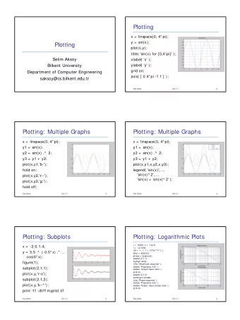
Lecture 4: Visualization Outline Basic plotting commands Types of - PowerPoint PPT Presentation
Lecture 4: Visualization Outline Basic plotting commands Types of plots Customizing plots graphically Specifying color Customizing plots programmatically Exporting figures Why use Matlab for visualization? Matlab is
Lecture 4: Visualization
Outline • Basic plotting commands • Types of plots • Customizing plots graphically • Specifying color • Customizing plots programmatically • Exporting figures
Why use Matlab for visualization? • Matlab is flexible enough to let you quickly visualize data, and powerful enough to give you complete control over the final product • Features: • Interactive plotting • simple 3D plotting • programmatic annotation
Basic Plots • 2D Visualization • plot (line plots) • histogram • scatter (scatter plots) • image/imagesc (images) • 3D Visualization • surf/mesh (surfaces) • plot3 (lines) • scatter3
Working with Figures • Create a new figure : figure(); • Specify a figure number: figure(1) • Hold onto a figure “handle” • figHandle1 = figure(1); • Re-select a figure: • figure(figHandle1) • Some useful functions: • clf: clear figure • close all: closes all figures • gcf: get handle to current figure
Demo: Figures
plot — Syntax:�plot(x,y)�plots�points�in�the�vector�y�against� points�in�the�vector�x
histogram/bar — Syntax:�histogram(y)�plots�a�histogram�of�the�values� in�y,�bar(x,y)�plots�bars�at�the�points�given�by�(x,y)
scatter — Syntax:�scatter(x,y,s,c)�lets�you�specify�the�size�(s)� and�color�(c)�of�each�point�given�by�(x,y)
image/imagesc — Syntax:�image(C)�plots�the�values�stored�in�the� matrix�C�as�an�image
surf & mesh — Syntax:�surf(x,y,z)�and�mesh(x,y,z)�are�used�to� visualize�a�surface�in�three�dimensions
plot3 — Syntax:�plot3(x,y,z)�plot�points�in�3D
Demo: Plot Types http://www.mathworks.com/help/matlab/2-and-3d-plots.html
subplots — the�‘subplot’�command�let’s�you�plot�multiple�plots�on�one�figure� — syntax:�subplot(nRows,�nCols,�index) (Figure�1) subplot(1,3,1) subplot(1,3,2) subplot(1,3,3)
subplots — the�‘subplot’�command�let’s�you�plot�multiple�plots�on�one�figure� — syntax:�subplot(nRows,�nCols,�index) (Figure�2) subplot(3,2,1) subplot(3,2,2) subplot(3,2,3) subplot(3,2,4) subplot(3,2,5) subplot(3,2,6)
Demo: Subplots
Other functions — gca�����������������get�handle�to�current�axis� — panel
Panel() — user-submitted�function�from�Matlab�File�Exchange�(FEX)� — http://www.mathworks.com/matlabcentral/fileexchange/20003-panel — Provides� MUCH% more�control�over�subplot�positioning,� layout,�margins,�etc.
Customizing Graphs Graphically Plot Tools
Demo: Customizing Graphically
The plot() function (again) • Plot() plots along dimension 1 of an array. • If there are multiple dimensions, plot creates a separate line for each column • If your data isn’t constructed this way, just transpose with the apostrophy character: • plot(data’)
Demo: Plot()
The plot() function (again) • For line plots, specify the line type using a format string: • plot(x,y,’b’) % plots blue line (default) • plot(x,y,’b.’) % plots blue dots • plot(x,y,’b:’) % plots blue dotted line • plot(x,y,’k--’) % plots black dashed line • plot(x,y,’ro’) % plots red circles • Chain together characters for full specification of color, marker, and line • plot(x,y,’ro-’) % plots red circles with solid line • plot(x,y,’ro:’) % plots red circles with dotted line
Plot Line Style • For line plots, specify the line type using a format string: • plot(x,y,’b’) % plots blue line (default) • plot(x,y,’b.’) % plots blue dots • plot(x,y,’b:’) % plots blue dotted line • plot(x,y,’k--’) % plots black dashed line • plot(x,y,’ro’) % plots red circles • Chain together characters for full specification of color, marker, and line • plot(x,y,’ro-’) % plots red circles with solid line • plot(x,y,’ro:’) % plots red circles with dotted line
Plot Line Style
Demo: LineSpec
Customizing Programmatically • Everything you can do graphically you can also do programmatically. • DON’T do something by hand if you have to do it more than once! • Examples • axes labels: xlabel(‘text’), ylabel(‘text’) • plot/axis title: title(‘text’) • Add text: text(x,y, ‘text to add’)
Customizing Programmatically • Graphics parameters are usually specified as ‘ parameter’, value pairs: • plot(x,y, ’linewidth’, 1.4) • plot(x,y, ’bo-‘, ’linewidth’, 2, ‘markersize’, 15) • plot(x,y, ‘o-’,‘MarkerFaceColor’, [1 0 0],‘markerEdgeColor’, [0 0 1])
Other useful functions • grid on adds grid lines • axis off turns off the axes • colorbar adds a colorbar to image plot • colormap hot switch colormap
Demo: Customizing Programmatically
Plot colors Matlab has 8 built-in colors: Black (k), Red (r), Blue (b), Green (g), Cyan (c), Magenta (m), Yellow (y), White (w) We can specify other colors using RGB (red, green blue) notation: red = [1 0 0] blue = [0 0 1] All RGB colors are 1x3 green = [0 1 0] arrays and all elements gray = [0.2 0.2 0.2] between 0-1. black = [0 0 0]
Demo: Color
Colormaps Colormaps are used to specify how data gets mapped onto di ff erent colors. Matlab has a few built-in colormaps, but you can also specify your own!
Why are colormaps important?
Much better!
Avoid the default colormap (jet)
Manipulating Figures Figures in Matlab are referenced using “handles”, which are pointers to di ff erent parts of the figure. Example: myhandle = plot(x,y); Will return a handle to the plot. Then you can run the following: get(myhandle); % to see a list of properties set(myhandle,‘Name’,Value); % to set the value of a property
Manipulating Figures Di ff erent parts of the figure are organized hierarchically: >> gcf >> gca >> get(gca,'Children') >> get(gcf,'Children')
Demo: Annotating plots
Exporting Figures - Formats Matlab saves figures using it’s own .fig format. To share figures or view outside matlab, export to other formats, including: JPG , PNG , EPS , PDF , TIFF
Bitmap vs. Vector graphics Two main classes of image formats: bitmap vs. vector graphics Bitmap (jpg, png): • Fixed image sizes • Best for actual images (pictures of stu ff ) Vector (eps, pdf): • Variable image sizes • Best for line / bar graphs, scatter plots, etc.
Exporting Figures print(figHandle,filename,formattype) e.g.: print(figure(1), ’MyPlot’,’-dpng’) formats: ‘-dpng’, ‘-depsc2’, ‘-dpdf’, etc add flag for resolution: ‘-r300’, etc
Demo: Exporting Figures
Other Resources 2D and 3D visualization examples: http://www.mathworks.com/help/matlab/2-and-3d-plots.html Custom colormaps: http://colorbrewer.org Panel http://www.mathworks.com/matlabcentral/fileexchange/20003- panel Colors in figures (blog post) http://figuredesign.blogspot.com/2012/04/meeting-recap-colors- in-figures.html
Poor Graphs Cawley et. al., Cell, Volume 116, Issue 4, 20 February 2004.
Poor Graphs 100% 75% Proportion 50% 25% 0% <30 30- <33 33- <36 36- <39 >=39 All Hematocrit Group(%) <=8,738 units/wk >8,738-13,944 units/wk >13,944-21,692 units/wk >21,692 units/wk Cotter et. al., Journal of Clinical Epidemiology 57 (2004)
Recommend
More recommend
Explore More Topics
Stay informed with curated content and fresh updates.









![2D PLOTTING Basic Plotting plot([1,2,3,4], [1,2,1,2]) All plotting commands have 2 similar](https://c.sambuz.com/1007082/2d-plotting-basic-plotting-s.webp)
