
Interaction design for operator control IxD1 / Ngatye Brian Oko
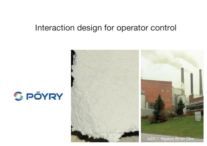
The factory
The control room
notes
notes
fi rst ideas
user analysis
who? - Both genders / Married or single - Age: 20-70 years - Education: Higher than high school / Certi fi cate in mechanical or technological studies - Gets special training - Different nationalities - Working in group / Sociable what? - Works 4 days a week - 12h working hours (90% in the control room 10% in the factory)
how? Exchange Check
how? Coffe break 6-9 h seated
how? Activities during the shift
design Brainstorming oportunities - Sharing information - Data history - Computer learns behaviour - Share screen - Guidance - Suggestions - Keep person engaged - Sequence recorder - Reward - Physical interaction - Non visual communication - Remote device - Remote controlling - Transferring info to the maintenance
research - Cognitive load - Human factors - Data visualization - Other control rooms
research fi ndings 2 Chris Bennett & Jody Ryall & Leo Spalteholz & Amy Gooch / Aesthetics of Graph Visualization - Cognitive load Perceived at a glance Information overview 5-9 elements max. Aesthetics matter Figure 1: Conceptual model of the factors involved in the interpretation of graph visualizations. 2. Perception & Cognition thorough treatment of Gestalt principles as they apply to graph drawing, assigning the principles to perceptual group- Node-link diagrams are simply a collection of points and ing and perceptual segregation categories. lines. Involuntary and voluntary processes drive the viewer’s ability to extract shapes and draw meaning from such dia- Perceptual grouping principles include: grams. Norman [Nor04] groups these processes into three • Good figure – refers to the simplicity and stability of a levels: visceral, behavioural, and reflective. The visceral figure [WS06]; level includes the basic perceptual tasks of distinguishing • Similarity – elements with common features, such as objects and forming our true first impressions. The be- colour or shape, appear to be grouped [WS06]; havioural level builds upon output from the perceptual level, • Continuation – colinear or near colinear elements tend to and focuses on issues such as readability and usability. The be grouped [DS06]; reflective level refers to the higher levels of emotion and cog- • Proximity – elements that are closer are more likely to be nition. Originally applied to the design of everyday things, grouped [DS06,WS06]; this model can help us to understand how we process and • Connectedness – physically connected elements are usu- evaluate graph visualizations. ally grouped [WS06]; and • Familiarity – elements that seem familiar or meaningful 2.1. Visceral Level are more likely to be grouped [WS06]
research fi ndings - Human factors Prevention
research fi ndings - Data visualization Concise Structure Versatility
research fi ndings - Other control rooms Dark Too many buttons Alienated
inspiration
inspiration
ideation concepts
ideation concepts
ideation concepts
ideation concepts
ideation concepts
function analysis - Show 3-5 parameters - Allow change parameters - Enhance physical interaction - Show history - Show overall situation - Analyse trends - Communicate changes - Has information hierarchy - Show relevant analysis - Record data - Guide the operator / Learning - Show information regarding the exterior - Connect the operator with the environment - Include people with visual dif fi culties
design goals - Enhance physical interaction (Natural) - Physical product related to the interface - Proposals about the environment - Use the interaction to decrease the stress
concept direction
concept direction
concept direction
On the range Out of range concept direction
concept direction
user tests
user tests
user tests
user tests
user tests
user tests
concept advantages - Visual change = prevention of sudden rush - Clock = Overall, history and the time now - History = preventing errors - Weather forecast = not isolated - Compare parameters = deeper understanding of the quality - Device = Communication, Engagement, get physical - Indicating = Locate the problem
thank you
Recommend
More recommend