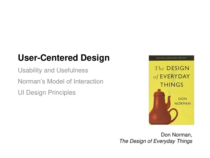
User-Centered Design Usability and Usefulness Normans Model of - PowerPoint PPT Presentation
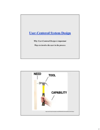
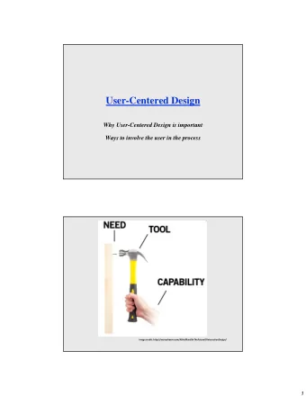
User-Centered Design Usability and Usefulness Normans Model of Interaction UI Design Principles Don Norman, The Design of Everyday Things What innovation made watching television easier? 2 http://www.tvhistory.tv 3 4 Devices capability
User-Centered Design Usability and Usefulness Norman’s Model of Interaction UI Design Principles Don Norman, The Design of Everyday Things
What innovation made watching television easier? 2
http://www.tvhistory.tv 3
4
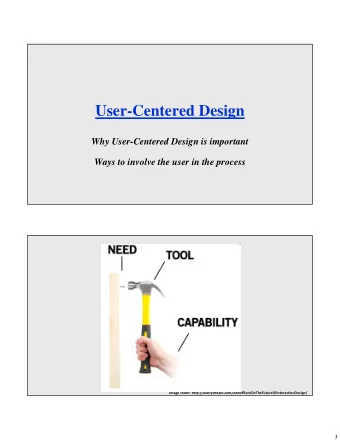
Devices capability Humans time Buxton, W. (2001). Less is More (More or Less), in P. Denning (Ed.), The Invisible Future: The seamless integration of technology in everyday life. New York: McGraw Hill, 145 – 179. 6
Usability and Usefulness Usability is the pragmatic component of user experience, including effectiveness, efficiency, productivity, ease-of-use, learnability, retainability, and the pragmatic aspects of user satisfaction. Usefulness is the component of user experience to which system functionality gives the ability to use the system or product to accomplish the goals of work (or play). Best Compromise high Usefulness Worst Compromise low high low Usability 9
The Importance of Usability “All other things being equal, a product that affords a better user experience often outsells ones with even more functionality. For example, take the Blackberry; once a market leader in smartphones but now outclassed by the iPhone, a later entrant into the market with less functional capabilities.” “Most users assume that they are getting correct and complete functional capability in their software, but the interface is their only way to experience the functionality. To users, the interaction experience is the system. ” - Hartson and Pyla. The UX Book. 2012. 10
Good Door Usability 11
Poor Door Usability 12
?!?!? 13
Example: Refrigerator Control warm cold warm cold Refrigerator Freezer Suppose the refrigerator is at the correct temperature. The freezer is too cold. What do you do? You can’t really check your work for 24 hours… 14
Example: Refrigerator Function It looks like two independent temperature controls It’s actually one temperature control and a cold air valve 15
User Mental Model (or Conceptual Model) What the user believes about the system (how system works, what state system is in) - “if I do ________, the system will do ________” - “the system is ________” Frequently, a mental model is inaccurate or incomplete compared to system model mental model system model perceive present express translate User Interactive System 16
Refrigerator User Model vs. System Model mental model The user’s mental model is two independent temperature controls system model The system model is one temperature control and a cold air valve 17
Three Models of a System Developer’s model : how the developer believes system is used System model : how the system actually works User’s model : how the user believes system should be used developer’s user’s system model mental model model Developer and User communicate via the system - Goal is to have both images align as closely as possible 18
It is not poor users capabilities, but poor design that leads to this kind of developers meme. 19
Don Norman’s Model of Interaction Execution : What we do to the system to achieve a goal Evaluation : Comparing what happened with our intended goal Evaluation I have a goal! User System Execution 20
Execution Stages Evaluation Stages 1. Physically perceive the current 1. Form an intention to act to state of the system achieve a goal 2. Interpret that perception 2. Plan a sequence of actions to according to experience fulfill that intention 3. Evaluate the interpreted state 3. Execute planned actions with compared to our goal physical movements I have a goal! Interpret Evaluate Perceive State State State 1. Intention 3. Execute 2. Plan to Act Actions Actions 21
Gulf of Execution and Gulf of Evaluation Gulf of Execution : Difficulty translating user’s intentions into actions allowed by system. Can user carry out their intentions? Gulf of Evaluation: Difficulty in interpreting the state of the system to determine whether our goal has been met. Gulf of Evaluation I have a goal! Interpret State Evaluate State Perceive State Intention to Act Execute Actions Plan Actions Gulf of Execution 22
The Value of the Model Gulfs contribute to an incorrect mental model. The goal of design is to minimize gulf of execution and gulf of evaluation. … tell if system … map state to I have a state means interpretation? … perceive the goal! goal is met? system state? … tell what … perform the … map actions are action? intention to possible? actions? 23
UI Design Principles Don Norman’s “fundamental” design principles Basic principles which reduce gulf of execution and evaluation and create a more correct mental model for user - Perceived Affordance - Mapping - Constraints - Visibility/Feedback - Metaphor 25
Perceived Affordance What you think you can do with an object, based on perceived properties. What influences our perception of affordances and the manner in which we develop mental models? - Individual histories (e.g. have you seen this before?) - Cultural background (e.g. how things are described in your culture) “click” “pull” “push” “drag” 26
Constraints Guide by preventing certain actions while enabling/encouraging others Norman’s Lego Motorcycle Experiment Physical Constraints - Bricks can only fit certain ways Semantic Constraints - Riders face forwards, wheels touch the ground Cultural Constraints - Red means brake light Logical Constraints - No leftovers! All pieces shoulde be used. 28
Constraints in User-Interfaces Physical, Logical, Semantic, Cultural? 29
Mappings The relationship between two things, in this case between the control movement and the results in the world. - Doors: bars/plates for pushing, handles for pulling - Conventions: up/clockwise for “more” GUIs: Components often mimic physical controls and follow same conventions and mappings. 30
Mappings in User Interfaces Physical actions of input device mapped to UI instrument Instruments actions mapped to object of interest Recall instrumental interaction - Degree of integration, degree of compatibility 31
Visibility Make relevant parts visible and convey the correct message - Doors: Parts often gave the wrong message (pull vs. push), but hinges made visible the swing direction (though poorly) - GUIs: Make controls visible, either on-screen on in menus. List keyboard short-cuts in menus. Communicating what action has actually been done; what result has been accomplished. - Refrigerator: Feedback loop is terribly slow. - GUIs: Every action should give feedback. If can’t be completed immediately, give some sort of progress indicator. 33
Feedback Execution Feedback that will help guide the user to act. i.e. communicate affordances Does widget effectively communicate: • That it is enabled/disabled? • That it has focus? Its current state? • Evaluation Feedback to communicate that an action has been successful (or failed). Communicate change in state and/or current state to the user e.g. “File has been successfully renamed from ‘f1’ to ‘bf1’” • If there’s an error, make sure to provide sufficient details for the user to correct their input. 34
Metaphor Set of unifying concepts in a GUI used to simplify interaction with a computer system Done by borrowing concepts from one domain (the source or vehicle) and applying them to another (the target or tenor) Scale can vary from system to application to UI feature Examples: - The desktop metaphor in windowing systems - Assembly-line metaphor for a new car configurator 35
Benefits of Metaphors Common language for objects - Window, Recycle Bin/Trash, Folders, Files Guide for cognitive semantics of system - Windows allow you to look into a house, or into a document - Recycling allows you to reclaim storage Analogy to explore similarities and differences - Computer window has scrollbars, more similar to a repositionable viewport - Differences arise because characteristics of the target cause inconsistencies in the metaphor 36
Inconsistencies in Metaphors Original Mac trash - Delete files on computer - Eject disk from drive File system metaphor - Original Mac had all file systems on desktop - BeOS had external drives on the desktop and internal drives in a “Computer” icon - Windows had all file systems in a “Computer” icon 37
Metaphor Gone Too Far Microsoft Bob (1995) 38
Recommend
More recommend
Explore More Topics
Stay informed with curated content and fresh updates.
