
Handy: a new Interaction Device Handy: a new Interaction Device for Vehicular Information Systems for Vehicular Information Systems G. Costagliola, Costagliola, S. Di Martino S. Di Martino , , F. F. Ferrucci Ferrucci G. Dip. di Matematica Matematica e e Informatica Informatica Dip. di Università à di Salerno di Salerno Universit G. Oliviero, Oliviero, U. U. Montemurro Montemurro, A. Paliotti , A. Paliotti G. Electric and Electronic Systems Electric and Electronic Systems Elasis SCpA Elasis SCpA – – Fiat Fiat Group Group
Outline Outline Motivations Motivations – Automotive HMI issues Automotive HMI issues – The proposal The proposal – The The Handy Handy device device – – The GUI The GUI – – Some preliminary evaluation Some preliminary evaluation – Conclusions and future work Conclusions and future work
Automotive HMI Automotive HMI Many studies report In- -Car Telematics Systems induce Car Telematics Systems induce Many studies report In an heavy visual workload on users, affecting negatively an heavy visual workload on users, affecting negatively road safety. road safety. Due to the safety concerns, US, EU and Japan have Due to the safety concerns, US, EU and Japan have identified as a short term priority short term priority the research on the research on identified as a Human- -Machine Interaction Machine Interaction for the vehicular domain. for the vehicular domain. Human Traditional HCI approaches cannot be effectively Traditional HCI approaches cannot be effectively applied to the automotive domain applied to the automotive domain – User/driver can dedicate only a few burst of attention to interact ct – User/driver can dedicate only a few burst of attention to intera with telematics system. with telematics system. – ITS can show only a reduced amount of information. – ITS can show only a reduced amount of information. – – Automotive users can have very heterogeneous skills Automotive users can have very heterogeneous skills
Related work Related work Jaguar S S- -Type Type Jaguar Alfa Romeo Connect Alfa Romeo Connect Audi / Volkswagen Audi / Volkswagen BMW iDrive iDrive BMW
The Proposal The Proposal
The project objectives The project objectives Fiat research centre research centre Elasis Elasis , and University of Salerno , and University of Salerno Fiat jointly worked on a EU granted project jointly worked on a EU granted project The goal: to define a novel interface allowing drivers to The goal: to define a novel interface allowing drivers to manage the functionalities of next- -generation telematics generation telematics manage the functionalities of next systems. systems. The main requirements for the system were: The main requirements for the system were: – Reduce the distraction (and in particular the visual workload) – Reduce the distraction (and in particular the visual workload) inducted by the system; inducted by the system; – Easy to use for naï ïve users; ve users; – Easy to use for na – Quick to use for expert users; – Quick to use for expert users; – Cost- -effective to industrialize in the next 2 effective to industrialize in the next 2- -3 years. 3 years. – Cost
Handy’ ’s s Rationale Rationale Handy Interaction with an ITS consists of three phases: Interaction with an ITS consists of three phases: 1.User has to search on the ITS faceplate the hardware User has to search on the ITS faceplate the hardware 1. control suited for the specific task, control suited for the specific task, 2.then ( then (s)he s)he has to place his/her hand or fingers on that has to place his/her hand or fingers on that 2. (typically small) control, and (typically small) control, and 3.finally ( finally (s)he s)he has to interact with the control in order to has to interact with the control in order to 3. achieve his/her goal. achieve his/her goal. The main goal of the proposed device is to The main goal of the proposed device is to minimize the distraction of points 1) and 2) minimize the distraction of points 1) and 2)
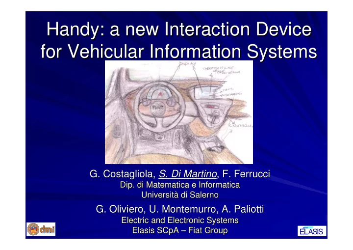
The Handy Handy device device The The idea is to have a remote The idea is to have a remote device, placed on the driver seat device, placed on the driver seat arm rest, just behind the gear arm rest, just behind the gear lever. lever. The device is characterized by The device is characterized by an ergonomic, comfortable an ergonomic, comfortable shape, recalling hand’ ’s palm. s palm. shape, recalling hand It encompasses: It encompasses: – a rotary wheel, placed under the – a rotary wheel, placed under the forefinger, forefinger, – and four and four soft soft- -buttons buttons , , – One placed under the thumb One placed under the thumb Three under the other fingers. Three under the other fingers.
Considerations Considerations The main advantage introduced by Handy Handy The main advantage introduced by is that users are always aware of both its is that users are always aware of both its position and of the displacement of their position and of the displacement of their fingers with respect to the interaction fingers with respect to the interaction controls. controls. Handy provides the user with at most 7 provides the user with at most 7 Handy actions, fitting the 7 7± ±2 capacity 2 capacity of the of the actions, fitting the typical user's processing load typical user's processing load
Semantic of the Handy Handy’ ’s s controls controls Semantic of the Control Type Features Control Type Features S1 Clickable The semantic associated with the S1 Clickable The semantic associated with the and tiltable and tiltable rotations, tilts and clicks of this element rotations, tilts and clicks of this element scroll depends on the active module and state of scroll depends on the active module and state of wheel the system, and is described by a label wheel the system, and is described by a label placed in a specific section of the GUI. placed in a specific section of the GUI. TB SoftButton This button is associated to an “ “escape escape” ” or or S1 T1 T2 TB SoftButton This button is associated to an “abort “ abort” ” function. It allows us to come up function. It allows us to come up one level in a menu hierarchy, as well as one level in a menu hierarchy, as well as T3 to abort a current interaction. to abort a current interaction. TB T1, T2, T3 SoftButton The semantic of these buttons depends on T1, T2, T3 SoftButton The semantic of these buttons depends on the active module and state of the system, the active module and state of the system, and is described by a label placed in a and is described by a label placed in a specific section of the GUI. specific section of the GUI.
The Graphical User Interface The Graphical User Interface
Some remarks on Automotive GUIs Some remarks on Automotive GUIs When designing GUI for telematics When designing GUI for telematics systems, one of the crucial issues is the systems, one of the crucial issues is the amount of information to show: amount of information to show: – Too much information leads the user to Too much information leads the user to – devote many visual and cognitive resources devote many visual and cognitive resources to identify the needed data among all the to identify the needed data among all the shown on the display. shown on the display. – Too few information makes a na Too few information makes a naï ïve user ve user – unable to effectively exploit the system. unable to effectively exploit the system.
GUI main rationale GUI main rationale The GUI must effectively support the The GUI must effectively support the Handy device. Handy device. The user must always be aware of all the The user must always be aware of all the possible actions possible actions Limit the amount of displayed information Limit the amount of displayed information to avoid visual workload to avoid visual workload
The GUI The GUI Developed by using C#, Altia and Simulink
Support for Handy Support for Handy
Amount of displayed information Amount of displayed information The idea is to provide two different GUI layouts, The idea is to provide two different GUI layouts, and to switch between them on the basis of the and to switch between them on the basis of the action carried out by the user: action carried out by the user: – If ( If (s)he s)he seems to be about to interact with the system, seems to be about to interact with the system, – the GUI displays all the information needed to the GUI displays all the information needed to effectively support the user’ ’s task. s task. effectively support the user We named this layout Interaction Modality We named this layout Interaction Modality . . – If ( If (s)he s)he seems to be not interested in interacting, then seems to be not interested in interacting, then – the system goes in the View Modality View Modality , showing only , showing only the system goes in the some module- -specific information, and hiding all the specific information, and hiding all the some module controls needed to interact. controls needed to interact.
GUI modalities GUI modalities
Recommend
More recommend