Gephi for Analysis Part I: Basics NEH Digital Culture 2020 Workshop - PowerPoint PPT Presentation
Gephi for Analysis Part I: Basics NEH Digital Culture 2020 Workshop What is Gephi? An open source visualization tool for graphs and networks that Works with large datasets Enables interactive network exploration Supports the
Gephi for Analysis Part I: Basics NEH Digital Culture 2020 Workshop
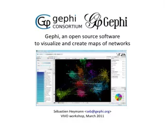
What is Gephi? ● An open source visualization tool for graphs and networks that ○ Works with large datasets ○ Enables interactive network exploration ○ Supports the visualization of evolving networks in real time (see full list of features here)
Social Network Analysis with Gephi Networks have two essential components: ● Actors who compose the network ( nodes in Gephi) ● Interactions between actors ( edges in Gephi) (see more here)
Gephi and Social Media Research ● Can create dynamic networks around specific hashtags, keywords, etc. ● Shows relationships between users in the network (Grandjean, 2013)
● Importing Data into Gephi For the purposes of this session, we’ll use a YouTube network that you learned how to collect in the “Twitter and YouTube Data Gathering” session on Monday ○ If you haven’t done that part yet, do it first! ● My seed video is from a project I am working on about a harassment controversy on YouTube
Importing Data into Gephi ● Once you launch Gephi, click on the “File” menu and select “Open…” ● Choose the dataset you want
Importing Data into Gephi ● Click “OK” to accept the default settings ○ This window also gives you basic information about the network, including number of nodes (actors), and edges (relationships)
Gephi for Analysis Once you’ve imported your data, it should look something like this:
Gephi for Analysis It’s easy to think of Gephi as a visualization tool to present findings, but we’re going to talk about an earlier stage of the process: analysis. This starts with understanding what your data can and can’t tell you.
Gephi for Analysis In this case, I used a seed video and asked for all the videos that are recommended from it. We can think about this in several ways: ● What YouTube’s algorithm thinks is similar ○ This could be used for media industry or technology-focused research ● What people tend to watch together ○ This provides insight into people’s behavior ● What a person might have promoted to them after watching one video ○ This can be used to think about filter bubbles, radicalization, misinformation, etc.
Gephi for Analysis But the YouTube tool has another option. If I had used Video Info and Comments, I would have (among other things) a network of comments on a certain video. I could use this for: ● Are there a few main voices in the conversation? ● What are the norms of social interaction? (and then compare to other interactions on different platforms, in person, etc.) ● Are the same people interacting with each other a lot? (and then compare to other videos from the same source or that are recommended from that source)
Gephi for Analysis ● I’m interested in information ecosystems, so I used video network and am thinking of it as what a person might have promoted to them after watching one video ● I often say: your question determines your method. You’ll use different tools based on what you’re trying to find out about your data.
Node size ● Once the data is imported, you can start using the tools to ask questions about it. ● Let’s start by using node size to see important participants in the network. ● In the “Appearance” pane, select the Size tool (the circles in the upper right), then Nodes, then Ranking ● Select “Degree” from the dropdown menu and set the Minimum to 10 and the Maximum to 50 - then, hit “Apply” ● Now the graph looks like this:
Node size ● Degree shows which nodes have more or fewer connections to other nodes ● Conceptually, for a question about an information ecosystem, the higher the degree, the more likely that video is to be shown to people watching the other videos ○ We could then say that it is likely to have a greater influence
Node labels But what are those nodes? Click the T at the bottom left to show the labels
Node labels The labels are often messy, but you can 1) Set them proportional to node size 2) Use Label adjust layout
Node labels Still kind of messy, but you can start to see the ones that are much bigger
Node labels ● If your labels overlap and are hard to read, use Label adjust layout
Node color ● But with everything the same color, it can be hard to see what’s going on. ● Let’s change the color on the nodes by degree too ● Configure the colors from the “Appearance” menu (click on the color palette icon) ○ By default, it’s shades of green, but you can double-click the arrows to select other colors ● Select “Apply”
Node color ● After you apply your changes, your visualization looks more like this: ● By making the more connected nodes both bigger and darker than the others, some of the “noise” in the graph goes away.
Layout ● But there’s still a lot of noisy overlap. ● In the “Layout” pane, you can select “Expansion” or “Contraction” to manipulate the spread of your network ○ Click once for a step more expanded or contracted ○ Gone too far by accident? Switch Expand to Contract, or vice versa, and go a step or two back
Layout ● Now you can see a lot of the key videos in this space, what the subject matter is, etc.
Node labels You can hover over a node to see which other nodes it connects to
Heatmap A heatmap is a quick way to see what’s close to a selected node. Select the tool, and then select your node of interest.
More display options At the bottom right, you can access more settings for appearance on edges, labels, and overall appearance
Saving the visualizations for later Save using the Take screenshot tool at the bottom left.
What does it mean? These networks, like any visualization, don’t tell you something all by themselves. You need to know at least something about the reality on the ground for these data to have meaning. In this case, knowing that this was a controversy with a gay Latinx man being harassed by a conservative YouTuber contextualizes why there are significant nodes about President Trump, male privilege, racism, pride march, socialism, etc.
What does it mean? This visualization helps give me a big picture of the information ecosystem around the video I started with, to understand how someone might arrive to watch it, and where they might go next. My next steps might be going and watching some of those videos to do textual analysis, looking at the comments on the seed video with textual analysis and/or word frequency, or looking at other sources of information about this incident, like tweets or news articles
Recommend
More recommend
Explore More Topics
Stay informed with curated content and fresh updates.
