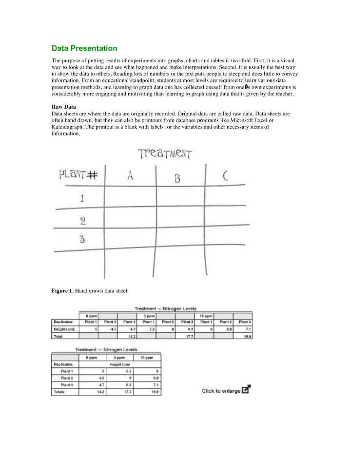

Data Presentation The purpose of putting results of experiments into graphs, charts and tables is two-fold. First, it is a visual way to look at the data and see what happened and make interpretations. Second, it is usually the best way to show the data to others. Reading lots of numbers in the text puts people to sleep and does little to convey information. From an educational standpoint, students at most levels are required to learn various data presentation methods, and learning to graph data one has collected oneself from one � s own experiments is considerably more engaging and motivating than learning to graph using data that is given by the teacher. Raw Data Data sheets are where the data are originally recorded. Original data are called raw data. Data sheets are often hand drawn, but they can also be printouts from database programs like Microsoft Excel or Kaleidagraph. The printout is a blank with labels for the variables and other necessary items of information. Figure 1. Hand drawn data sheet
Figure 2. Data sheet from Microsoft Excel. You can do different things with your raw data. You can compile it as is into a table (Figure 3) for presentation, or statistically analyze it to yield means, standard deviations, etc. ( See Basic Statistics ) The data may look best presented as a table, a drawing (Figure 4), or on a map (Figure 5). Figure 3. Tables in Word. Tables present a synopsis of your raw data. The synopsis is usually in the form of means and the results of any statistical tests. Graphs Graphs can be drawn by hand or on a computer. Programs such as Microsoft Excel, Kaleidagraph and AppleWorks produce graphs and perform some statistical calculations. Statistics programs such as SAS and SYSTAT are higher-powered programs that perform many statistical tests as well as producing graphs. All of these programs vary in the types of graphs they will produce and the individual features. Playing with the program and reading the help files are usually necessary exercises to become proficient with them. Below are samples of the most commonly used graphs. They are labeled generically and do not relate to any activity in this website specifically. These were produced using Microsoft Excel for Macintosh OS X and Excel for Windows. A bar graph compares values across categories or treatments. The x-axis gives the treatment values ( independent variable ), while the y-axis depicts the values of the dependent variable . The values of the bars can be raw data, totals or means . These sample graphs are of numbers of insects of three different species found in plants growing at different densities.
A: The independent variable on the x-axis is plant density and the dependent variable on the y-axis is the raw number of insects.
B: The mean number of insects is the dependent variable. C: Two kinds of data are presented on this graph; mean number of insects per plant density and the overall mean number of each insect species. Combining two sets of data on one graph can be done, and the visual juxtaposition of the two different sets of information that results can be very illuminating.
Figure 4. A - C Figure 5. A common statistical test calculated with means is the standard deviation . Standard deviations can be presented visually on bar, line and data point graphs. Here is a bar graph with the standard deviation value for each mean. They are called error bars when on a graph. Figure 6. A Line graph. Line graphs are used to show data points over time. Each line is for a single
treatment ( independent variable ). The x-axis shows the time interval and the y-axis depicts the values of the dependent variable. The graph can have data points shown (Graph A) or just the lines (as in Graph B, below). Figure 6. B Line graph. Line graphs are used to show data points over time. Each line is for a single treatment ( independent variable ). The x-axis shows the time interval and the y-axis depicts the values of the dependent variable. The graph can have data points shown (Graph A) or just the lines (Graph B). Figure 7. Pie Chart. Pie charts are used to show the contribution of each item to the whole. The values are commonly given as a percent or a proportion. Shown is the percentage of each type of plant in a fictitious habitat.
A: Scatter Plot This graph depicts three species of plants each tested at the same densities in pots. There are five replicate pots per density level treatment. Each data point is the average for the 5 pots at that density. Densities are: 1, 5, 10, 15, 20, 25, 30 and 35 plants per pot. The dependent variable is plant height in cm. B: Scatter plot with correlation coefficients. This graph is the same as the scatter plot. In this one the correlation coefficient was calculated using Microsoft Excel. The equation is also given in the Statistics section of this web site.
C: Scatter plot with outlier. This graph is similar to the scatter plot, except it has an outlier data point. An outlier is a data point that lies well away from the rest of the data points. Figure 8. A - C. ¡
Recommend
More recommend