
Data Visualization Workshop 22-26th of November 2010 With George Legrady www.georgelegrady.com
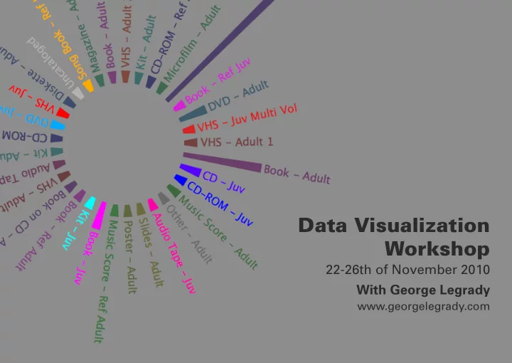
Project The focus of the workshop was to visually represent the data collected from the Seattle Public Library. (www.spl.org) This data base has been created in 2005, recording every ingoing and outgoing item along with the time, date, item type, title, it’s Dewey code, keyword references and other information. Concept The idea was to represent how many articles are borrowed and for how long per item type in a specific category. I hoped to represent this in a circular graphic where the height of each bar would represent the amount and the width would represent the average time lapse each item type was borrowed for.
Process I started producing mock-up visuals without using the actual data first to set up the code necessary for the development of the application which is shown below. I soon realized that time was short and that I would not be able to accomplish what I hoped in the given time we had. Mr. Legrady suggested I should work on and modify a similar project accomplished by his assistant Reza Ali (www.syedrezaali.com). This helped me a lot but I had to give up the idea of calculating the average time lapse each item type was borrowed for due to the complexity of the algorithmes involved.
Result The final result was a circular graphic representing the amount of various item types of the Arts and Recreation Dewey cat- egory per month during the year of 2009. Using various the “n” and “p” keys one can switch from one month to the next. I gave specific colors to each category giving brighter tones to items aimed for a younger audience (referenced under “Juv”). In the future I hope to display the item types in an alphabetical order which will give more coherence to the use of color.
Recommend
More recommend