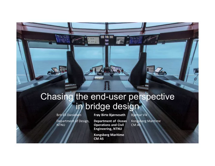

Chasing the end-user perspective in bridge design Brit-Eli Danielsen Frøy Birte Bjørneseth Bjørnar Vik Department of Design, Department of Ocean Kongsberg Maritime NTNU Operations and Civil CM AS Engineering, NTNU Kongsberg Maritime CM AS
• 27 collisions on the Norwegian continental shelf between 2001 and 2011 Can it be explained through: • Misconceptions • High cognitive load Background • Reduced vigilance • Information overload • Misplacement of important information and equipment • Cluttered work spaces
Does clutter really affect us? • Psychology Today mentioned this a couple of years ago: 1. Low subjective well-being 2. Unhealthier eating 3. Poorer mental health 4. Less efficient visual processing 5. Less efficient thinking
Have you forgotten to place half of the equipment? Quote: Captain of Stril Luna when seeing the concept equipped in real life for the first time
Our case study
History • Firts showed at Nor-shipping 2011 • First vessel sailed in 2014 • This case study presents the feedback and experiences from the crew of these two vessels after 5 years sailing with the bridge concept.
User centred design process from idea to Design criteria sailing product - Safety Holistic design thinking - Simplicity - Performance Research based decision making - Proximity
The challenge • Increasingly more technologically advanced equipment • Increasing amount of equipment for the operators to relate to with complex user interfaces • Too much equipment in the consoles causes poor ergonomic placement • Increased load on the operator’s working memory and less capacity to handle critical situations • Small degree of standardization 14
The goal 15 • To increase operational safety in demanding maritime operations through: • A complete redesign of the ship bridge environment, including consoles, levers and software user interfaces. • User-centred design process where the human factor, ergonomics and user friendliness is the basis for development • Introducing a more comfortable and safe working environment for both operators and service personnel • Unified alert management – silence all alerts from one place • Common dimming of lights reduces stress and mental load
• Increased field of vision – minimal occlusion • Angled console front end to optimise work position reducing strain • Within arm’s reach- Equipment in close proximity to the user • Operator’s chair – adjustable to personal preference supporting seated and standing operations with handpicked breathable materials • Adjustable displays close to the operator for optimal viewing angle and reflection reduction • Consistent software interfaces ensure usability and increased What was new? operational safety
Process
Consistent interfaces with a common way of navigating across systems Handling and displaying alerts - a common alert philosophy Unified application dimming and palettes Unified method for standard application settings.
Methods • Micro ethnographic studies • In total approximately 84 hours of observation divided on two vessels • Semi-structured interviews with officers and crew • Challenges • Inexperience can lead to misunderstandings an misconceptions of observed situations and conversations • Beneficial to collect information about cultural topics from crew • Findings may be transferable and of interest to designers and engineers within this field • «Getting used to» • Adapting to the environment may not reveal problematic issues.
Findings – design success and issues Item Design success Design issues Users found it “user-friendly” and “well The overall bridge design None Small windows obstruct arranged”. Equipment needed for navigation and DP- view in fore steering operations readily available from main working One lever obstructed view position. Satisfied with size, feedback and scale on An overview display of Did not accommodate position. to part of radar-screen. thruster levers. tanks required 180-degree comfortable seating for a Not all alarms were mental rotation. seven-hour shift. Extra laptop needed on aft Satisfied with unified alarm handling for most integrated and had to be Easy to get in/out of. Positive that can be Consoles Touchscreen with integrated functions found Levers Alert philosophy Chair Rudder lever has opposite console during cargo Graphical User Interface Well-functioning. alarms on one screen. managed from mid moved back/forward. Satisfied with three-in-one function of DP “practical” and “time-saving”. function to thruster-levers, operations. console. joystick, as well as placement of buttons on Colour contrast issue, users Backrest broke in high sea- not used due to fear of top and at base. found black text on a grey sate and had to be fortified. confusion. Open front of console accommodate view background hard to read. Blue light by lever base outside. obstruct night vision.
Integrated Bridge systems and vessel autonomy • The crew were concerned about a development towards vendors controlling more from shore. • E.g. troubleshooting or maintenance that previously was done on board now have to be performed remotely by experts on shore. • The digitalisation of maritime sector will possibly lead to more tasks and responsibilities being performed by the onshore organizations.
Integrated Bridge systems and vessel autonomy It might be wise to make an assessment in collaboration with seafarers of how future tasks and responsibilities should be shared between onshore organization and the crew onboard in order to find an arrangement that can work for both parties.
Conclusion • Overall very positive feedback after 5 years sailing, • Describing the bridge system as being “very well arranged” and “a very user-friendly system”. • The human-centred design process behind the development of this bridge system seem to have been able to accommodate many of the end-user needs. • The design makes sense to the seafarers when it is in line with their work practices. • Some points of improvement • Some concerns regarding the crew’s autonomy as integrated bridges may increase supervision and control from shore.
Future work • The results from this particular study is important to the product organisation for two reasons. • First, to provide insight to further improve the concept and address the flaws pointed out. • Second, to underline the importance of continuing to invest in science-based product development and product improvement, and to confirm that the concept development process incorporating human factors and a user centric process has been a success.
Thank you! This work was supported by the SMACS project, financed by the Norwegian Research Council, Grant no. 267509. We are grateful to the shipping company and especially the officers openminded and friendly participation.
References • Amer, T., Campbell, K. L., & Hasher, L. (2016). Cognitive control as a double-edged sword. Trends In Cognitive Sciences, 20 (12), 905- 915. doi:10.1016/j.tics.2016.10.002 • Bliese, P. D., Edwards, J. R., & Sonnentag, S. (2017). Stress and well-being at work: A century of empirical trends reflecting theoretical and societal influences. Journal of Applied Psychology, 102 (3), 389-402. doi:10.1037/apl0000109 • Cutting, J. E., & Armstrong, K. L. (2016). Facial expression, size, and clutter: Inferences from movie structure to emotion judgments and back. Attention, Perception, & Psychophysics, 78 (3), 891-901. doi:10.3758/s13414-015-1003-5 • Roster, C. A., Ferrari, J. R., & Jurkat, M. P. (2016). The dark side of home: Assessing possession ‘clutter’ on subjective well-being. Journal of Environmental Psychology, 4632-41. doi:10.1016/j.jenvp.2016.03.003 • Vartanian, L. R., Kernan, K. M., & Wansink, B. (2017). Clutter, chaos, and overconsumption: The role of mind-set in stressful and chaotic food environments. Environment and Behavior, 49 (2), 215-223. doi:10.1177/0013916516628178
Recommend
More recommend