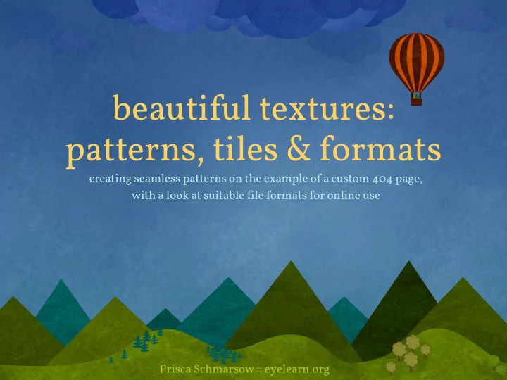

beautiful textures: patterns, tiles & formats creating seamless patterns on the example of a custom 404 page, with a look at suitable file formats for online use Prisca Schmarsow :: eyelearn.org
Steps covered 1. file organisation 2. sketching & planning 3. creating seamlessly tiling textures 4. adding repeating illustrations 5. saving for web
1. file organisation preparation folder asset creation ~ working f iles • layered files with original work on textures and patterns • optimised files in various sizes (for testing purposes) • libraries files for brushes & patterns (for future use) texture-library organising online assets site assets folder • visuals sized & optimised for use online • visuals saved in appropriate file format, considering transparencies and file sizes • distinguish seamless patterns for tiling by .gif / .jpg / .png using subfolder or specific file name patterns
2. sketching & planning quick recap on vector vs bitmap Via the zoom (here at 400%) - you can clearly see the difference between the 2 formats: The vector image remains unchanged while the bitmap image, due to its dependence on resolution, now clearly shows its pixellation. VECTOR BITMAP • lines and curves which are • pictorial information via a defined by mathematical grid of pixels objects • resolution-dependent & will • resolution-independent & deteriorate in quality full scalability while through editing/scaling Choose the appropriate tool maintaining high quality for the job ~ or combine :)
2. sketching & planning STEP 1 ~ think / plan / sketch / draw • always start by planning with an open mind, without considering the technical constraints • sketch out ideas and focus on the design and message, in keeping with the brief • don’t limit your creativity STEP 2 ~ consider the f inal output browser window http:// • consider how your final design will be displayed in the browser • plan for optimum presentation, code implementation and light file size • compromise your design idea if need be while maintaining core aspects
clouds balloon corners + paper texture + background texture hills
clouds balloon corners + paper texture + background texture hills
balloon clouds + paper texture corners + background texture hills
3. creating seamless tiling textures the window background Considerations: ~ flat pattern / shaded texture? ~ overall colour scheme? (remember to plan for su ffi cient contrast for text elements) ~ dimensions & file size of final graphics ~ repeating the texture: horizontally / vertically / both? for rich, shaded textures ~ use Photoshop: • use an existing image to start from or create your own textures from scratch • work with multiple layers to build up a rich and varied image • carefully consider colours used in gradients, subtle shades o f ten work best !WARNING! gradients as backdrop to text can be tricky to implement!
3. creating seamless tiling textures Allow some time to play and experiment ~ some tips for creating textures: • experiment with layer modes, opacities and blurs • using the same layer twice with di ff erent layer modes can add depth and intensity • play with some artistic and sketch filters ~ always use your own settings for a more original result • be mindful when combining di ff erent texture styles ~ always keep the final image in mind and avoid clashes in colour, style and density • zoom in closely while editing ~ and always view the result at 100% to preview how it will appear within your final design • use adjustment layers for fine-tuning • bear in mind the visual focus of the page ~ desaturation of background visuals, textures and elements can help emphasize the important parts of the content
3. creating seamless tiling textures smaller f ile sizes through repeating images ~ thanks to CSS :) • once you are happy with your texture - crop to a suitable size & ensure that it will tile seamlessly if repeated in the browser window • check via the o ff set filter how the tiling would look: top menu > Filter > Other > O ff set • carefully edit your image to blend the repeated visuals without lines or visible edges, repeat the o ff set filter to check your final result not all images are suitable for tiling ~ some will require a lot of editing. original horizontal + vertical o f fset horizontal o f fset
3. creating seamless tiling textures possible working methods: using tools to blend image edges clone stamp tool Spot Healing Brush Tool Healing Brush Tool Patch Tool using copies of images layer in combination with feathered layer masks
3. creating seamless tiling textures horizontal tiling via CSS — repeat-x body { background: #66f url(imgs/grad.jpg) top left repeat-x; } common uses: browser window http:// • gradient backgrounds • textures with top/bottom features • interface element enhancements
3. creating seamless tiling textures vertical tiling via CSS — repeat-y body { background: transparent url(imgs/shadow.png) top center repeat-y; } common uses: browser window http:// • flexible shadows on content containers • vertical borders / dividers / ornaments • interface element enhancements
3. creating seamless tiling textures full tiling via CSS — repeat body { background: #3a4583 url(imgs/tartan.gif) top left repeat; } common uses: browser window http:// • pattern backgrounds • uniform textures • interface element enhancements
4. adding repeating illustrations the header/footer visuals centre cloud, not repeating • tight crop to keep image dimensions as small as possible • saved as PNG24 for full transparency, due to textured background CSS: background: transparent url(imgs/cloud.png) top center no-repeat; scattered clouds, repeating horizontally • tight crop to keep image dimensions as small as possible, additional space added • saved as PNG24 for full transparency, due to textured background CSS: background: transparent url(imgs/clouds.png) top 30% repeat-x;
4. adding repeating illustrations the header/footer visuals mountains, repeating horizontally • tight crop with aligned le f t and right site image edges to avoid gaps - ensure edges line up perfectly • saved as PNG24 for full transparency, due to textured background CSS: background: transparent url(imgs/peaks.png) bottom center repeat-x;
5. saving for web image f ile formats • always keep an eye on your overall file size! .gif especially for image intensive designs ~ it all adds up. • always choose the appropriate format ~ .jpg bearing in mind browser compatibilities (e.g. IE6 cannot handle PNG24 without fixes) • if possible ~ use CSS to repeat a small image to fill the relevant area & ensure that the tiling is seamless .png • when saving large visuals ~ optimise as much as possible before saving for the web • combine visual elements into one image file where possible
5. saving for web = Graphics Interchange Format .gif • limit of 256 colours • lossless compression • transparency with matte colour • animation use for: • flat colours within limited range • animation TIPS: • limit colours if possible to reduce final file size Matte colour needs to be set to match the • experiment with the value for background of the content element it is ‘lossy’ displayed in ~ an ugly pixellated halo will • zoom in to see when the image otherwise be visible and ruin all your hard starts disintegrating ~ check aain work... for 100% view
5. saving for web = Joint Photographic Experts Group .jpg • no colour limit • lossy compression • no transparency use for: • photographic images • visuals with shading and blended tonal transitions When pushed into lower quality settings - you TIPS: will notice that boundaries between the colour • try di ff erent quality settings to blocks become blurred, lines and boxes will appear. push file size down • experiment with adding blur • zoom in to see when the image starts disintegrating ~ check aain for 100% view
5. saving for web = Portable Network Graphics .png • 2 formats: - PNG8 ~ similar to GIF (+ safe to use in IE6) - PNG24 ~ similar to JPG ( ! display errors in IE6 ! ) • lossless compression • transparency use for: • all images • transitional transparencies TIPS: use PNG compression tools to further optimise your PNGs • try PNG8 instead of GIF to compare file sizes • for PNG24 - limit colour before saving for web 8bitalpha.com imageoptim.pornel.net • zoom in to see when the image (online tool) (mac only) starts disintegrating ~ check aain for 100% view
... and all that’s le f t to do is to put it all together ;) browser window http://
Recommend
More recommend