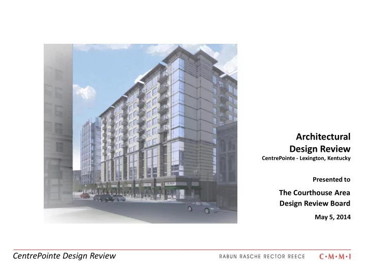

Architectural Design Review CentrePointe - Lexington, Kentucky Presented to The Courthouse Area Design Review Board May 5, 2014 CentrePointe Design Review
Intersection of Limestone and Main CentrePointe Design Review
Main Street CentrePointe Design Review
Detail View, Main Street Retail CentrePointe Design Review
Intersection of Upper and Main CentrePointe Design Review
Intersection of Limestone and Vine CentrePointe Design Review
Vine Street CentrePointe Design Review
Detail View, Intersection of Upper and Vine CentrePointe Design Review
This sidewalk cafe gives public access to the landscaped motor court/courtyard at the interior of the block GENERAL DESIGN GUIDELINES 2.1 Maintain the alignment of buildings at the sidewalk edge. Pedestrian-friendly motor court CentrePointe Design Review
Apartment Hotel Sidewalk Cafe Office GENERAL DESIGN GUIDELINES 2.2 Orient the primary entrance of a building toward the street. 2.14 Locate the primary building entrance to face the street. CentrePointe Design Review
RETAIL RETAIL RETAIL GENERAL DESIGN GUIDELINES 2.2 Develop the ground floor level of a project to encourage pedestrian activity. LANDSCAPED MOTOR COURT SPECIALTY RESTAURANT OUTDOOR RESTAURANT OUTDOOR RESTAURANT SEATING SEATING CentrePointe Design Review
SERVICE AREA IS CONCEALED BEHIND OVERHEAD DOORS GENERAL DESIGN GUIDELINES 2.22 Minimize the visual impact of mechanical equipment on the public way. 2.23 Minimize the visual impacts of utility connections and service boxes 2.25 Minimize the visual impacts of trash storage and service areas. ALL MECHANICAL AND UTILITY CONNECTIONS OCCUR UNDERGROUND IN PARKING GARAGE CentrePointe Design Review
Rusticated base GENERAL DESIGN GUIDELINES • Polychrome brickwork • Stone inlay • 2.3 New interpretations of traditional Cornices • building styles are encouraged. Corner glazing • Cantilevered balconies • Steel elements • CentrePointe Design Review
GENERAL DESIGN GUIDELINES 2.4 A new building should incorporate a base, a middle and a cap. C C B B A A CentrePointe Design Review
GENERAL DESIGN GUIDELINES 2.5 A new building should maintain the alignment of horizontal elements along the block. 2.6 Floor-to-Floor heights should appear to be similar to those seen historically. CentrePointe Design Review
GENERAL DESIGN GUIDELINES 2.7 Consider dividing larger buildings into “modules” that are similar in scale to buildings seen historically A B A A B B B C CentrePointe Design Review
GENERAL DESIGN GUIDELINES 2.7 Consider dividing larger buildings into “modules” that are similar in scale to buildings seen historically. 2.8 Maintain the established building scale of two to four stories in height. Mid-height band at the “four story mark” Upper stories set back from street CentrePointe Design Review
Brick Aluminum Cast Stone GENERAL DESIGN GUIDELINES Appearance 2.9 Materials should appear similar to Stone Inlay those used historically. Steel 2.10 A simple material finish is Stucco encouraged for a large expanse of wall plane. Brick Aluminum Stone CentrePointe Design Review
GENERAL DESIGN GUIDELINES 2.11 Upper-story windows with vertical emphasis are encouraged. 2.12 Windows should align with others in a block. 1:2 Proportion CentrePointe Design Review
GENERAL DESIGN GUIDELINES 2.13 Building entrances should appear similar to those used historically. 2.16 A fabric awning is encouraged. 2.18 Mount awnings to accentuate character-defining features of window openings. CentrePointe Design Review
PUBLIC STREETSCAPE IMPROVEMENTS CentrePointe Design Review
CHAPTER 2 (GENERAL DESIGN GUIDELINES) • 2.1 Maintain alignment of buildings at the sidewalk edge. Nearly 100% of the building façade at the street level is built to the property line/sidewalk edge. The exceptions are pedestrian and vehicular openings which give access to the interior of the block. • 2.2 Orient the primary entrance of a building toward the street . This Project features seven components and numerous entries, among them retail, commercial office, apartment, condominium and hotel. The entrances are handled differently for each. The office, apartment, and retail components orient their primary entrances to Main Street. The extended stay hotel and full-service hotel components have vehicular drop offs on the motor court at the interior of the block, but also feature secondary walk-up entrances oriented to Main and Vine Streets respectively. The feature restaurant component orients its main entrance to Vine Street. The condominium component, located atop the hotel on Vine Street, shares a front entrance with the hotel. • 2.3 New interpretations of traditional building styles are encouraged . The design of the Project varies in style around the block depending on the adjacent context. Along Main Street, the building uses many traditional design elements, such as cornice lines, polychrome brickwork, individual windows, and fabric awnings, but is not a literal imitation any of its historic neighbors. • 2.4 New buildings should incorporate a base, a middle and a cap. The Project, with respect to its elevation along Main Street, complies with this item. The street level story and top stories are both visually distinct from the remainder of the building. • 2.5 A new building should maintain the alignment of horizontal elements along the block . This guideline is largely not applicable to this project, which does not adjoin existing buildings within the block. However, the Project does address the guideline by aligning the retail sign band along Main Street. • 2.6 Floor-to-floor heights should appear to be similar to those seen historically. The floor-to- floor heights of this project, along Main Street, are in the range 9’-4” to 13’-6”. In each case, individual floors and windows are discernable as such. • 2.7 Consider dividing a larger building into “modules” that are similar in scale to buildings seen historically. The length of this Project along Main Street has been divided visually into modules approximately 42 feet in width, in accordance with this recommendation. • 2.8 Maintain the established building scale of two to four stories in height . This guideline also offers the following recommendation for buildings taller than four stories: “Although a new building may be taller than surrounding buildings, the first several stories should visually relate in scale to the surrounding historical context.” The project addresses this guideline by making the architecture of the lower stories distinct from that of the upper stories. At a line approximately 55 feet above the street level, the Project features a cornice and a change in exterior veneer, which achieves the aim of this guideline with respect to building character without limiting the height of the building to a historical norm. • 2.9 Materials should appear similar to those used historically . The majority of the Main Street elevation is brick with aluminum and glass punched window openings, which is in straightforward compliance with this guideline.
Recommend
More recommend