Webpages with Style Dr. Steven Bitner Comments from HW #1 Image - PowerPoint PPT Presentation
Webpages with Style Dr. Steven Bitner Comments from HW #1 Image size large images take a long time to download, try compressing images for web page use. Be wary of generated html, it is usually bad. Default file for a webpage is
Webpages with Style Dr. Steven Bitner
Comments from HW #1 Image size – large images take a long time to download, try compressing images for web page use. Be wary of generated html, it is usually bad. Default file for a webpage is index.html unless otherwise specified on the server. Be mindful of closing tags as well as closing empty tags.
Adding a favicon <link rel="icon" type="image/png" href="/references/images/icon.png" />
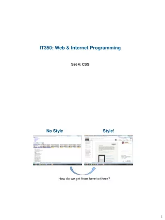
What is CSS Cascading Style Sheets HTML was not intended to control how things looked, but rather to mark content CSS is designed for designing Cascading Style Sheets do just that…cascade
CSS syntax Selector such as h1 Attribute Value Comments are just like multi-line C (or PHP) comments
Style by tag tagname E.g. h1 { } For example you may want all hyperlinks to be red in stead of blue
Style by id #id E.g. #surveyForm { } Lets you define the style for a certain element Lead with # character to let the browser know this is the style for an id Useful for things such as a navigation div which may contain an unordered list different from any other such list
Style by class .class E.g. .surveys { } Groups of elements can all have the same style Lets you define the style for a class of elements Lead with . character to let the browser know this is the style for a class of elements
Inline CSS Truly no better than using traditional HTML 3.2 attributes Mixes style and content <h1 style=‘color:#ff0000;’> Nooooooooo!</h1> No better than <h1 color=‘red’>Old way</h1> Do not do this!
Document head CSS If not much styling is applied, this may be a decent option Included between <head> </head>tags <style type="text/css"></style>
Including an external style sheet Same format as document head CSS, but stored in a separate file Most preferred way since it keeps pages cleaner The only way to utilize CSS that truly cascades <link rel="stylesheet" type="text/css" href="style.css" />
Precedence The more specific the CSS, the higher the priority In-line 1. Internal 2. External 3. Exception: If the external style sheet is referenced after the internal style is defined.
HW #2 comments Be careful of tag case. This goes beyond just being compliant, but also note that, for example, <B> and </b> are not the same things and for more complex pages, you will not get what you want on the screen consistently. Be mindful of closing tags. A couple of folks left off </table> You can spend hours trying to figure out why stuff isn’t where you put it Try to clean up extraneous stuff It may not matter now, but having extra markup can affect the maintainability of your code and could cost you or your clients money.
Multiple selectors Can apply CSS to a multitude of selectors div,p { } Will apply to all divs and all paragraphs div p { } Will apply to all paragraphs within a div div>p { } Will apply to all paragraphs who’s parent is a div div+p { } Will apply to all paragraphs that immediately follow <div> tags
CSS in action http://csszengarden.com/
Background background-color:X; Can be a hexidecimal value ‘#ff0000’ is red Can be a decimal value ‘ rgb (255,0,0)’ is red Can be a color name ‘red’ is red background-image:url (‘imageFile.png’); Default is for the image to repeat, tiling the entire page. background-repeat:X; Can be ‘repeat - x’ Can be ‘repeat - y’ Can be ‘no - repeat’
Background cont. background-position:X; Options are top, bottom, center, right, left or inherit Or you can do it all at once: background:X Y Z;
Text color:X; text-align:X; Can be left, right, center or justify text-decoration:X; none, overline, underline, line-through, blink text-transform:X; lowercase, uppercase, capitalize
Text cont. vertical-align:X; Lots ofoptions; top, middle, bottom, sub and super white-space:X; pre option makes an element the same as <pre></pre> tags text-indent:X; controls the indenting of the first line of text
Font font-family:X; Start with the preferred font but you can include more general fonts in case the users browser doesn’t support e.g. font- family:”Times New Roman”, Times, serif; or font-family:"Courier New", Courier, monospace font-style:X; Let’s you make italic text
Font cont. font-size:X; Cross browser compatibility requires you to set font-size:100%; for the body Better to use em than px since em resizes properly when a user zooms. font-weight:X; Can make bold text,as well as bolder or lighter text Can specify weight on scale from 100-900 where 400 is normal and 700 = <b></b> Or combine as font:X Y Z;
Links Can define styles for: link visited hover active
Lists Style how list elements are displayed list-style-type:X; Different shapes for <ul></ul> disc, circle, square… Different numbering types for <ol></ol> lower-alpha, upper- roman… Can also use none for both list types to remove any markings list-style-image:X;
Tables border-collapse:collapse; text-align vertical-align padding border Other attributes for background and text are usable too
Outlines Not the same as border Does not count as part of the element’s dimensions Can be useful for CSS debugging, though typically browser specific tools are more useful (such as inspect element in Chrome)
Display display:X; inline, block, none, table-row, etc inline takes up the width necessary for display block takes up all width possible and adds a new line before and after table-row can be useful when hiding and then un-hiding rows in a table none completely collapses the element Can also use visibility:hidden; Does not collapse the element, still takes up space
Positioning Static Default Items flow based on content No overlap with other static elements Fixed Will overlap with other elements Does not scroll Can be useful for table headers on long tables Useful for navigation bars that should always be visible
Positioning cont. Relative Positions the element relative to its normal position The original space reserved for the element is still reserved in the page flow Can overlap
Positioning cont. Absolute Allows for exact specification of location Positioned relative to the first parent element that is not the default (static) positioning type Does not hold a space in the document layout Therefore, it overlaps Set the z-index:X; attribute in order to specify the order of the elements. A higher z-index means that the element appears in front of those with a lower z-index. By default, the last element added is on top and so forth
Additional positioning properties cursor overflow left (right, top, bottom) clip Only rect available
Float Horizontal alignment Following content will flow around it float:left; Stacks elements from the left and all following content will appear to the right of it float:right; Elements stack from the right and all following content will appear to the left of it
Clear Needed to start content on a new line after floating elements usually clear:both; is used, but can specify if you only want to insert the element below left or right floating elements Using block level elements or <br /> tags will not overcome float alone Tall images, short text lines
Alignment Center block elements use margin-left:auto; margin-right:auto; Use absolute or fixed positioning Use float
Pseudo-classes (elements) : Already saw this with links – a:hover { } Other useful pseudo-classes include first-child nth-child(argument) Can be even, odd, or n type such as 2n+3 first-letter focus Form input element
Media types @media print screen handheld
Attribute styling [attribute] e.g. [title] [attribute=value] e.g. input[type=text]
Recommend
More recommend
Explore More Topics
Stay informed with curated content and fresh updates.
