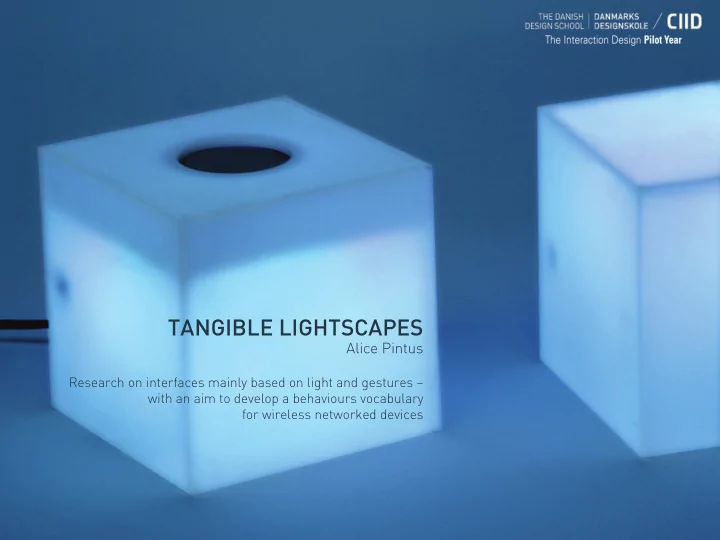

TANGIBLE LIGHTSCAPES Alice Pintus Research on interfaces mainly based on light and gestures – with an aim to develop a behaviours vocabulary for wireless networked devices
INSPIRATION I’m interested in the use of light as a means of humanizing technology. 80% of all sensory perceptions are optic and need light as an information medium. The eye is always consciously or unconsciously monitoring the environment : human attention is captured by the brightest items in the visual field, by moving objects, by unforeseen elements and by everything potentially dangerous.
INSPIRATION Animals like jellyfish have an entire vocabulary only based on bioluminescence signals.
INSPIRATION Use light and sound if there is no other common language! “Close encounters of the third kind” Steven Spielberg 1977
TOPIC/DOMAIN Beyond any cultural and linguistic barrier, peripheral human attention is attracted by light, this attitude can be used to convey information in a strategic way. It is possible to take advantage of these proprieties: * designing interfaces that use light as a core feedback tool, exploiting light’s not intrusive qualities *limiting the information overload given by many traditional interfaces
INITIAL STATEMENT The aim of my research is * COLOURS to understand how to create a basic light behaviour vocabulary to design a non verbal interface. * SPEED OF CHANGES (RATE): frequency, duration, cycles, Light can be a very synchronicity, pattern (fading, pulsing, blinking...) effective feedback. Using a recognisable pattern is already a way to deliver content, because structure is equal to information (Morse code) * INTENSITY/BRIGHTNESS * SHAPE: using many LEDs, low definition screen * CULTURAL REFERENCES: red/stop, green/go….
EXPERIENCE PROTOTYPING Is it possible to design a light behaviour vocabulary? I used Dubmate prototypes - developed with Jacob Sikker Remin and Francesco Mondelli- to run 2 rounds of user tests (12 interviews) to understand people’s reaction to a mainly light based interface. Dubmate is a portable device, basically an evolution of the traditional USB stick, designed to share files through a tangible user interface avoiding the use of computers. The interface is based on the use of gesture and lights/colours.
EXPERIENCE PROTOTYPING/ First round I designed the first behaviour routine according to my way of imagining the different activities of the device.
EXPERIENCE PROTOTYPING/ First round feedbacks ‘This blinking light makes me nervous’ (female, 37 years old) ‘It’s nice to do a physical gesture to start the action, it gives a feeling of control’ (male, 70 years old) ‘It’s useful to show something that is digital in a physical way’ (female, 26 years old) ‘This behaviour is frustrating: it’s too slow, it should be faster also to see the direction of the transfer. This fading light makes me think that the device is not working quite enough for me’ (female, 26 years old) (male, 29 years old) (female, 37 years old) ‘I expected something different...’ (female, 23 years old) (female, 37 years old)
EXPERIENCE PROTOTYPING/ Second round In the second test session, instead, the light behaviour is completely based on the feedback collected during the first round of tests.
EXPERIENCE PROTOTYPING/ CONCLUSIONS These tests allow me to think that it is possible to create a common light language that can be largely understood : people have a clear idea on what is easier for them and why (even if there are different opinions on the same ‘I understand the meaning, but I think that this signal is too strong, it seems I did behaviour). The users can something very very bad, this blinking makes you feel stupid’ (male, 27 years old) connect pretty easily light behaviours to meanings ‘I like when my Hard Drive LED is blinking really fast, it’s nice to think it is doing its and states. best to do the transfer as quick as possible’ (male, 22 years old) ‘Now it’s simpler then before!’ (female, 37 years old) ‘Light has the potential to make something inviting and intuitive. It is playful and useful and this add value to the interaction with the device. You enjoy using the object more’ (male, 27 years old)
CONTEXT How to use light to show connections between networked objects that don’t have any physical cable? Today, connecting wireless devices is inconvenient: you have to go through interfaces that do not relate to the physical arrangement of the objects. It can also be difficult to understand which devices are connected and what they are communicating.
CONCEPT My “device language” gives a concrete representation of the intangible and invisible events that are taking place. It allows users to feel more in control by providing them with a direct interaction with the objects they are using. Design a vocabulary of light behaviours that shows people what their devices are doing. This vocabulary can be applied to a wide range of contexts where devices (speakers, headphones, memory storage devices, cameras, laptops…) are communicating wirelessly.
INTERFACE GOALS I would like to design a tangible communication protocol between networked objects that share data and connection. UNDERSTANDING How might we show the voice/thoughts/actions of 2 devices communicating to each other? Make the intangible visible: feel don’t think. CONTROL How might we design a physical/direct interaction on the device? People feel more in control if they can physically operate on the device, this interaction amplifies the trust they put in the object.
WIRELESS DEVICES Which are the common COMMUNICATION activities /states for devices that are . connect / disconnect the devices communicating wirelessly? . show the devices’ signal strenght strength HOW CAN WE DESIGN A CABLE MADE OF LIGHT? DATA TRANSFER . progress . error
3D REPRESENTATION OF THE MAP/ PROTOTYPE I designed a set of cubes main device to physically represent the light behaviours map * Device with memory storage ° mp3 player * Device with its own personal ° memory storage device ° time capsule colour: it gives the colour to ° camera the peripheral device it is ° laptop connected to. The user can set ° mobile phone ° ... his customized colour peripheral device ° speaker ° headphone ° ampli ° screen * Device with no memory ° projector storage ° wireless router * Device with no personal ° wireless mouse colour: it takes the colour of ° keyboard ° web cam the device it is connected to ° pen tablet ° microphone ° …
THE MAP/ 1 CONNECTION LIGHT CONNECT heart beat pattern solid light CONNECTED light intensity according to signal strenght LOSING heart beat pattern SIGNAL
THE MAP/ 2 CONTROL LIGHT TRANSFERING light pulsing (Sender colour) TRANSFER solid light (Sender colour) COMPLETE ERROR blinking red light
THE MAP GESTURE CONNECTION LIGHT CONTROL LIGHT join the 2 faces with CONNECT RFID tag/antenna heart beat pattern solid light light is off CONNECTED light intensity according to light is off signal strenght tap once the button TRANSFERING light intensity according to on the Sender device light pulsing (Sender colour) signal strenght TRANSFER light intensity according to solid light (Sender colour) COMPLETE signal strenght LOSING heart beat pattern SIGNAL cover the button on any DISCONNECT light turns off device for more then 2 sec. light turns off ERROR blinking red light blinking red light
INTRO TO THE SCENARIO CONNECTION LIGHT The light vocabulary applied to an everyday life situation. CONTROL LIGHT How to design a product with a light behaviour? Sally CONNECTION LIGHT CONTROL LIGHT Anne CONNECTION LIGHT MENU CONTROL LIGHT Paul
VIDEO SCENARIO a. CONNECT 2 DEVICES b. TRANSFER DATA BETWEEN 2 DEVICES
PRODUCT DESIGN? The placement of the light feedback is just an example, it could have been in many other different ways.
CONCLUSIONS People can easily connect light states to meaning. There are basic universal set of functions for wireless devices that can be expressed trough a light status. Today every device has its own vocabulary, it is hard to guess what it is saying. A research on a “universal device language” could show potentials and opportunities for undeveloped interaction tools. Well designed device-device communication can lead to more intuitive user-device interaction.
NEXT STEPS ° More user tests during the exhibition! ° New behaviours for other device’s activities ° Light will be used in the interface to make visible the devices’ behaviour as if they were living beings, stretching its emotive communication qualities, trying to express the device’s personality ° Integration with product design
SPECIAL THANKS Dave Mellis Simona Maschi Alie Rose Manuel Scano THANK YOU! All my classmates! Alice Pintus http://alicepintus.wordpress.com/
Recommend
More recommend