TALK PREPARATI ONS. (1) PRACTI CE YOUR TALK (REPEATEDLY REPEATEDLY - PDF document
SUGGESTI ONS FOR TALK PREPARATI ON AND PRESENTATI ON Michael P. Nusbaum / Rita Balice-Gordon (2001) Neuroscience Graduate Group, Univ. of Pennsylvania Most Recently Updated: July, 2015 Giving effective talks about your work will be an integral
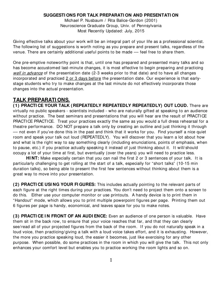
SUGGESTI ONS FOR TALK PREPARATI ON AND PRESENTATI ON Michael P. Nusbaum / Rita Balice-Gordon (2001) Neuroscience Graduate Group, Univ. of Pennsylvania Most Recently Updated: July, 2015 Giving effective talks about your work will be an integral part of your life as a professional scientist. The following list of suggestions is worth noting as you prepare and present talks, regardless of the venue. There are certainly additional useful points to be made –– feel free to share them. One pre-emptive noteworthy point is that, until one has prepared and presented many talks and so has become accustomed last-minute changes, it is most effective to begin preparing and practicing well in advance of the presentation date (2-3 weeks prior to that date) and to have all changes incorporated and practiced 2 or 3 days before the presentation date. Our experience is that early- stage students who try to make changes at the last minute do not effectively incorporate those changes into the actual presentation. TALK PREPARATI ONS. (1) PRACTI CE YOUR TALK (REPEATEDLY REPEATEDLY REPEATEDLY) OUT LOUD. There are virtually no public speakers - scientists included - who are naturally gifted at speaking to an audience without practice. The best seminars and presentations that you will hear are the result of PRACTICE PRACTICE PRACTICE. Treat your practices exactly the same as you would a full dress rehearsal for a theatre performance. DO NOT prepare a talk only by creating an outline and just thinking it through –– not even if you’ve done this in the past and think that it works for you. Find yourself a nice quiet room and speak your talk out loud (REPEATEDLY). You will discover that you learn a lot about how and what is the right way to say something clearly (including enunciations, points of emphasis, when to pause, etc.) if you practice actually speaking it instead of just thinking about it. It will/should occupy a lot of your time at first, but eventually (over the years) you will need to practice less. HI NT: Make especially certain that you can nail the first 2 or 3 sentences of your talk. It is particularly challenging to get rolling at the start of a talk, especially for “short talks” (10-15 min duration talks), so being able to present the first few sentences without thinking about them is a great way to move into your presentation. (2) PRACTI CE USI NG YOUR FI GURES: This includes actually pointing to the relevant parts of each figure at the right times during your practices. You don’t need to project them onto a screen to do this. Either use your computer monitor or use printouts. A handy device is to print them in “Handout” mode, which allows you to print multiple powerpoint figures per page. Printing them out 6 figures per page is handy, economical, and leaves space for you to make notes. (3) PRACTI CE I N FRONT OF AN AUDI ENCE: Even an audience of one person is valuable. Have them sit in the back row, to ensure that your voice reaches that far, and that they can clearly see/read all of your projected figures from the back of the room. If you do not naturally speak in a loud voice, then practicing/giving a talk with a loud voice takes effort, and it is exhausting. However, the more you practice speaking loud, the easier it becomes, just like exercising for any other purpose. When possible, do some practices in the room in which you will give the talk. This not only enhances your comfort level but enables you to practice working the room lights and so on. 1
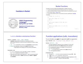
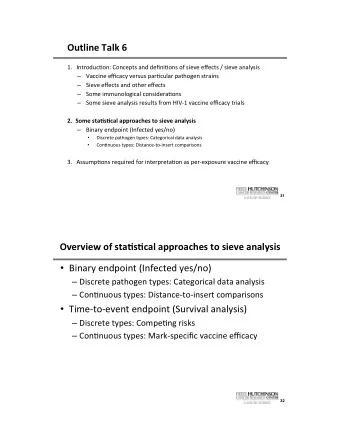
(4) MAKE THE FI GURES LARGE : Have the figures fill as much of the screen as possible. This includes figures that are entirely statements. Use the largest font size that fits. If you are preparing figures for a POSTER, format each figure so it completely fills the section of poster dedicated to that figure. If the audience (including the back row) cannot see your figures, INCLUDING the labeling, then why bother showing it? Also, use sans-serif types of fonts for labeling, such as Arial, Helvetica, Calibri, Tahoma, etc. These are less cluttered than serif fonts such as Times Roman. (5) MULTI -PANEL FI GURES- LAYERI NG: It is often challenging for an audience to focus on one section of a multi-panel figure, yet it is often most useful to present a data set as a multi-panel figure. In these cases, the most effective presentation method is to build up the figure sequentially. For example, if the full figure has 4 panels, then initially present only Panel A, so you can focus the audience attention on it. Then go to the next slide, which will present Panels A + B, enabling you to discuss Panel B. And so on until all 4 panels are present. (6) USE COLOR AND DECLARATI VE LABELI NG I N FI GURES: (A) Color is a very powerful tool for highlighting important information. It can call the audience’s attention to important issues that otherwise might be buried in a complicated figure or text slide. (B) Remember to LABEL whatever media you’re using clearly and carefully. (C) For figure titles, use a simple, declarative sentence that delivers the ‘‘take-home’’ message: For example: Good- “Over-expression of protein X reduces neurotransmitter release” versus Not as Good- “Effect of protein X over-expression on neurotransmitter release.” (7) TO MAI NTAI N I MPORTANT I NFORMATI ON, USE I NSERTS/ LEGENDS: Sometimes, there are a lot of details in your presentation that are relevant to much/all of your talk, but those details are not explicitly defined on each Figure. It is often challenging for the audience to remember these details, thus degrading their level of understanding. There are two ways to cope with this problem. FIRST, use a small “insert” or “legend” to the side on relevant figures, so that this relevant detail (e.g. pathways, acronyms, detailed relationships, etc) can remain visible for the duration of the talk, and the audience can refer to it as they need to. SECOND, frequently present summary schematics during your presentation to keep the audience focused and to remind them of what they just learned. This is a particularly valuable mechanism for ensuring that your message is retained by the audience. Plus, repetition of important points is never wasted! (8) POWERPOI NT SPECI AL EFFECTS: Powerpoint is a very useful tool –– and the animation can really enliven a presentation. However, it can also be a distraction and become really irritating. You need to ask yourself if the end result is enhanced or diminished by all of the ‘‘extras.’’ Sound is rarely necessary and can be very distracting. (9) ONE CAREFULLY CONSTRUCTED AND WELL-LABELED SUMMARY DI AGRAM I S WORTH A THOUSAND WORDS: Figures that consist entirely of text are often helpful, when interspersed with data. However, a summary cartoon can be more memorable. Try to combine the two approaches by finding or making a summary cartoon and using bullet points of text below it to remind you and the audience of the important issues you wish to raise, discuss and be remembered. 2
Recommend
More recommend
Explore More Topics
Stay informed with curated content and fresh updates.

