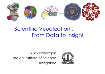
Scientific visualization Nelle Varoquaux 0 / 24 What is scientific - PowerPoint PPT Presentation
Scientific visualization Nelle Varoquaux 0 / 24 What is scientific visualisation? Visualisation is a method of computing. It transforms the symbolic into the geometric, enabling researchers to observe their simulations and computations.
Scientific visualization Nelle Varoquaux 0 / 24
What is scientific visualisation? “Visualisation is a method of computing. It transforms the symbolic into the geometric, enabling researchers to observe their simulations and computations. Visualisation offers a method for seeing the unseen. It enriches the process of scientific discovery and fosters profound and unexpected insights.” Visualisation in Scientific Computing, NSF report, 1987 “For example, about 50 percent of the cerebral cortex of primates is devoted exclusively to visual processing, and the estimated territory for humans is nearly comparable.” The MIT Encyclopedia of the Cognitive Sciences 1 / 24
Anscombe’s quartet, 1973 x1 x2 x3 x4 y1 y2 y3 y4 1 10.00 10.00 10.00 8.00 8.04 9.14 7.46 6.58 2 8.00 8.00 8.00 8.00 6.95 8.14 6.77 5.76 3 13.00 13.00 13.00 8.00 7.58 8.74 12.74 7.71 4 9.00 9.00 9.00 8.00 8.81 8.77 7.11 8.84 5 11.00 11.00 11.00 8.00 8.33 9.26 7.81 8.47 6 14.00 14.00 14.00 8.00 9.96 8.10 8.84 7.04 7 6.00 6.00 6.00 8.00 7.24 6.13 6.08 5.25 8 4.00 4.00 4.00 19.00 4.26 3.10 5.39 12.50 9 12.00 12.00 12.00 8.00 10.84 9.13 8.15 5.56 10 7.00 7.00 7.00 8.00 4.82 7.26 6.42 7.91 11 5.00 5.00 5.00 8.00 5.68 4.74 5.73 6.89 What is common to those data sets? Mean of x 9 “The purpose of computing is Variance of x 11 Mean of y 7.50 insights, not numbers.” Variance of y 4.12 Linear regression y = 3 . + 0 . 5 x R 2 0.666 Richard Hamming, 1962 p-value 0.0021 2 / 24
Anscombe’s quartet, 1973 What is common to those data sets? Mean of x 9 “A computer should make both Variance of x 11 Mean of y 7.50 calculations and graphs” Variance of y 4.12 Linear regression y = 3 . + 0 . 5 x R 2 0.666 Francis Anscombe (1918-2001) p-value 0.0021 2 / 24
Visualization pipeline 3 / 24
Data type Quantitative : values or observations that can be measured • Continuous (e.g. temperature) • Discrete (e.g. number of inhabitants) Categorical : values or observations that can be sorted into groups or categories • Nominal (e.g. nationality) • Ordinal (e.g. months) • Interval (e.g. age groups) 4 / 24
Graphical elements A scientific figure can be fully described by a set of graphic primitives with different attributes: • Points, markers, lines, areas, ... • Position, color, shape, size, orientation, curvature, ... • Helpers, text, axis, ticks, ... • Interaction, animation, ... But who want to describe each individual elements? Describing a figure in terms of such graphic primitives would be a very tedious and complex task. This is exactly where visualization libraries are useful because they will automatize most of the work (more or less depending on the library). 5 / 24
Visualization types Data Visualisation catalogue by S. Rebecca 6 / 24
10 Simple Rules for Better Figures Nicolas Rougier, Mike Droettboom and Philip Bourne. 7 / 24
Rule 1: Know your audience 8 / 24
Rule 2: Identify your message 9 / 24
Rule 3: Adapt the figure 10 / 24
Rule 4: Captions are not optional The A and B patches are actually the same color even though we Optical Illusion perceived them at being different color. 11 / 24
Rule 5: Do not trust the defaults 12 / 24
Rule 6: Use color efficiently 13 / 24
Rule 6b: Above all, do no harm! 14 / 24
Rule 7: Do not mislead the reader 15 / 24
Rule 8: Avoid “chart junk” 16 / 24
Rule 8b: Less is more 17 / 24
Rule 9: Message trumps beauty 18 / 24
Rule 10: Get the right tool • PDFCrop (remove white borders) http://pdfcrop.sourceforge.net • GraphViz (easy graph) http://www.graphviz.org • ImageMagick (scripted image processing) http://www.imagemagick.org/script/index.php • Gimp (bitmap image manipulation) https://www.gimp.org • Inkscape (vector image manipulation) https://www.inkscape.org • Tikz (scripted vector art) http://www.texample.net/tikz/examples/all/ • And many, many, many others 19 / 24
Enough theory, let’s practice! https://www.stat.berkeley.edu/˜nelle/teaching/ 2017-visualization/README.html 20 / 24
Examples of misleading figures 21 / 24
Misleading figures 22 / 24
Misleading figures 23 / 24
Misleading figures 24 / 24
Recommend
More recommend
Explore More Topics
Stay informed with curated content and fresh updates.
