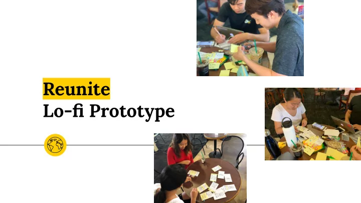

Reunite Lo-fi Prototype
The Team Tyler Ricky Jennifer Danielle Hong Grannis-Vu He Tang
Overview ◉ Mission Statement ◉ Selected Interface ◉ Low-Fi Prototype ○ 3 Tasks ◉ Experiment ○ Methods ○ Results ◉ UI Changes
Reunite We want to help reconnect old friends who have not seen each other in a while or do not connect on a regular basis. Reunite attempts to break barriers to friendship set by geographic location.
Mission Reunite old friends.
Concept Sketches 6
Selected Interface 7
Smart Watch Pros - Less screens to navigate than mobile UI - Intuitive compass design - Simple interface Cons - Can’t see profiles in detail - Other features inaccessible (e.g. adding friends)
Mobile UI Pros - Versatile functionality - Innovative presentation of notification - Easier to see larger amounts of data - Overall accessibility Cons - Can be confused with other social media apps
Lo-Fi Prototype
Task Storyboards 11
Task One: Find out which friends are in the area 12
Task Two: Learn when friends will be visiting area 13
Task Three: Make plans to meet with friends Easily schedule a time and Various ways to reach out get reminders
Experiment 15
Participants Stanford student Australian native Chinese tourist from East Coast
Methods ◉ Public, quiet environment ◉ Presented one screen at a time ◉ Allowed participants to explore ◉ Minimal guidance to complete three tasks ◉ Recorded successes and confusions ◉ Debriefed at end 17
Successes ◉ All participants completed all three tasks ◉ Liked push notifications ◉ Easy navigation when icons present
Pain Points ◉ Confusion with navigation bar ◉ Unintuitive buttons ◉ Information overload in friends and events pages ◉ Concept of a home screen
UI Changes
Summary Users able to complete all three tasks Build on existing UI to better organize information Rearrange the flow of information and tasks to increase clarity and ease in navigation
Thanks! Any questions ? Anything you ◉ like? ◉ wish? ◉ wonder? 22
Recommend
More recommend