RESPONSIVE DESIGN mobil e ma tu e rs CSS GRID TERMINOLOGY Lines - PowerPoint PPT Presentation
CS498RK SPRING 2020 RESPONSIVE DESIGN mobil e ma tu e rs CSS GRID TERMINOLOGY Lines Cell Area Vertical and Rectangular space A single unit of a horizontal lines surrounded by four CSS Grid that divide the grid grid lines TERMINOLOGY
CS498RK SPRING 2020 RESPONSIVE DESIGN mobil e ma tu e rs
CSS GRID
TERMINOLOGY Lines Cell Area Vertical and Rectangular space A single unit of a horizontal lines surrounded by four CSS Grid that divide the grid grid lines
TERMINOLOGY Track Row Column Space between A horizontal track A vertical track two grid lines
TERMINOLOGY Gutter Container Item The container that Space between Any direct child of holds the entire rows and columns the container CSS Grid
USING GRID Create a grid container: 1 display: grid Define rows and columns: 2 grid-template-columns and grid-template-rows Add gutter: 3 grid-gap
HTML CSS <div class="container"> <div class="item item1">1</div> .container { <div class="item item2">2</div> display: grid; <div class="item item3">3</div> grid-template-columns: 150px 150px 150px; <div class="item item4">4</div> grid-template-rows: 150px 150px; <div class="item item5">5</div> grid-gap: 1rem; <div class="item item6">6</div> } </div> .item { border: 0.25rem solid #FF500A; border-radius: 0.5rem; CodePen display: flex; justify-content: center; align-items: center; }
NEW UNIT: fr A fraction of available space in the grid container grid-template-columns: 150px 150px 150px; become s width: calc(450px + 2rem); grid-template-columns: 1fr 1fr 1fr; wha t ??
calc() width: calc(450px + 2rem); width: calc(100% - 80px); width: calc(100% / 6); font-size: calc(1.5rem + 3vw); Lets you perform calculations when specifying CSS property values https://caniuse.com/#search=calc https://developer.mozilla.org/en-US/docs/Web/CSS/calc
repeat() grid-template-columns: 1fr 1fr 1fr; grid-template-rows: 150px 150px; become s grid-template-columns: repeat(3, 1fr); grid-template-rows: repeat(2, 150px); ca n als o b e use d fo r pa rt of a listin g !
MIXING UNITS You can mix fixed( px , em ) and flexible( %, fr ) sizes grid-template-columns: 100px 30% 1fr;
POSITIONING ITEMS 1 2 3 4 .item1 { grid-row-start: 2; 1 grid-row-end: 3; grid-column-start: 2; grid-column-end: 3; } 2 o r .item1 { 3 grid-row: 2 / 3; grid-column: 2 / 3; }
Basi c Layou t CodePen
TEMPLATE AREAS 1 2 Add area names to container Update item placement .header { grid-template-areas: grid-row: 1 / 2; "header header header" grid-column: 1 / 4; "content-1 content-1 sidebar" } "content-2 content-3 sidebar" "footer footer footer"; become s .header { grid-area: header; }
NAMED LINES 1 2 Give names to lines in templates Update item placement .header { grid-template-columns: grid-row: 1 / 2; [main-start content-start] 1fr grid-column: 1 / 4; [column3-start] 1fr } [content-end sidebar-start] 200px [sidebar-end main-end]; become s grid-template-rows: [row1-start] 80px [row2-start] 1fr [row3-start] 1fr [row4-start] 100px .header { [row4-end]; grid-column: main-start / main-end; grid-row: row1-start / row2-start; }
RESOURCES https://mozilladevelopers.github.io/playground/css-grid https://css-tricks.com/snippets/css/complete-guide-grid/ https://gridbyexample.com/ https://cssgridgarden.com/
RESPONSIVE DESIGN
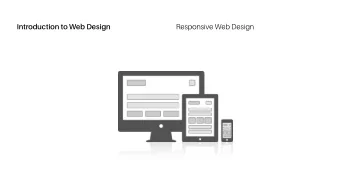
ide a A website should look good and be accessible on every display, from wide screens to mobile devices.
RESPONSIVE DESIGN Eliminates the distinction between mobile and desktop websites. Allows a single codebase that is displayed differently in various screen sizes Achieved through media queries https://developers.google.com/web/fundamentals/design-and-ux/responsive/
DESKTOP vs MOBILE vs TABLET Mobile 52% Desktop 45% Tablet 3% https://gs.statcounter.com/platform-market-share/desktop-mobile-tablet
https://internetingishard.com/html-and-css/responsive-design/
MEDIA QUERIES @media only screen and (min-width: 961px) { <regular-css-rules> }
MEDIA QUERIES a t -rul e medi a featur e @media only screen and (min-width: 961px) { <regular-css-rules> } medi a typ e
VIEWPORT ZOOMING By default, mobile devices zoom out to fit entire desktop layout onto the viewport. This prevents mobile devices from rendering responsive designs, In order to disable it, we need to specify a <meta> tag in the <head> <meta name='viewport' content='width=device-width, initial-scale=1.0'/> https://internetingishard.com/html-and-css/responsive-design/
DESIGN Start with the design of how the website will look at every breakpoint. Various responsive design patterns exist. (Mostly Fluid, Column Drop, Layout Shifter, etc.) Implement them using media queries. https://internetingishard.com/html-and-css/responsive-design/
DESIGN Fluid Layout: Content stretches/shrinks to fill the entire viewport. Fixed-Width Layout: Content has the same width regardless of the viewport Generally, Mobile/Tablet → Fluid, Desktop → Fixed-Width https://internetingishard.com/html-and-css/responsive-design/
BASIC PRINCIPLES Mobile-First: Start implementing mobile version first to maximize code reuse. Choosing Breakpoints: Don’t need to be device specific (i.e. iPhone X vs Galaxy S9). Take advantage of ranges. Relative vs Static Units: Use relative units when you want your content to adapt (when you don’t have enough screen real-estate), static units when you want the same look (when you have enough space). https://blog.froont.com/9-basic-principles-of-responsive-web-design/
dem o https://gitlab.com/uiuc-web- programming/responsive-demo
RESOURCES https://internetingishard.com/html-and-css/responsive-design https://developers.google.com/web/fundamentals/design-and-ux/responsive/ https://blog.froont.com/9-basic-principles-of-responsive-web-design/ https://alistapart.com/article/responsive-web-design/
NEXT CLASS: DATA BINDING https://uiuc-web-programming.gitlab.io/sp20/
Recommend
More recommend
Explore More Topics
Stay informed with curated content and fresh updates.
