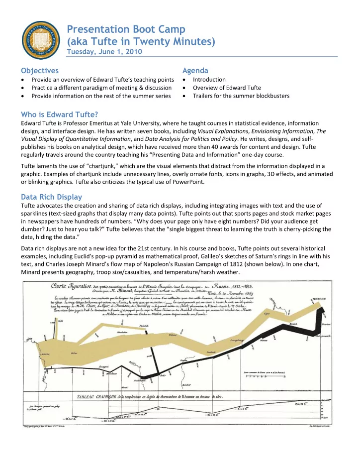

Presentation Boot Camp (aka Tufte in Twenty Minutes) Tuesday, June 1, 2010 Objectives Agenda Introduction Provide an overview of Edward Tufte’ s teaching points Practice a different paradigm of meeting & discussion Overview of Edward Tufte Trailers for the summer blockbusters Provide information on the rest of the summer series Who is Edward Tufte? Edward Tufte is Professor Emeritus at Yale University, where he taught courses in statistical evidence, information design, and interface design. He has written seven books, including Visual Explanations , Envisioning Information , The Visual Display of Quantitative Information , and Data Analysis for Politics and Policy . He writes, designs, and self- publishes his books on analytical design, which have received more than 40 awards for content and design. Tufte regularly travels around the country teaching his “Presenting Data and Information” one -day course. Tufte laments the use of “chartjunk,” which are the visual elements that distract from the infor mation displayed in a graphic. Examples of chartjunk include unnecessary lines, overly ornate fonts, icons in graphs, 3D effects, and animated or blinking graphics. Tufte also criticizes the typical use of PowerPoint. Data Rich Display Tufte advocates the creation and sharing of data rich displays, including integrating images with text and the use of sparklines (text-sized graphs that display many data points). Tufte points out that sports pages and stock market pages in newspapers have hundreds of numbers . “Why does your page only have eight numbers? Did your audience get dumber? Just to hear you talk? ” Tufte believes that the “ single biggest threat to learning the truth is cherry-picking the data, hiding the data .” Data rich displays are not a new idea for the 21st century. In his course and books, Tufte points out several historical examples, including Euclid’s pop - up pyramid as mathematical proof, Galileo’s sketches of Saturn’s rings in line with his text, and Charles Joseph Minard ’s flow map of Napoleon's Russian Campaign of 1812 (shown below). In one chart, Minard presents geography, troop size/casualties, and temperature/harsh weather.
Chart Design Principles by Mike Alexander What to Avoid What to Attempt Overall Tip & Why It Works Avoid Fancy Formatting Don’t apply b ackground colors to the chart or plot area. Colors … should be reserved for key data points in your chart. Don’ t use 3D charts or 3D effects. Avoid applying fancy effects such as gradients, pattern fills, shadows, glow, soft edges, and other formatting. Don’t try to enhance your charts with clip art or pictures. Skip the Unnecessary Chart Junk Remove gridlines Remove borders Skip the trend lines Avoid data label overload Don’t show a legend if you don’t have to Remove axes that d on’t provide value Sort Your Data Before Charting Unless there is an obvious natural order such as age or time, it’s generally good practice to sort your data when charting. By sorting, I mean sort the source data that feeds your chart in ascending or descending order by data value. Limit the Use of Pie Charts Pie charts typically take up more space than their cousins the line and bar charts. Pie charts can’t clearly represent more than two or three data categories. Bar charts are an ideal alternative to pie charts. Make Effective Use of Chart Titles You can use chart titles to add an extra layer of information, presenting analysis derived from the data presented in the chart. Don’t Be Afraid to Not Use a Chart You typically use a chart when there is some benefit to visually seeing, trends, relationships, or comparisons. Ask yourself if there is a benefit to seeing your data in chart form. If the data is relayed better in a table, then that’s how it should be presented. Other Tips Use Data Tables, Not Data Labels Maintain Appropriate Aspect Ratios Parse Data Into Separate Charts A data table allows you to see the data values for A skewed aspect ratio can distort your charts, A single chart can lose its effectiveness if you try to plot too each plotted data point, without overcrowding the exaggerating the trend in charts that are too tall, and much data into it. Step back and try to boil down what exactly chart itself. Although data tables increase the space flattening the trend in charts that are too wide. the chart needs to do. What is the ultimate purpose of the your charts take up on your dashboard, they respond Generally speaking, the most appropriate aspect ratio chart? well to formatting and can be made to meld nicely for a chart is one where the width of the chart is about into your charts. Data tables come in particularly twice as long as the height is tall. handy if your clients are constantly asking to see the detailed information behind your charts.
Designing Effective Tables and Graphs by Stephen Few The effective display of quantitative information comes down to two fundamental challenges: 1. selecting the right medium of display and 2. designing the individual visual components to display the information and message as clearly as possible. A table works best when: It is used to look up individual values It is used to compare individual values The values must be expressed precisely A graph works best when the message is contained in the shape of the data, such as patterns, trends, co-relationships, and exceptions to the norm. Chart Smart by Dona M. Wong Don’t resort to a table unless a huge amo unt of data has to be included and space is limited. Rows of numbers do not have any visual impact. It requires a lot of work for the reader to compare and contrast the data. Expressing quantitative and descriptive information in a tabular form is often the simplest method of presenting copious amounts of data. However, it should be used judiciously and as a last resort in most cases. A chart is more memorable than a table of numbers. Unhelpful Grids Name Fall 05 Fall 06 Fall 07 Fall 08 Fall 09 Business 564 573 594 583 609 A large table using grid lines or alternating gray to Chemistry 797 820 804 768 795 separate each entry can be very daunting. The busy grid lines distract the reader from the data. Env. Design 665 657 668 651 609 Physical Sci. 481 429 506 541 570 In a small table, alternating a gray background or Other 815 752 696 832 1018 gridlines for every entry is unnecessary. The eyes can easily follow the numbers across the table. Name Fall 05 Fall 06 Fall 07 Fall 08 Fall 09 Name Fall 05 Fall 06 Fall 07 Fall 08 Fall 09 Business 564 573 594 583 609 Business 564 573 594 583 609 Chemistry 797 820 804 768 795 Chemistry 797 820 804 768 795 Env. Design 665 657 668 651 609 Env. Design 665 657 668 651 609 Physical Sci. 481 429 506 541 570 Physical Sci. 481 429 506 541 570 Other 815 752 696 832 1018 Other 815 752 696 832 1018 Optimal Visual Guides Name Fall 05 Fall 06 Fall 07 Fall 08 Fall 09 Business 564 573 594 583 609 Use thin rules after three to five entries to help the Chemistry 797 820 804 768 795 reader follow the numbers across a table. A wide table needs a rule every three lines. A narrow table with two Env. Design 665 657 668 651 609 columns of numbers does not require any guides. Physical Sci. 481 429 506 541 570 Shading can be used to highlight a column of data or an Other 815 752 696 832 1018 entry. Chart in a Table Name Fall 05 Fall 06 Fall 07 Fall 08 Fall 09 Trend Whenever space is available in a table, it Business 564 573 594 583 609 is always helpful to chart the column of Chemistry 797 820 804 768 795 data that is the main message. Env. Design 665 657 668 651 609 Physical Sci. 481 429 506 541 570 Other 815 752 696 832 1018
Recommend
More recommend