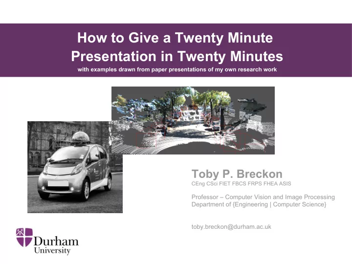

How to Give a Twenty Minute Presentation in Twenty Minutes with examples drawn from paper presentations of my own research work Toby P. Breckon CEng CSci FIET FBCS FRPS FHEA ASIS Professor – Computer Vision and Image Processing Department of {Engineering | Computer Science} Key Research areas: Image Processing, Computer Vision, Machine Learning toby.breckon@durham.ac.uk
People may be coming and going from parallel sessions – help them be sure they are < USE PAPER TITLE IN FULL SO in the right place AS NOT TO CONFUSE PEOPLE > with perhaps some clever and witty shorter strap-line if you must Some eye catching images that make people want to stay in the session to hear your talk and another …. A. Author, Toby P. Breckon , B. Author Authors in order, who School of Basket-Weaving presenting (bold) University of Poppleton, UK and where + contact. That is all. person.name@institution.place University Logo
This talk about talks …. ● 3 sets of inter-leaved slides (slides look like ) – example content (illustrative only) – presentation - “how-to” tips – presentation – best avoided S : 3
From an on-board camera ... [ video ] ….. we can perform real-time analysis of the road environment as we drive . S : 4
… so that worked then Now : (a) I have everyone's attention (b) everyone is clear on what I am talking about (c) (hopefully) everyone is now interested enough to pay attention the rest of the story S : 5
What I did back there ... ● Like a “magician in reverse” - reveal the finale ... before the “nuts and bolts”. ● Top Tip: a simple illustrative example up-front to grab peoples attention , get everyone on- board with the story and break the ice use images and/or video animations – not text, graphs or equations (as they have the opposite effect). S : 6
What I avoided …. ● Launching straight into a literature review of “prior work on ...” ● Starting with some really dull “Overview of my talk” slide …. dull, dull, dull ! ● Some convoluted, time wasting story of where Durham is …. (no one cares, they are here to hear the science!) S : 7
Motivation ... Modern vehicles contain a range of dynamics tunable to the road environment …. Source: <INSERT URL> (fair use) S : 8
Motivation ... … both {on | off } road and specific driving environments Source: <INSERT URL> (fair use) S : 9
Automatic Environment Classification Motorway/Highway ? Off-road forward facing Trunk Road on-board camera Urban Source: <INSERT URL> (fair use) S : 10
What I did back there ... ● Re-enforced the key message: What is the problem you are trying to solve and why is it important? ● Ensured (again) I take the audience with me in the story/journey Top tip: for illustrative images use google search but always acknowledge source ● Source: images.google.co.uk S : 11
What I avoided …. ● Leaving all/some thinking “yes, but why do this ?” ● Losing people with too much technical detail to early on one slide / diagram www.fsaesim.com ● Mis-judging the audience by using very specific jargon to the problem domain…. S : 12
Do judge your audience .. “the RGB pixel values from the off-side drive Specialists in the topic ? ● cam ….” e.g. sensor systems and algorithms for cars – Adjustment of language and slide Specialists in the domain ? to meet appropriate level ● e.g. sensor systems and algorithms – content Specialists in the subject ? ● e.g. engineers or computer scientists – Professional Non-Specialists …. ● e.g. physicists / psychologists / medics – Non-specialists (i.e. generalists) ● e.g. public / open day visitors / school children – “the colour information from the camera ….” ● Top tip: practice presentation using a set of peers at the same level as intended audience S : 13
No really do pre-judge your audience ... ● Above all – it helps get them all on-board This makes all the difference in the world. Who am I speaking to ? - that is the question. (remember cross-disciplinary, cross-cultural and international aspects) ● For example … a recent talk I gave over in Physics started as follows ... S : 14
Image Understanding ... • “What does it mean, to see? The plain man's answer (and Aristotle's, too) would be, to know what is where by looking.” S : 15
Automating Image Understanding ... Source: http://chenlab.ece.cornell.edu/projects/FECCM/ S : 16
… and our work specifically looks at Automotive Visual Sensing S : 17
i.e. more general introduction is used for a more general (scientific) audience pre-judge your audience ... S : 18
Snazzy images of your kit in B/W work well – take some on that camera you carry with you always! S : 19
Prior Work • Road Environment Classification – Combined Colour & Texture Features – Neural Network Classification – Near Real-time Performance [Tang / Breckon, 2011] • Urban Traffic Scene Understanding – Texture Classification & Scene Object Labelling – Urban scene focussed, different task [Ess et al., 2009] S : 20
What I did back there ... ● Simple lead in to cover prior literature ● 2-3 most relevant examples with illustrations ● Close off quickly with referral back to paper What I avoided …. ● Long and (talk) time-wasting review – people are here to see your work! Top tip: 2-3 most relevant or 1 from each inter-disciplinary topic only ● S : 21
Outline Pipe-line Feature Feature Classification Detection Representation S : 22
Approach [Tang / Breckon, 2011] Feature Feature Classification Detection Representation Colour / Texture 136D combined Neural Network - colour histogram colour/texture - GLCM texture features feature vector - single Gabor Filter response - Hough-based line count [Tang / Breckon, 2011] S : 23
Proposed Approach Feature Feature Classification Detection Representation Colour / Texture 136D combined Neural Network - colour histogram colour/texture - GLCM texture features feature vector - single Gabor Filter response - Hough-based line count [Tang / Breckon, 2011] Multiple Gabor Filter Histogram of Filter Decision Forest Responses Response Magnitude [Mioulet et al., 2013] S : 24
Proposed Approach Feature Feature Classification Detection Representation Key issue: speed vs. granularity Multiple Gabor Filter Histogram of Filter Decision Forest Responses Response Magnitude [Mioulet et al., 2013] S : 25
What I did back there ... ● Gave a clear outline of my approach first – with no maths – with no graphs ● Clearly explained how my approach differs from prior work ● Built up diagrams aimed at different auidence levels (the first of which is very simple ) S : 26
Details ….. • < delve into this as much as time now allows > S : 27
What to please avoid …. ● Over use of equations that no-one (at your audience level) will understand ● Over use of complex graphs or tables without clear signposts to help the audience ● Too much text. S : 28
Some details ….. (illustrative only) Penalty term > 0 for each “wrong side of the boundary” case – Find “hyperplane” via computational optimization S : 29
Some details ….. (illustrative only) Considering Range Accuracy S : 30
Evaluation (illustrative only) • training via Cross-validation – large dataset – parameter exploration • Low Gabor feature Quantization = optimal performance N = 5 → classification in • Outperforms [ Tang / Breckon, 2011 ] S : 31
Some more results ….. (illustrative only) Qualitative Quantitative [ video ] S : 32
What I did back there ... ● Gave a supported outline of my detailed approach second – with clear sign-posts / break-down of the maths – with clear sign-posts on the graphs ● Clearly explained my results with sign-posts of what to look at – ideally quantitative + qualitative (audience dependent) – how it outperforms prior work [Author, year] S : 33
Presentation Basics ● Do not read all the text exactly off the slide … every single last word of it including really long sentences like this one …. ● Instead …use headings – add emphasis – use italics + bold S : 34
Do not …. ● Use a wacky, detailed slide template. ● Weird templates mean content is lost. BUT DO HAVE SLIDE NUMBERS : 35 (helps with questions, later)
Do not …. ● use wacky slide transitions also ● … the audience will just feel sea sick! + wastes time S : 36
Simple is beautiful. Less text (on slides) , more words (from your mouth) S : 37
But please do …. ● Use images …. ● Use video examples … [Sokalski/Breckon, 2010] [Katramados/Breckon, 2011] – [Kundegorski / Breckon et al. '14] [ video ] screen capture software to – produce “canned demos” Arrange windows appropriately ● Edit videos to show highlights – exact clip – avoid long lead in Linux: screenrecorder + openshot (editing) ● Windows: camstudio + virtualdub (dated) ● Examples (google images!) ● Test your technology – powerpoint / ● PDF / libreoffice / vlc Side by side comparisons ● Simplest option – url click to unlisted youtube video – Highlights ● S : 38
Recommend
More recommend