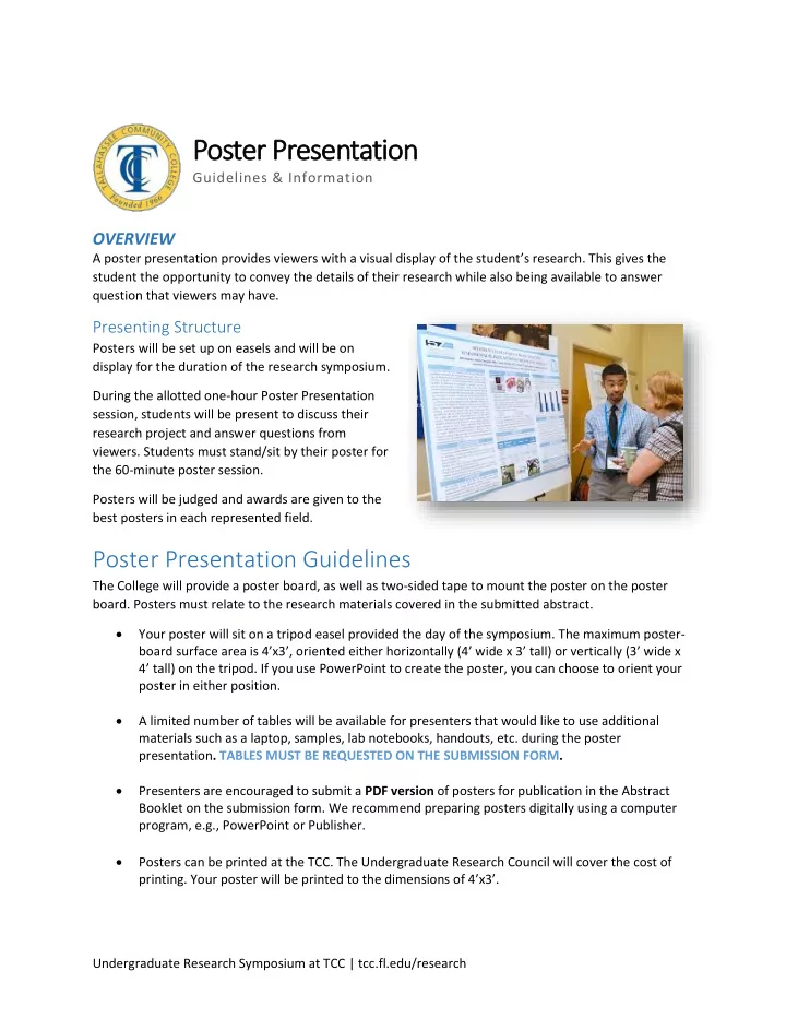

Poster Presentation Guidelines & Information OVERVIEW A poster presentation provides viewers with a visual display of the student’s research. This gives the student the opportunity to convey the details of their research while also being available to answer question that viewers may have. Presenting Structure Posters will be set up on easels and will be on display for the duration of the research symposium. During the allotted one-hour Poster Presentation session, students will be present to discuss their research project and answer questions from viewers. Students must stand/sit by their poster for the 60-minute poster session. Posters will be judged and awards are given to the best posters in each represented field. Poster Presentation Guidelines The College will provide a poster board, as well as two-sided tape to mount the poster on the poster board. Posters must relate to the research materials covered in the submitted abstract. Your poster will sit on a tripod easel provided the day of the symposium. The maximum poster- board surface area is 4’x3’ , oriented either horizontally (4’ wide x 3’ tall) or vertically (3’ wide x 4’ tall) on the tripod. If you use PowerPoint to create the poster, you can choose to orient your poster in either position. A limited number of tables will be available for presenters that would like to use additional materials such as a laptop, samples, lab notebooks, handouts, etc. during the poster presentation . TABLES MUST BE REQUESTED ON THE SUBMISSION FORM. Presenters are encouraged to submit a PDF version of posters for publication in the Abstract Booklet on the submission form. We recommend preparing posters digitally using a computer program, e.g., PowerPoint or Publisher. Posters can be printed at the TCC. The Undergraduate Research Council will cover the cost of printing. Your poster will be printed to the dimensions of 4’x3’. Undergraduate Research Symposium at TCC | tcc.fl.edu/research
Preparing a PowerPoint Presentation General Tips Generally, posters read from left to right and top to bottom. Posters should provide enough information to explain research without an oral presentation. Ideally, the content should stimulate discussion and initiate questions. Avoid overwhelming viewers with too much information. Be clear and concise in all statements, graphs, legends, etc. Before printing, have at least two people who are not familiar with your research review your poster. Does your concept come across clearly to them? Keep in mind their feedback when considering the changes you can make to improve your project. Poster Design Tips Sections to include in a poster are an abstract , methodology , results , discussion , and conclusions . If appropriate, an introduction section may be placed after the abstract. See below for example and breakdown of one of several acceptable poster layout options. Undergraduate Research Symposium at TCC | tcc.fl.edu/research
1. For the title , choose a font that is easy to read, and type in all caps and in bold. [Suggested font size: 80 pts.] Name and department for you and your faculty advisor should follow, in the same format as your proposal. 2. Abstract should be identical to the one submitted in your proposal, which will also be in the symposium program. 3. To draw attention, use headings and subheadings appropriate to your research – what’s shown above is just a sample, but you will want to use different font sizes and contrasting colors to help give your presentation a sense of hierarchy and order. 4. Please use as many high-resolution pictures, tables, or graphs you like and place them anywhere on your poster with an appropriate margin. All graphs, pictures, or tables should be a suggested minimum font size of 28 pts., so all words and numbers are still readable after the poster is printed on an 8.5x11 sheet of paper. Figures and tables should have numbers and legends. 5. Use any background color you like for your poster. Our recommendation is to try a simple background to avoid distraction. Contrasting colors against light background make it easier to read your poster. You have the freedom to display your research materials in various forms of text, figures, charts, schematics, and photographs, as long as all media is readable/visible from at least 6 feet away. Before permanently affixing your poster design, try different layouts . Be sure to keep in mind the proportions of figures, tables, and text elements. Text should not exceed more than 35-40% of the poster area. Undergraduate Research Symposium at TCC | tcc.fl.edu/research
Recommend
More recommend