
C OMPARE AND C ONTRAST P OSTER AND P OWER P OINT • P RESENTATIONS P OSTER P RESENTATION D IALOGUE – L OGICAL F LOW • E TIQUETTE • D ESIGN G UIDELINES • E VALUATION AND F EEDBACK • C REATE A 1 TO 2- MINUTE INTRODUCTION TO YOUR RESEARCH • AND PRESENT
How is a poster presentation different from an oral presentation?
POWERPOINTS POSTERS M ORE L ESS • • L ESS M ORE • • M ORE L ESS • • M ORE L ESS • • LONGER • • SHORT L ESS M ORE • • M ORE • • LESS ONE MANY • • LONGER ONE • • SHORTER MULTIPLE
• • • • • •
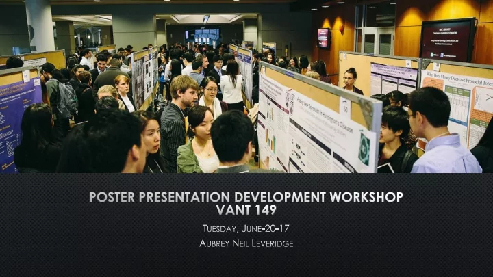
Observation, Cooperation, & Innovation Poster Session UBC Vantage College Conference July 18-19, 2016
Be prepared to speak to a broad audience Prepare and rehearse a two‐minute overview of your research How to get the dialogue started: “Do you have a few minutes to hear about my research ?” Be prepared for someone to ask you “Tell me a bit about your research”
Be prepared for informal dialogue Anticipate questions Your poster is an advertisement for your research Provide a hook to draw them in Present the highlights of your research Handouts are optional
Assume your audience is not a part of your discipline Define important concepts Simplify the language and avoid jargon, especially in your verbal explanation Use visual aids to explain processes, theories, and outcomes Be sure to speak slowly and clearly Remember the intonation practice from VANT 140 Begin stages high – ending low Stress important words
Rehearse your 1 - 2 minute presentation to ensure: You are able to present in the time allotted (<2 Minutes) Your nerves won’t get the best of you You present clearly and smoothly You know what you want to say You appear competent and knowledgeable Practice one‐on‐one or small group discussions
Y OU CANNOT COVER EVERY DETAIL OF YOUR RESEARCH , SO ANTICIPATE QUESTIONS A UDIENCE MEMBERS MAY ASK ABOUT : M ORE DETAIL ABOUT THE RESEARCH METHODS ( DON ’ T INCLUDE EVERY DETAIL IN YOUR 1-2 MINUTE TALK ). H OW FINDINGS RELATE TO OTHER PHENOMENA W HERE YOUR RESEARCH WILL GO FROM HERE M OST QUESTIONS COME FROM PEOPLE INTERESTED IN YOUR RESEARCH THAT WANT TO KNOW MORE I F YOU DON ’ T KNOW THE ANSWER , SAY SO . T HAT IS AN INTERESTING IDEA . I NEED TO INVESTIGATE THAT FURTHER
Credit sources APA Style Citations are important to support your work . Be truthful Present problems encountered Ensure you are presenting your research honestly Do not exaggerate conclusion or implications.
A Good Poster Will Have: Minimal paragraphs of text. The poster should read from top left to bottom right, like you are reading a paper. Bullet points should be optimized. Photos, graphs and other illustrations should be used to help visualize outcomes. Make sure to have high quality resolution on the images. Try to use JPEG images. Should summarize the importance of the topic, how it is being examined, and what has been learned. Your 1 – 2 minute talk should represent the poster.
Practice your 1 – 2 minute “elevator speech” about your research project Be prepared to have one‐on‐ one and small group conversations
• • • •
Have your poster ready to hang Arrive early for your session. Stay for the entire session Do not leave your poster unattended Get to know the research of your nearby posters Invite faculty members! Selfies are okay (not too many and don’t let them disrupt the presentation)
Dress professionally
Size: 3’ x 4’ (36” x 48”) Tip: Design your poster on a PowerPoint slide and resize when printing
Poster Presentation Title The title should be approximately the entire width of the poster the main text broken into multiple columns, usually three or four columns depending on the size of the poster. You may also want to use section headings within the columns at the start of each section.
Title (Suggested font size: 72-120) Use fonts such as Times New Roman Placed at the top center of the poster Below the title, in smaller font, include the following (Suggested font size: 48-80): Names of authors Major Your VANT149 Instructor University of British Columbia
Introduction (Suggested Header Font Size 36‐72) What is the problem and why is it important? (Body Font Size 24‐ 48) Hypothesis? What are you investigating? Define the problem, question, or topic Research Methods (Suggested Header Font Size 36‐72) Surveys, experiments, interviews, data analysis, etc… (Suggested Body Font Size 24‐48 ) Results and Discussion (Suggested Header Font Size 36‐72): What have you discovered or what do preliminary results show? (Suggested Body Font Size 24‐48 ) References (Suggested Header Font Size 36‐72) Acknowledgements (Suggested Header Font Size 36‐72)
• I NCLUDE AND LABEL ALL GRAPHICS , CHARTS , TABLES , FIGURES , AND PHOTOS • I NFORMATION SHOULD BE BRIEF AND PRESENTED LOGICALLY • P OSTERS SHOULD BE READABLE FROM ABOUT 1 METER AWAY
Edit, review and spell‐check all elements of your poster display Maintain a logical flow of information
Posters should be colourful and eye‐catching (but not overly colourful!) Pay attention to contrast when selecting text colors Try not to put text over images
Consistent use of space Leave space around images and blocks of text Avoid creating a crowded poster Good Spacing Bad Spacing
Use of color Select colors the compliment and contrast with each other Avoid extremely bright colors Text color should contrast background color Easiest to read: black text on a white background Include color as design elements (borders, shapes, etc.) Also ok: dark background with light colored text
Use of text Select no more than 2 different fonts Too many GETS DISTRACTING And difficult to read AVOID USING ALL CAPITAL LETTERS People read shapes of words Using all capitals distorts those shapes slowing our processing time
Each poster will be evaluated by a Vantage College instructor This is an opportunity to give you constructive comments These evaluations will be used to rank poster presentations and determine any awards
• • • • • •
• • •
CHALLENGE YOURSELF TO THE UNKOWN: Creating, Exploring & Sharing 3RD ANNUAL VANTAGE ONE CAPSTONE CONFERENCE Your presentation or poster is an advertisement for your research Provide a hook to draw people in Present the highlights of your research Engage in dialogue Have fun Now let’s work on your poster and 1 – 2 minute introduction.
Recommend
More recommend